#plotly

Alex Zapalexzap
2025-06-26


Thinking Outside the Box: Top 20 Plotly/Python Code Examples of Amazing Data Visualization That Will Blow Up Your Mind!

Uncovering Hidden Treasures of Plotly’s Interactive Graphics & Apps for Data-Driven Decision-Making (DDDM) across Industries

Example: live global earthquake visualization around Sat, Sep 9, 2023, 12:11 AM (Morocco earthquake) using Plotly EDA.
👇

medium.com/@alexzap922/thinkin

Live global earthquake visualization around Sat, Sep 9, 2023, 12:11 AM (Morocco earthquake) using Plotly EDA.
Steven Sandersonspsanderson@rstats.me
2025-06-23

Want to visualize 3D random walks? Then my #R package developed with my fellow R coder from another country Antti Rask called RandomWalker has you covered!

#R #RStats #RandomWalker #Random #Stochastic #plotly

library(RandomWalker)
library(plotly)

set.seed(123)
rw <- random_normal_drift_walk(.num_walks = 1, .dimensions = 3)

plot_ly(
  data = rw,
  x = ~ x, 
  y = ~ y,
  z = ~ z,
  type = "scatter3d",
  mode = "lines",
  opacity = 1,
  line = list(
    width = 1,
    color = "steelblue",
    reverscale = FALSE
  ))library(RandomWalker)
library(plotly)

set.seed(123)
rw <- random_normal_drift_walk(.num_walks = 1, .dimensions = 3)

plot_ly(
  data = rw,
  x = ~ x, 
  y = ~ y,
  z = ~ z,
  type = "scatter3d",
  mode = "lines",
  opacity = 1,
  line = list(
    width = 1,
    color = "steelblue",
    reverscale = FALSE
  ))
2025-05-28

contexto: Cálculos financieros con 3 acciones del sector de software
Con 3 estados de volatilidad: Baja, Media, Alta

objetivo: Calcular retorno promedio de acciones durante 4 años
Visualizar en 3D los promedios agrupado por volatilidad
El color amarillo indica el punto con mayor probabilidad
- Scatter de retornos se concentra alrededor de cero
- ¿Cual es tu interpretación?

#Rstats #Plotly

2025-05-28

# objetivo: Scatter 3D de Iris
# Explicar en forma didáctica en 3 pasos:
# - Grafico interactivo
# - Color y marcadores
# - Etiquetas

#Rstats #Plotly #3D #SoftwareLibre #Flisol

2025-05-18

objetivo: Scatter dentro de 3 planos paralelos a planos Cartesianos
- Los planos pueden moverse dentro del scatter

#Python #Plotly #Flisol #SoftwareLibre #3D #Planos

Kevin Brown-Silvakevin@brown-silva.social
2025-05-18

Finished lunch and wondering what to do? Check out an open space:

4th floor tables (under the tents): Ask a Friendly Meat-Loving Vegan
Room 308: Young Professionals Meetup!
Room 309: All Presenters/Speakers
Room 310/311: @ThePSF & Meetups Discussion
Room 315: Creative Coding with Python
Room 316: Hosting with #Teahouse
Room 318: #OpenAPI and Arazzo specifications
Room 319: Geeking Out about AI Evals
Room 320: Consciousness
Room 321: #Plotly Data Viz

#PyConUS #PyConUS2025 #PyConUSOpenSpaces

2025-05-13

objetivo: Dados 3 puntos, calcular
- Graficar plano 3D
- Agregar 3 puntos en el plano

#Python #3D #Plotly #Flisol #SoftwareLibre #Tutor

2025-05-10

contexto: Problema de geometría 3D
Algoritmo depende de formulas geométricas 3D
Resolver usando mismas ideas 2D Monte Carlo

objetivo: Encontrar volumen del cono circular

#Rstats #Flisol #SoftwareLibre #MonteCarlo #Plotly

2025-04-20

Некоторые особенности создания диаграммы Санки (Sankey Diagram) на Python библиотека plotly

Разбираемся как упаковывать данные в диаграмму Sankey, от этапа проектирования до сборки финальных кортежей.

habr.com/ru/articles/902566/

#Sankey_Diagram #Python #plotly

2025-04-15

Генерация цветовых градиентов для дашбордов Dash и отдельных графиков Plotly

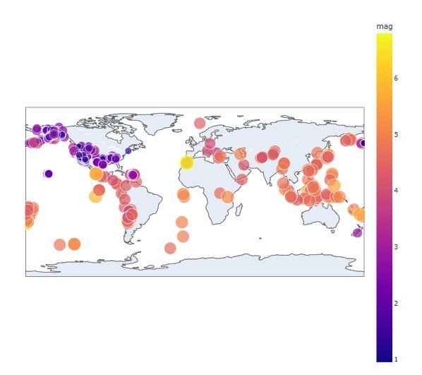
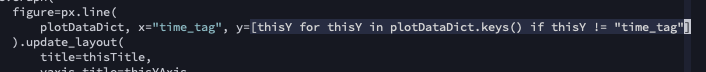
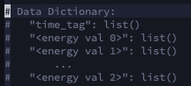
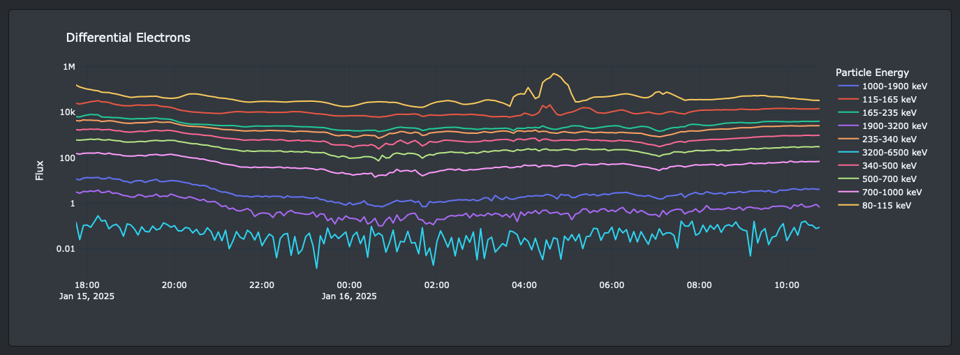
Создание цветовых градиентов для дашбордов в Dash/Plotly Проблема: при создании интерактивных дашбордов часто возникает сложность с автоматической цветовой разметкой категорий, количество которых может динамически меняться. Решение: автор делится методом создания адаптивных цветовых схем-градиентов, которые автоматически подстраиваются под количество категорий без ручного задания цветов. В статье вы узнаете: Как избежать проблем с ручным назначением цветов Как предотвратить “заканчивание” заранее подготовленных цветовых палитр Как создать равномерные цветовые градиенты в рамках заданной схемы Практические примеры реализации на Plotly и Dash Для кого: разработчики дашбордов, работающие с Plotly и Dash, которые хотят оптимизировать процесс визуализации категориальных данных. Что внутри: готовые решения для автоматического создания цветовых градиентов, которые можно легко интегрировать в свои проекты.

habr.com/ru/articles/900810/

#python #dash #plotly #plotly_dash

Recep Suluker "Uzaycı"rsuluker
2025-04-11

* Generates both 2D () and 3D () orbit maps
* Uses real-time data from Space-Track.org
* Offers a clean interface for intuitive use - http://localhost:8501

2025-04-08

Три разные единицы измерения на одном графике с библиотекой Plotly

📊 Информативные графики с двумя осями Y и тремя разными единицами измерения в Plotly! В этом туториале я разберу, как с помощью мощной библиотеки Plotly на Python создать интерактивную визуализацию с тремя различными единицами измерения. Вы узнаете: • Как настроить вторичные оси Y и X • Способы визуализации разнородных данных • Техники форматирования шкал и меток • Варианты красивого оформления мульти-осевых графиков

habr.com/ru/articles/898970/

#визуализация_данных #plotly #python #dash #dashboard

2025-04-03

Diving into wildlife for the "circle" day! 🦌 Using & to compare monthly and sightings 🐻 Data wrangled with and . Any guesses which animal is seen more consistently throughout the year? 😜

Who's Out and About? Tracking Vermont's Big Two by Month
While moose are a year-round presence, black bears hibernate during the winter months
Moose (19,670 Observations) Black Bear (2,059 Observations)
Data Source: https://www.sciencebase.gov/catalog/item/663ce56cd34e77890839%1c8
Observations are from trail cameras located in Caledonia, Essex, and Orleans Counties, (2014-2022).
2025-03-31

# objetivo: plotear dos curvas con plotly

# proceso : Para plotear varias curvas:
# Define un gráfico en blanco con el diseño deseado:
# - (no agregues ningún trazo todavía)
# Asegúrate de que nuestra lista de columnas no incluya fecha
# Agrega las curvas uno a la vez

#rstats #plotly #softareLibre #costarica software Libre BCV paralelo

2025-02-24

Compare the Best Data Visualisation Libraries for Python and Pandas

Stack choices for Python Data Visualisation – you will need to choose different tools for interactive environments, data manipulation, and data visulisation. A common and flexible setup comprises Jupyter notebooks, the Pandas library, and Matplotlib.
Philip Gillißenguerda@ruhr.social
2025-02-18

I just published a new version of #BeetsStatistics, including new plots with #plotly, a new genre heatmap, some CSS improvements. Try it out and let me know if you have any feedback!

github.com/guerda/beets-statis

docker pull ghcr.io/guerda/guerda/beets-statistics:1.0.1

v1.0.1 fixes a small issue with the decades and quality page.

#beets @beets

2025-02-11

Visualize atmospheric data using Python Heatmap Analysis! Learn to create scatter plots & heatmaps with Seaborn & Matplotlib for insightful weather pattern analysis. PythonHeatmap
tech-champion.com/data-science

Carlos Cámara-Menoyoccamara@scholar.social
2025-01-23

@OpenSciTwente @matplotlib @bret I can think of two options for #datavisualisation #dataviz

labplot.org/ is a desktop #FLOSS with a nice GUI to generate #dataviz that can also generate code and they are on the #fediverse @LabPlot .

#plotly has an online visual editor that is also quite interesting: chart-studio.plotly.com/create

I am learning about Plotly and Dash right now.

Dash application reactiveness from underlying code changes, the layout of "cards”, and the dashboard being served from a web server makes this tool very cool, in my mind.

On another note: Plotly Express line graphs allow for a list of keys to be passed to it and it will plot multiple datasets from a single dictionary in one graph. The only requirement is all the datasets need to be the same length.

#Python
#Plotly
#Dash

Python code snippet of a list comprehension, passing a list of dictionary keys as a list to the y named argument of a line plot.A python code snippet of a comment showing the structure of the data dictionary being passed to the Plotly line plot. It is a dictionary containing a single X axis list along with multiple Y axis lists. Each Y axis dictionary key is a name of the particle energy level.A screenshot of the resultant Plotly graph where (in this case) one graph contains 10 datasets.A screenshot of the terminal printout when a Dash application is run. It prints the localhost port that the web server is listening to requests on as well as any other python debug printouts from the custom code.

Client Info

Server: https://mastodon.social
Version: 2025.04
Repository: https://github.com/cyevgeniy/lmst