#30DayMapChallenge2024

2024-12-03

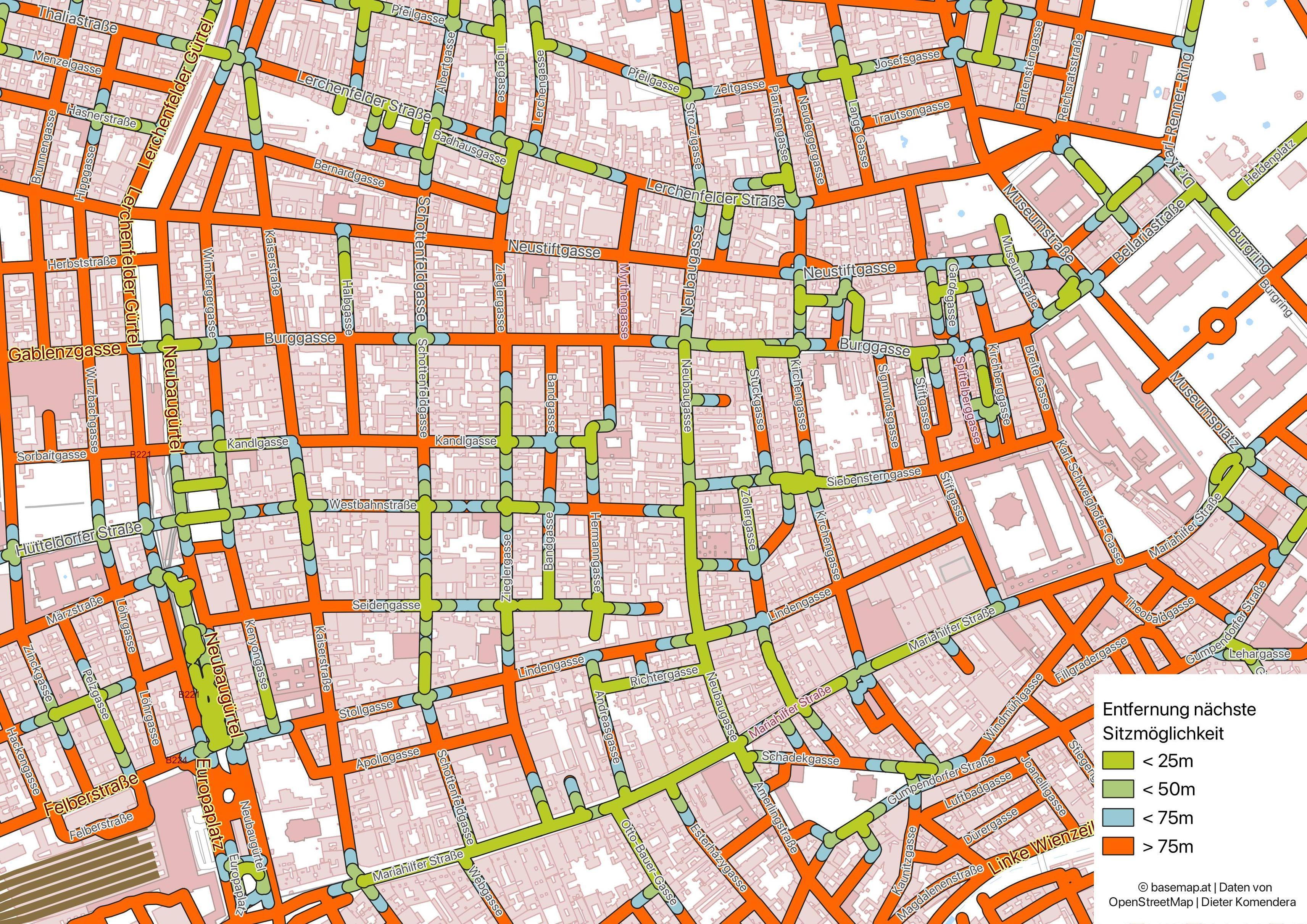
Last week, we wrapped up our participation in the #30DayMapChallenge2024, an annual event for mappers of all skill levels to explore diverse mapping themes and showcase their creativity. 🌍✨
This year marked Kontur’s 4th time joining the challenge, with 20 talented team members demonstrating their mapping expertise across all topics, from “Points” to “The Final Map….” 🎯

A huge thanks to everyone who participated alongside us and used Kontur tools to create amazing maps! 🚀

2024-11-30

#30DayMapChallenge Day 30: The final map
When you work at Kontur even your art is geospatial. Tied together the world, one nail at a time📌.

#30DayMapChallenge2024 #artmaps

2024-11-29

#30DayMapChallenge Day 29: Overture Data

We’ve captured the essence of Paris in a postcard-style map! 🇫🇷 Using data from the @overturemaps we extracted cafés, restaurants, bakeries, roads, and buildings to showcase the best places where you can definitely try a croissant 🥐.

This is just a small example of how Kontur can create layers with almost any data you need. Whether it’s for exploring a city’s culinary delights or analyzing complex datasets, we’ve got you covered.

#30DayMapChallenge2024

2024-11-28

#30DayMapChallenge Day 28: The Blue Planet
The Blue-footed Booby is a bird that nests and raises its chicks in only two places on Earth: the Galápagos Archipelago and the Gulf of California.
This bird is remarkably trusting of humans, which makes it vulnerable.
As it steps with its blue, planet-like feet, it reminds us how fragile and important the things we often take for granted truly are. 🐦💙

#BlueFootedBooby #30DayMapChallenge2024

2024-11-27

#30DayMapChallenge Day 27: Micromapping
In #Wrocław, Poland, tiny dwarf statues are hidden throughout the city! 🧙‍♂️ Installed to honor the anti-communist Orange Alternative movement, which used dwarf graffiti as a creative protest against the regime. Can you spot them all? 🔍
#OrangeAlternative #Wrocławskiekrasnale, #Wrocławskiekrasnoludki #30DayMapChallenge2024

2024-11-25

#30DayMapChallenge Day 25: Heat
These maps compare the rising climate heat risk in the Amazon with forest health🌡️🌳. The results show how increasing temperatures and wildfire risks are closing in, rapidly degrading this vital ecosystem.
#foresthealth #KonturAtlas #30DayMapChallenge2024 

2024-11-24

#30DayMapChallenge Day 24: Only circular shapes

Welcome to the Fruity Solar System! 🍊🪐 A cosmic map where planets are sweet, tangy, and juicy. If you ever need the current positions of celestial bodies for your next interstellar journey, feel free to use this photo! 🌞🍏😁

#30DayMapChallenge2024

2024-11-23

#30DayMapChallenge Day 23: Memory
This map by Noel Gorelick, co-founder of #GoogleEarthEngine & newest Kontur team member, combines Hansen Global Tree Cover/Loss dataset & 80+ workshop locations (from memory) that helped Earth Engine "map" its impact 🌲🌍.
#30DayMapChallenge2024

2024-11-22

#30DayMapChallenge Day 22: 2 Colors

Some hexagons on Kontur maps (kontur.io) aren’t what they seem!

This map, crafted by our backend engineer, explores hexagonal oddities in just 2 colors⚫️ 🟤 - a statistical snapshot of the world through the lens of H3.

Data for this topic is generated by the script gist.github.com/sleeping-h/18f which uses h3-pg extension github.com/zachasme/h3-pg
(but could be generated with any other h3 bindings)

#30DayMapChallenge2024

2024-11-21

#30DayMapChallenge Day 21: Conflict

At Kontur, we primarily analyze natural disasters, yet it’s clear that humanity often brings the greatest devastation upon itself. The worst destruction in war unfolds directly on the frontlines, where everything in its path is erased. Some regions, like the areas around Verdun, have yet to fully recover even after a century.
This map shows the cumulative months that each hexagon has been a frontline since 1900.

#30DayMapChallenge2024

2024-11-20

Defizitanalyse von konsumfreien Sitzmöglichkeiten im Öffentlichen Straßenraum in Wien

Wie weit ist das nächste Bankerl entfernt?

"Regelmäßige Ruhe- und Verweilbereiche sind besonders für mobilitätseingeschränkte Personen oder auch ältere Menschen essenziell, damit sie einen Fußweg überwinden können. Allen Personen soll jedoch einen angenehmen Aufenthalt im öffentlichen, konsumfreien Raum geboten werden." – Masterplan Gehen Neubau

#30DayMapChallenge #30DayMapChallenge2024 #Wien #OSM #OpenStreetMap #GIS

Karte vom 7. Bezirk in Wien, mit den Straßen grün, blau oder organe eingefärbt, je nachdem wie weit es zur nächsten Sitzmöglichkeit im Öffentlichen Raum ist
2024-11-20

#30DayMapChallenge Day 20: @openstreetmap data

Where should mapping efforts focus at the #Philippines? 🇵🇭

We analyzed OSM gaps, recent edits, past disasters, and population to identify priority areas. Powered by atlas.kontur.io and our AI-driven #MCDA tool!

#30DayMapChallenge2024 #KonturAtlas

2024-11-20

map.atownsend.org.uk/vector/in
and you can see the directions on it.
This is all just using regular #OpenStreetMap data (so I guess it fits today's #30DayMapChallenge2024 ).

2024-11-19

#30DayMapChallenge Day 19: Typography

Explore #Amsterdam through typography!

This map reimagines the city center, turning streets, rivers, and landmarks into a stunning composition.

#30DayMapChallenge2024

2024-11-18

#30DayMapChallenge Day 18: 3D

Ever tried building a 3D model of a city with no drones or aerial imagery?🏙️ We did it in #Batumi ! With the help of #qgis #OpenDroneMap, #Polycam3D, and #pix4d lesson learned: photogrammetry without drones is creative chaos 😅.

#30DayMapChallenge2024

2024-11-17

#30DayMapChallenge Day 17: Collaborative Map 🗺️✨
The Kontur team gathered in one room at ODIN (formerly NICS) to mark events we’ve participated in—using emojis for people icons and Draw tools within #ODIN to collaborate in real-time! See how ODIN supports dynamic teamwork and visual collaboration:
kontur.io/solutions/odin/
#30DayMapChallenge2024

2024-11-16

#30DayMapChallenge Day 16: Choropleth

Remember video game arcades? We sure do! While they're not as popular as they used to be, they're making a comeback recently. This map shows which countries have the most arcades per populated area. 🕹️

Insights like these can help in planning new arcade locations 🎯 or analyzing cultural trends tied to entertainment spaces.
And this is an example of how Kontur can create layers with almost any data you ask for. ✨

#30DayMapChallenge2024

2024-11-14

#30DayMapChallenge Day 14: A world map #Football (aka #soccer) reigns as the world’s most popular team sport, with massive budgets! ⚽️ This map showcases the estimated market value of national teams globally, based on the combined values of their players. 💸
#30DayMapChallenge2024

2024-11-13

#30DayMapChallenge Day 13: A new tool

Exciting news! #KonturAtlas develops an #AI - powered MCDA tool!

🎉 The holidays are coming, and with the help of this cutting-edge AI feature, we set out to find the best spots in Europe to encounter reindeer in just a few seconds! 🦌❄️ Check out the map below to see the results! 👇

#Christmas2024 #AI #MCDA #30DayMapChallenge2024

2024-11-12

#30DayMapChallenge Day 12: Time and Space
This timeline tracks Cyclone Ian as it swept through Florida, South Carolina, Cuba, and Puerto Rico in October 2022. 🌪️
Mapping events like Cyclone Ian across time and space provides emergency response teams with essential, timely insights—because in a crisis, every minute counts. ⏱️
Kontur's real-time analysis tools empower teams to make data-driven decisions instantly as situations unfold.

Stay tuned as we continue our #30DayMapChallenge2024 journey!

Client Info

Server: https://mastodon.social
Version: 2025.07
Repository: https://github.com/cyevgeniy/lmst