#cssUnits

2026-01-09

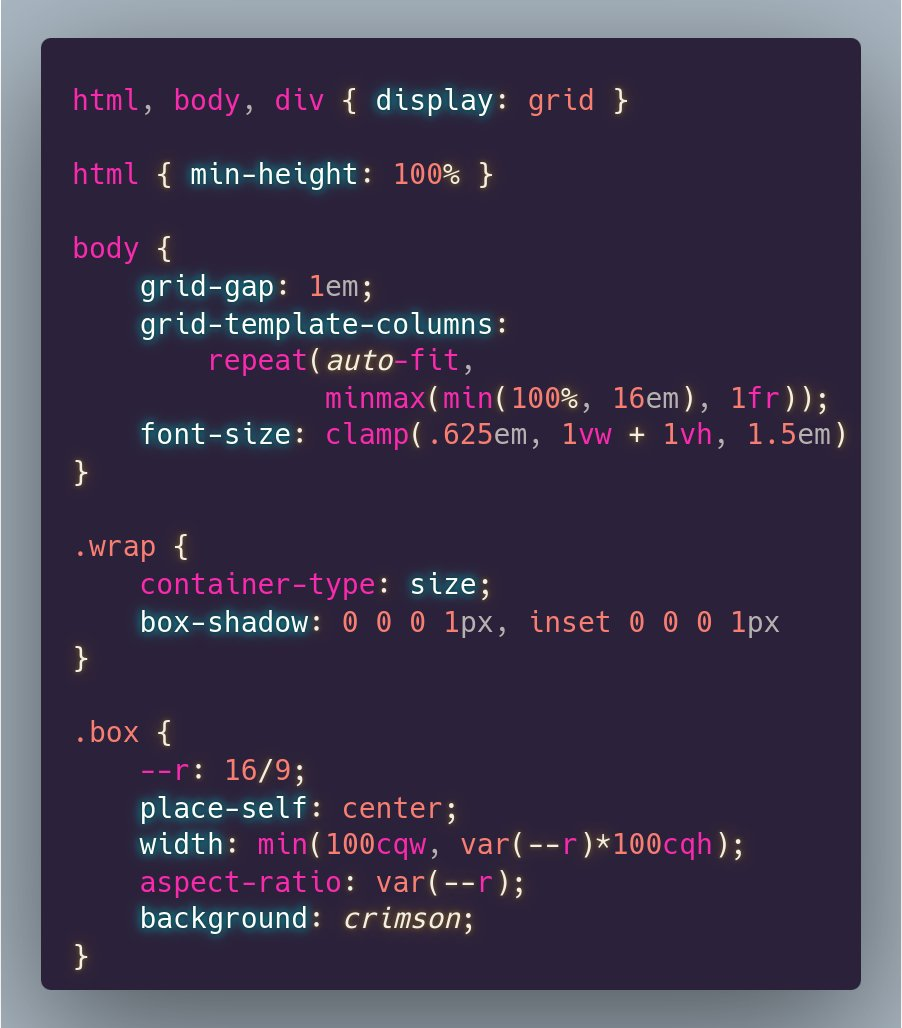
Lỗi layout CSS thường không phải do Flexbox hay Grid! Hầu hết chúng đến từ các vấn đề về đơn vị như 100vh trên mobile, em bị nhân đôi, hoặc px bỏ qua tỷ lệ chữ. Hiểu rõ về các đơn vị CSS có thể giúp bạn tránh nhiều phiền toái!

#CSS #Layout #WebDevelopment #Frontend #Programming #BugFixing
#LỗiCSS #PhátTriểnWeb #FrontendDev #LậpTrình #CSSUnits

reddit.com/r/programming/comme

Inautiloinautilo
2025-11-01


Simple full-bleed and breakout styles · Modern CSS solutions for a classic problem ilo.im/1682wb

_____

Inautiloinautilo
2025-10-27


Transition to the other side · A little CSS magic with container query units ilo.im/167m1o

_____

Inautiloinautilo
2025-09-24


The best CSS unit for spacing · “We don’t have to choose between px and rem.” ilo.im/1673zo

_____

Inautiloinautilo
2025-07-24


Designing for user font-size and zoom · Using modern CSS units and math functions ilo.im/165luy

_____

Inautiloinautilo
2025-05-12


The CSS height enigma · Unraveling the mystery of percentage-based heights ilo.im/163u5k

_____

Inautiloinautilo
2025-04-16
Inautiloinautilo
2025-02-01


Full-bleed layout with modern CSS · Edge-to-edge sections with minimal code ilo.im/1621v3

_____

Inautiloinautilo
2024-09-20


New values and functions in CSS · Long-desired features are making it into the specs ilo.im/1605ka

_____

Ana Tudor 🐯anatudor
2024-06-13

If you want a fixed aspect-ratio element that always touches either the horizontal or vertical edges of its flexible size and aspect ratio wrapper *which does not coincide with the viewport*, you can make the wrapper a container and use container query units.

Live test on @codepen codepen.io/thebabydino/pen/Exz

The CSS code used to achieve this:

```
html, body, div { display: grid }

html { min-height: 100% }

body {
	grid-gap: 1em;
	grid-template-columns: 
		repeat(auto-fit, 
		       minmax(min(100%, 16em), 1fr));
	font-size: clamp(.625em, 1vw + 1vh, 1.5em)
}

.wrap {
	container-type: size;
	box-shadow: 0 0 0 1px, inset 0 0 0 1px
}

.box {
	--r: 16/9;
	place-self: center;
	width: min(100cqw, var(--r)*100cqh);
	aspect-ratio: var(--r);
	background: crimson;
}
```
Ana Tudor 🐯anatudor
2024-05-13

As exciting (and useful) all the new units are, it looks like things working as expected with them isn't a thing for now.

Safari has problems with `lh` bugs.webkit.org/show_bug.cgi?i and doesn't seem to support `cap` (at least from what I've tested in Epiphany).

pablolarahpablolarah
2024-03-07
Red pink text on light pink background:
Learn These Viewport-Relative CSS Units (100vh, 100dvh, 100lvh, 100svh)
Inautiloinautilo
2023-11-07


Why you should use px units for spacing techniques · The drawbacks of using relative units for margin, padding, and the like ilo.im/15fman

_____

Inautiloinautilo
2023-08-09


An overview of CSS sizing units · Size units are vital to crafting optimal cross-media/device layouts ilo.im/14k8tr

_____

Inautiloinautilo
2023-07-12


New CSS viewport units · Say hello to the small, large, and dynamic viewport units ilo.im/14209x

_____

Inautiloinautilo
2023-06-08


Re-evaluating px vs em in Media Queries · Is the common recommendation to use ems instead of pxs still valid? ilo.im/13esaa

_____

Client Info

Server: https://mastodon.social
Version: 2025.07
Repository: https://github.com/cyevgeniy/lmst