#BadUXDesign

Spoooky Kagan MacTane (he/him)kagan@wandering.shop
2025-10-02

Memo to all UX designers and developers: when creating a "date picker" component, ask yourself, "Will my grandparent ever have to enter their birthday using this? Hell, will *I*, a person old enough to drink in the US, ever have to enter my own birthday?"

If so, then for Gods' sake, put in a way for people to go to any month *without* having to go through Every. Intervening. Month. 🤦🏻
#usability #BadUX #BadUXDesign #UX #UXDesign #UIUX

Spoooky Kagan MacTane (he/him)kagan@wandering.shop
2025-07-30

TextEdit is driving me nuts. Not only is there no way to make "paste without formatting" the default (and they call it "paste and match styles", which is just... WTF, your mindset is so utterly backwards from mine), but also they made the keyboard chord for it completely finger-breaking. Seriously, ⌥⇧⌘V? Try putting your fingers on all those keys at once. Especially compared to the ease of ⌘V!

Someone was just being an asshole.

#MacOS #TextEdit #UI #UX #BadUX #BadUXDesign #asshole

Third spruce tree on the lefttezoatlipoca@mas.to
2025-06-18

#Windows11's new #StickyNotes app (a thinly disguised #OneNote) is fucking annoying. Since it is so-called "smart", and it attempts to provide context around the "source" of your note, its window is constantly updating with "current source" ALL THE TIME. Its visually distracting AF.

And it can't be disabled. Do better #Microsoft.

#badux #baduxdesign #productmanagement

Windows 11 sticky notes app showing a note I just made. It captured the fact that before switching TO it, I was working in a browser window.If I tab AWAY, unless I blow it open to its own little subwindow, the note itself closes (which I guess is reasonable). And for some reason the "+Note" and "Screenshot" buttons now appear. The addition of these buttons now shifts my list of notes down, visually disruptive.If I tab to another application (or back to a browser as here), that "Recent notes" label changes to "Your notes from <Vivaldi icon> <name of webpage> - Vivaldi". 
Which is yet ANOTHER visual disruption out of the corner of my eye.And there's a setting called "Remember the source: Automatically capture the active window information to help you remember better." with a checkbox. 

If you uncheck this box, the stupid label change remains, all that stops is where the top of your note has a snip of `Source: <what window you had open>`. The visual disruption of that label changing, and having the +Note/Screenshot buttons appear and disappear all the time is annoying AF.
Spoooky Kagan MacTane (he/him)kagan@wandering.shop
2025-06-15

UX designers (which includes nearly anyone developing front-end code, whether it's in your job title or not), remember that real people will have to use your interface. It will affect them. It can have a serious impact on their quality of daily life.

Don't drive your users to this: mastodon.online/@nikitonsky/11

#UI #UX #UIUX #UXDesign #BadUX #BadUXDesign #FrontEnd #webdev #WebDevelopment

Spoooky Kagan MacTane (he/him)kagan@wandering.shop
2025-04-22

I think I have wanted to paste *with* formatting maybe twice in my life. Every. Other. GODDAMNED. Time, I have wanted to just paste the DATA I copied from elsewhere, and have it match the place I'm pasting it into.

"Paste without formatting" should be the default. "Paste WITH formatting" should be the behavior you have to explicitly ask for.

#UXDesign #BadUX #BadUXDesign #UX

Spoooky Kagan MacTane (he/him)kagan@wandering.shop
2025-03-31

I'm really annoyed with Slack's #UX behavior where normally, pressing Enter sends the text you're composing and Shift+Enter lets you insert a line-break... EXCEPT when you're in a code block. At that point, for no reason that I can discern, the behavior is reversed, and you have to just hit Enter to add another line, while pressing Shift+Enter in the code block will immediately send your message.

Whyyyyy‽😖

#Slack #BadUX #BadUXDesign

Spoooky Kagan MacTane (he/him)kagan@wandering.shop
2024-08-21

I am once again telling all software developers everywhere that "Paste without formatting" should be the default.

#software #UI #UIUX #UXDesign #BadUXDesign

Spoooky Kagan MacTane (he/him)kagan@wandering.shop
2024-06-18

A quick note about gift links to places that supply Open Graph cards: the card (which is far bigger than the text link) will link to *the normal (paywalled) version* of the article. Only the text link actually has the extra magic in it that makes it a gift link.

Yes, even if the card visually says "gift article" in it! It's confusing and annoying, and #BadUX, but now you know.

#UI #UIUX #UX #BadUXDesign

An illustration of the UX problem described in the post. It shows a screencap of a post that has a text link at the top — and that text link is only about 30 characters long, and then gets cut off with three periods, so it's not very noticeable or a very large click/tap target! Below that is a line of normal, commentary text about the link and article, and below that is a huge, ginormous Open Graph card, starting with a huge, ginormous image from the article, and also containing headline text that's larger than any of the standard text in the post. And the image says "Gift Article" in a banner at the top right corner.

There is a green outline around the truncated text link, and an arrow leads to green text saying, "You have to click here to go to the gift article". There's a red outline around the ginormous Open Graph card, and text that says, "Clicking here will take you to the paywalled article, despite the big block that says "Gift Article".
Spoooky Kagan MacTane (he/him)kagan@wandering.shop
2024-06-14

Reminder for anyone handling names in a form, database, or whatever: both given names and surnames can have spaces in them. "Mary Ann" is a valid name, and "St. Clair" is a real family name. Allow your users to put in their names properly, and *never* call them "invalid".

(What's actually invalid if you do that is *your name validation logic*.)

#webdev #WebDevelopment #BadUX #BadUXDesign #UX #UI #names

Spoooky Kagan MacTane (he/him)kagan@wandering.shop
2024-04-14

A lot of Windows apps, if you open a file, make some edits, and hit "Save As", will default to saving in the same folder/directory you opened the file from.

This is easily-predictable and therefore sensible behavior.

Then there are some (like Photos) that will default to saving in some folder that you recently opened a file from in *some completely other application*, which is absolutely deranged, and who even thought up this behavior? It's senseless and annoying.

#WTF #BadUX #BadUXDesign #UX

David Roesslidavidroessli
2024-04-13

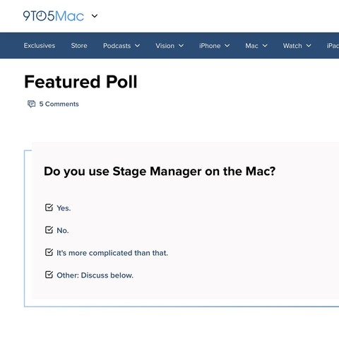
Come on @9to5Mac, you can do better than this… Ticked checkboxes acting as radio buttons that trigger a submit on touch, really?

9to5mac.com/poll-post/do-you-u

Screenshot of a form with radio buttons shaped as checked checkboxes #ftl
Spoooky Kagan MacTane (he/him)kagan@wandering.shop
2024-04-02

App developers: if you use notifications very sparingly, for things that I actually care about, I'll leave them turned on and even appreciate them.

But if you abuse notifications and hit me with too many, I'll block notifications from your app. Globally. All of them. And then I'll forget about it, and never revisit that decision.

Once you hit that point, it's too late. You ain't coming back.

Think about it *before* you decide to do notifications.

#apps #developers #UX #UXDesign #BadUXDesign

Spoooky Kagan MacTane (he/him)kagan@wandering.shop
2024-03-29

This is the wrong way to make your #UI elements, especially for this question.

There are 2 problems:

1) These look like check boxes, but behave like radio buttons. Selecting one deselects the others.
2) "Race" actually *should* be done with check boxes, and allow multiple answers! (Then the "two or more" option could be removed.)

This is #BadUX, and #BadUXDesign.

#webdev #WebDevelopment

A portion of a web form. The text at the top says, "Please Identify your Race (Select one)". Below that are a series of square boxes that look like check boxes, with labels: American Indian or Alaskan Native; Asian; Black or African American; Hispanic or Latino; White; Native Hawaiian or Other Pacific Islander; Two or More Races; and Decline to Self Identify
James Holdenjamesholden@mas.to
2024-03-29

Just paid the final balance on a hotel booking. “Warning! Payment successful”. #baduxdesign

Spoooky Kagan MacTane (he/him)kagan@wandering.shop
2024-03-26

Nobody:
Website owners: You know what people really love when they're reading something? To have a giant modal popup in their face!

Narrator: It turns out they actually don't.

😠😠😡

#webdev #BadUXDesign #BadUX

Spoooky Kagan MacTane (he/him)kagan@wandering.shop
2024-03-03

Hey, #webdev​s: If you're making a popup or modal, you need to make sure it's *NEVER* taller or wider than the browser's viewport. Otherwise, the controls to close it can wind up extending beyond the viewport, where the user can't access them... and hence, can never close the modal.

All they can do is close *the entire tab*.

Don't do this.

#WebDevelopment #usability #UX #BadUX #BadUXDesign #UXDesign

Spoooky Kagan MacTane (he/him)kagan@wandering.shop
2024-02-17

"Paste with formatting" should *never* be the default.

At this point, most places that paste-with-formatting on Ctrl-V will do it without formatting on Ctrl-Shift-V, but... dammit, flip them around! Default to *without*; on the amazingly rare occasions when I want that behavior, I'll ask for it.

#UX #BadUX #BadUXDesign

Spoooky Kagan MacTane (he/him)kagan@wandering.shop
2024-02-04

Really not loving the #UX decisions on things like TikTok/YouTube Shorts/etc., where videos autoplay muted. I can see the logic:

* Why make the user have to hit a button to start play? Watching a video is literally all this is URL for, just give them the video!
* But don't ever autoplay with sound.

But the result is now I always have to hit *two* controls: first to unmute, then I've got to acquire the scrubber and drag it back to start (which is invariably nightmarish). #BadUX #BadUXDesign

Spoooky Kagan MacTane (he/him)kagan@wandering.shop
2024-01-18

Hey, front-end devs: If you put a click handler on a link to make it do something special rather than just navigating to the href, make sure your handler *only triggers on left-click*, NOT on middle-click or right-click!

If I tried to use middle-click to open the link in a new tab, and your event handler nullified my intent as a user, I will not be happy with your site.

#webdev #WebDevelopment #UX #BadUX #BadUXDesign

Spoooky Kagan MacTane (he/him)kagan@wandering.shop
2023-12-12

I cannot say how much I HATE TaskRabbit's web site. There are so many things about the #UX there that drive me insane. The one on my mind right now is:

When you're looking at potential taskers for a job, *whyyy* is there no way to open any of them in another tab so you can compare?!?

It's like nobody on their #webdev team has ever tried to use their own site.

#BadUXDesign #BadUX #WebDevelopment

Client Info

Server: https://mastodon.social
Version: 2025.07
Repository: https://github.com/cyevgeniy/lmst