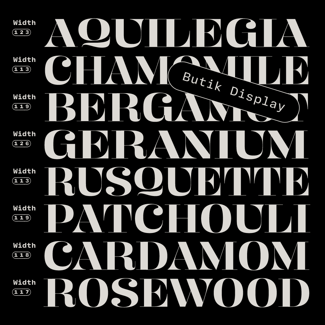
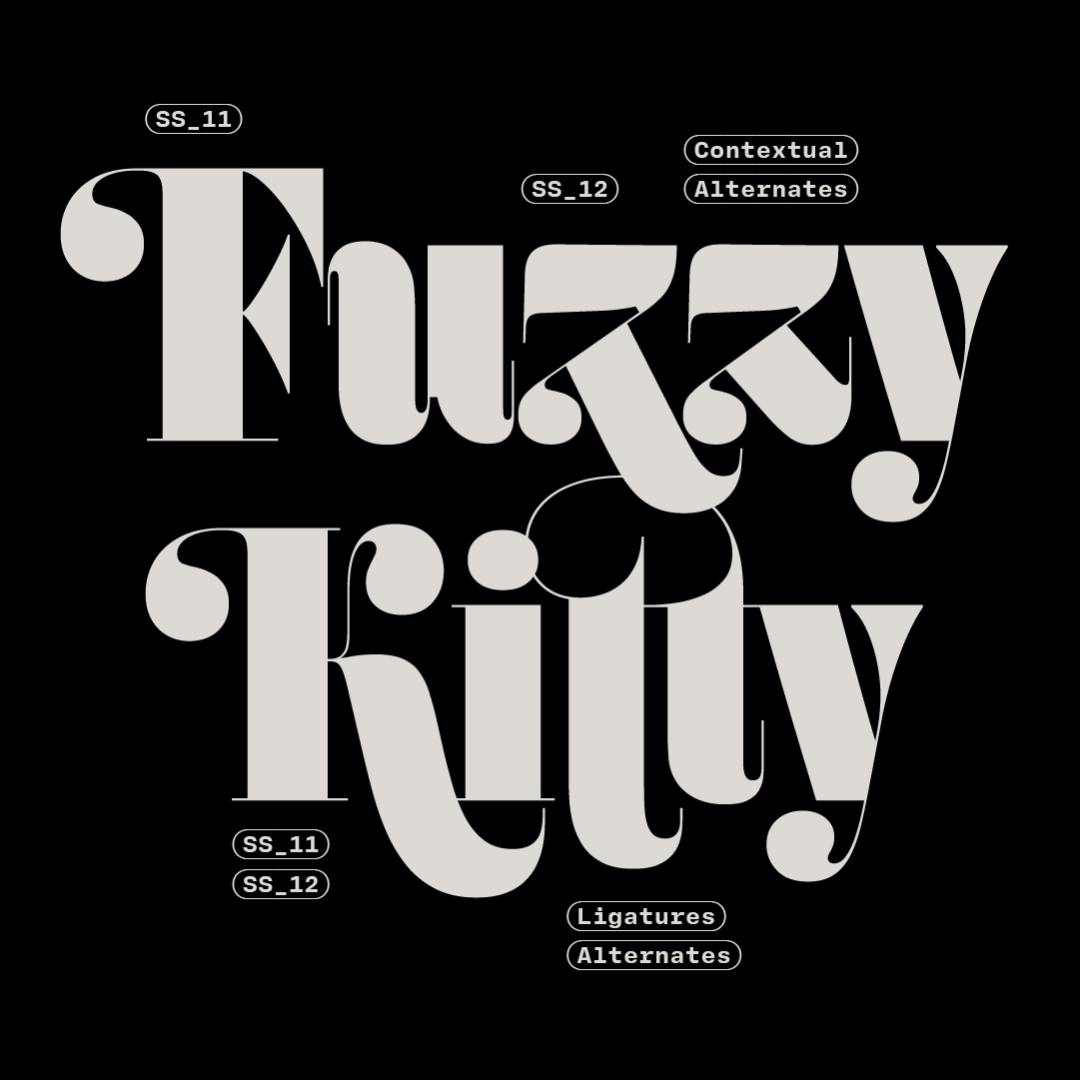
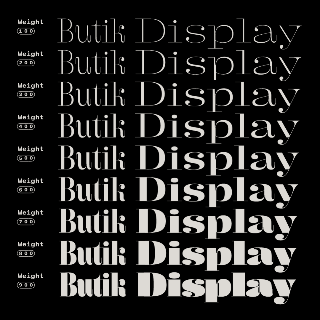
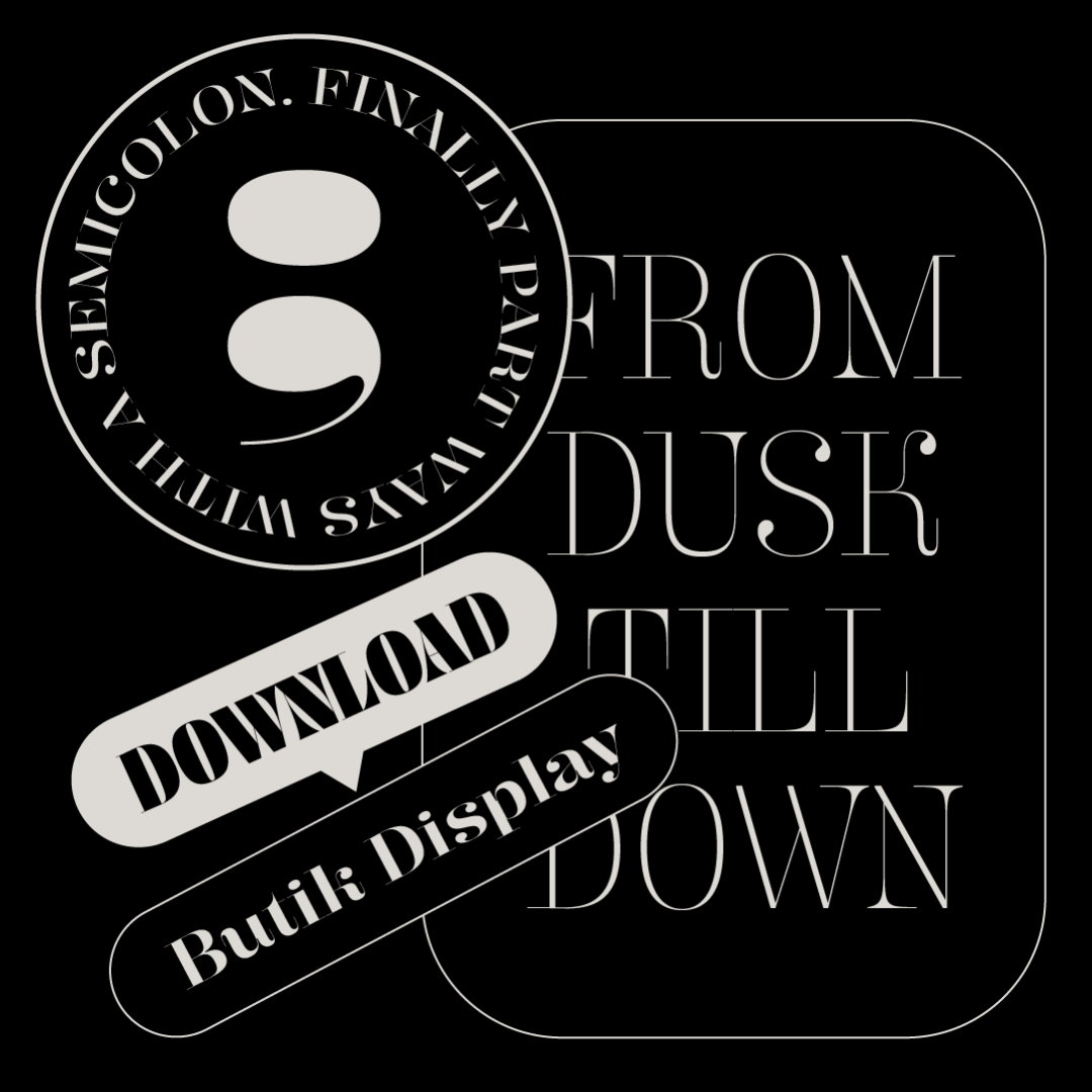
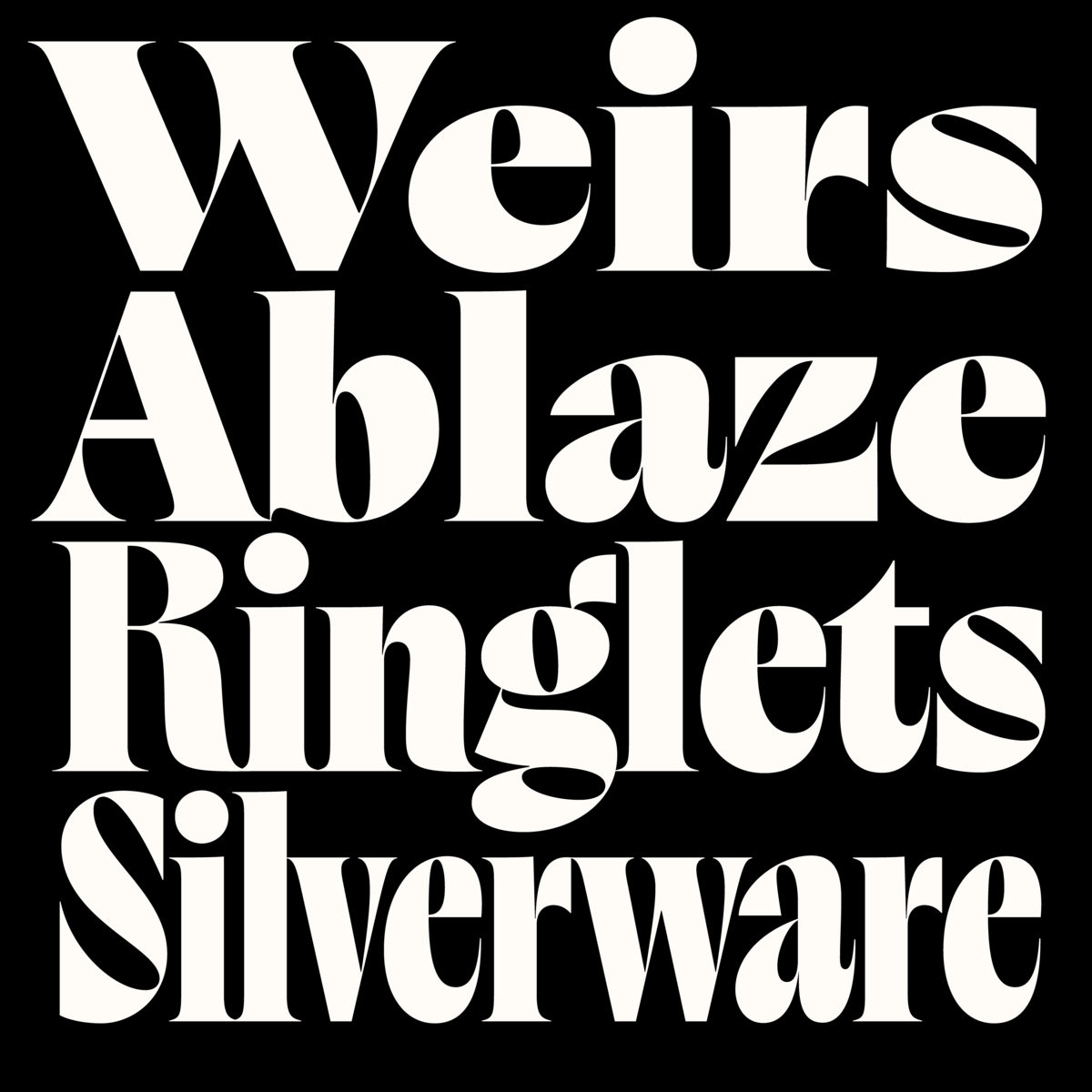
Butik by Anna Štepanovská
rosettatype.com/Butik
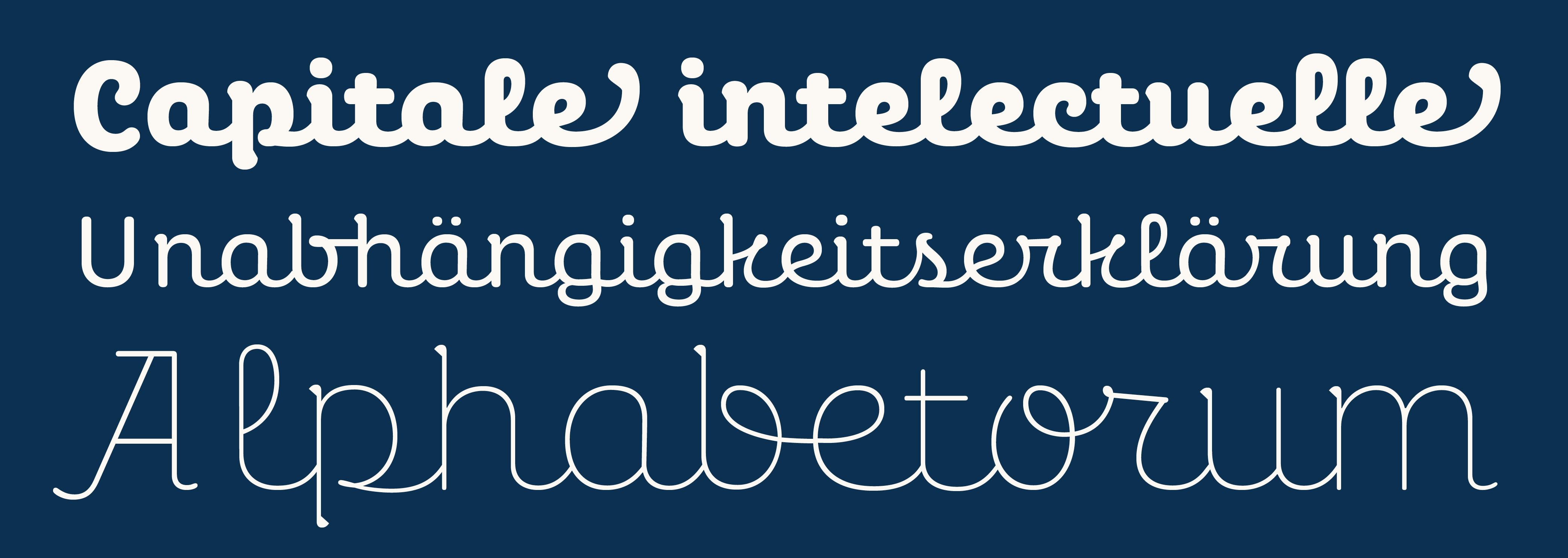
A buoyant Didonesque display typeface with a full palette of weights and widths and ensemble of lively alternates, swashes, and expressive ball terminals. These days, we rarely see refined drawings such as these.
#fontstyle #newfont #font #typeface #typography #typedesign #graphicdesign #designedbywomen #postmodern #designtrends #fonts #rosettatype #didone #bodoni #displayfont
#NewFont
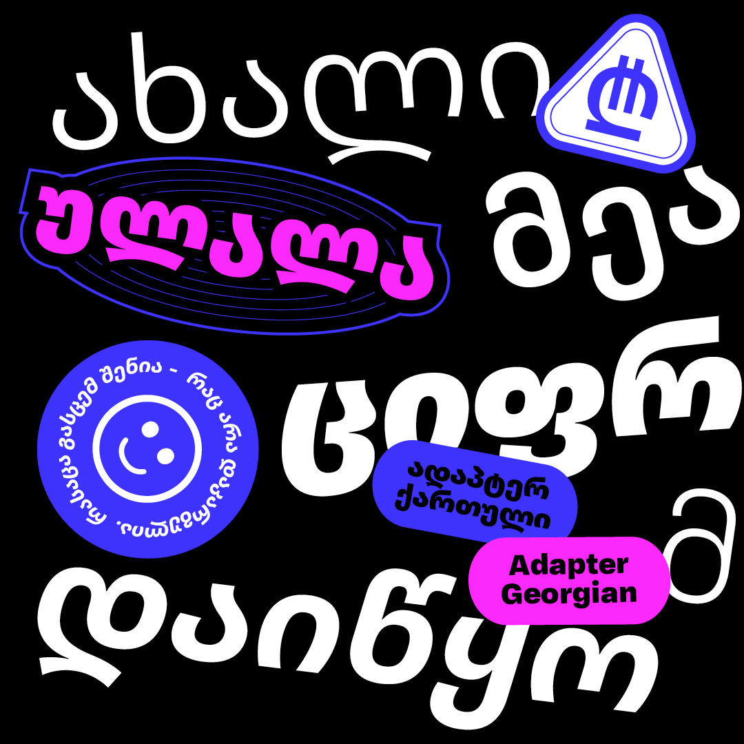
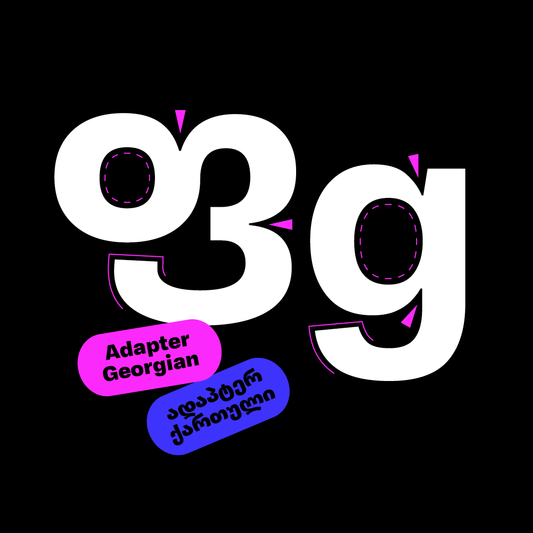
As part of our programme to broaden the reach of Adapter World, we invited Ana Sanikidze to work with us and design Adapter Georgian Text, a universal monolinear typeface with contemporary aesthetics. The text oriented styles with a wide range of weights are packed into a single variable font.
Design: Ana Sanikidze
Art-direction: David Březina
Font engineering: Johannes Neumeier
#fontstyle #newfont #font #typeface #typography #typedesign #graphicdesign #designedbywomen #postmodern #designtrends #fonts #rosettatype #adaptergeorgian #georgianfonts #georgian #TDC
Design: Ana Sanikidze
Art-direction: David Březina
Font engineering: Johannes Neumeier
#fontstyle #newfont #font #typeface #typography #typedesign #graphicdesign #designedbywomen #postmodern #designtrends #fonts #rosettatype #adaptergeorgian #georgianfonts #georgian #TDC
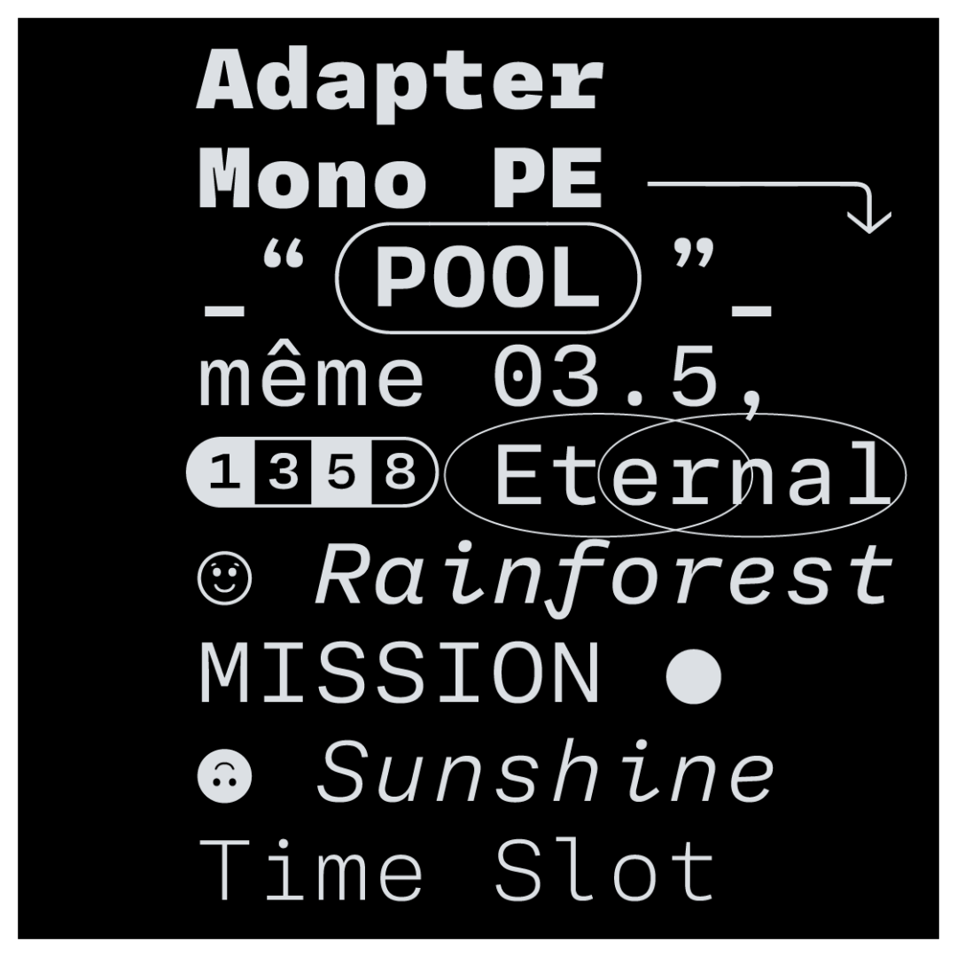
Adapter Mono PE is a monospaced type family with an editorial state of mind. It features a range of weights, strongly inclined italics with cursive alternates, and numerous stylistic sets to meet all your fixed-width letter needs.
Design: Tania Chacana
Art-direction: David Březina
Font engineering: Johannes Neumeier
Cyrillic consultancy: Maria Doreuli
Greek consultancy: Irene Vlachou
#fontstyle #newfont #font #typeface #typography #typedesign #graphicdesign #designedbywomen #monospaced #postmodern #designtrends #fonts #rosettatype #adaptermono
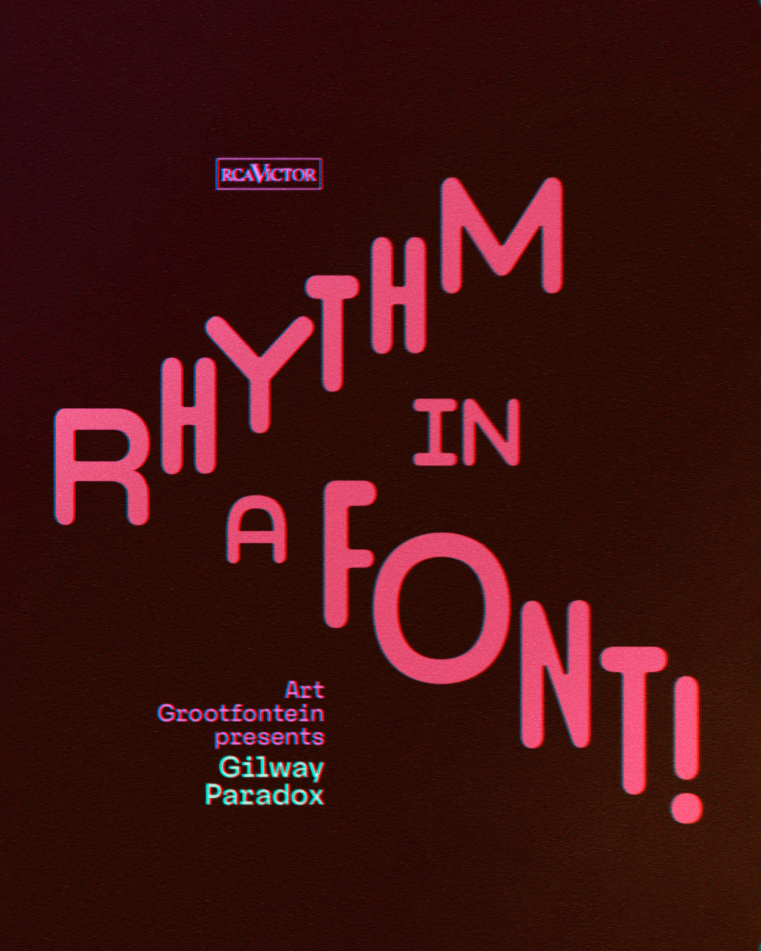
A typeface like no other!
Gilway Paradox dances between widths to bring energy and rhythm to your designs. Soft curves, bold personality.
Discover the beauty of contrast.
🔗 Link in bio to explore!
#typedesign #newfont #fontlaunch #gilwayparadox #creativefonts @Typetopia #typomania
RL Folklor is a distinctive display #typeface designed by Radek Łukasiewicz. It explores the dynamic interplay of positive and negative space, resulting in bold, blocky letterforms with a carved aesthetic. #RLFolklor draws inspiration not from specific #typefaces but from craftsmanship, particularly the textures and forms of #woodcut aesthetics. https://radluka.com/rl-folklor
#typedesign #newfont #fontdesign #typefacedesign #fonts #graphicdesign #radeklukasiewicz #certainmagazine
👓 I can't resist trying my next font, GILWAY PARADOX, inspired by the #Severance amazing series! 💾
Gilway Paradox will be available in Light, Regular, and Bold weights with matching italics, offering endless possibilities for unique designs.
Stay tuned for the official release date and get ready to embrace the Paradox!
#GilwayParadox #NewFont #Typeface #Typography #typographie #motiondesign #FontDesign #DualWidth #typeinmotion
Bitzer is the latest #typeface by James Plattner, now available on Future Fonts @futurefonts Designed for headlines, #logos and editorial design, Bitzer’s narrow proportions allow for efficient #text arrangement without compromising #readability. 🔗 https://futurefonts.xyz/james-plattner/bitzer
#variablefonts #newfont #typedesign #typefacedesign #typefaces #fontdesigner #fonts #fontdesign #variablefont #futurefonts #jamesplattner #therightfont
Something exciting is brewing in the world of type... 🤫 I'm thrilled to give you a sneak peek at my latest font project: Gilway Paradox!
This typeface blends a friendly, contemporary feel with unexpected dynamism. Its dual-width characters will create a striking visual rhythm, perfect for adding a touch of excitement to any design.
Stay tuned for the official release date and get ready to embrace the paradox!
#GilwayParadox #NewFont #Typeface #Typography #FontDesign #DualWidth #DynamicType #
Pouler is an open-source, all-caps display #typeface created in 2024 by Alexandre Créquer, an independent #typedesigner based in Rennes, France.
Inspired by French rurality and slang, #Pouler combines an approachable personality with generously rounded forms, exuding a playful energy and a distinctive, organic charm.
https://alex-creq.com/typefaces/pouler
#typefaces #typefacedesign #fontdesign #fonts #typedesign #newfont #displayfont #opensource #freefont #freeware #alexandrecrequer #therightfont
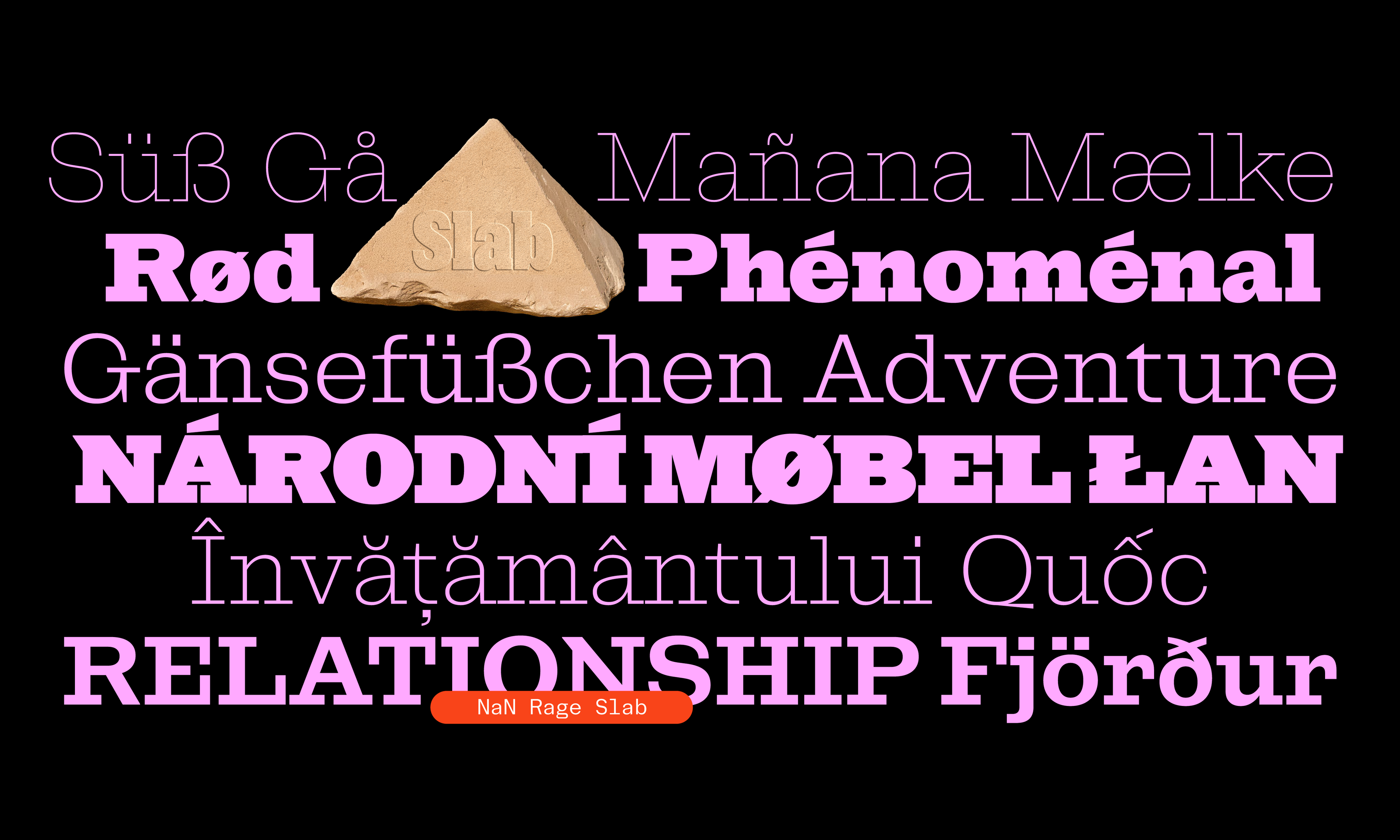
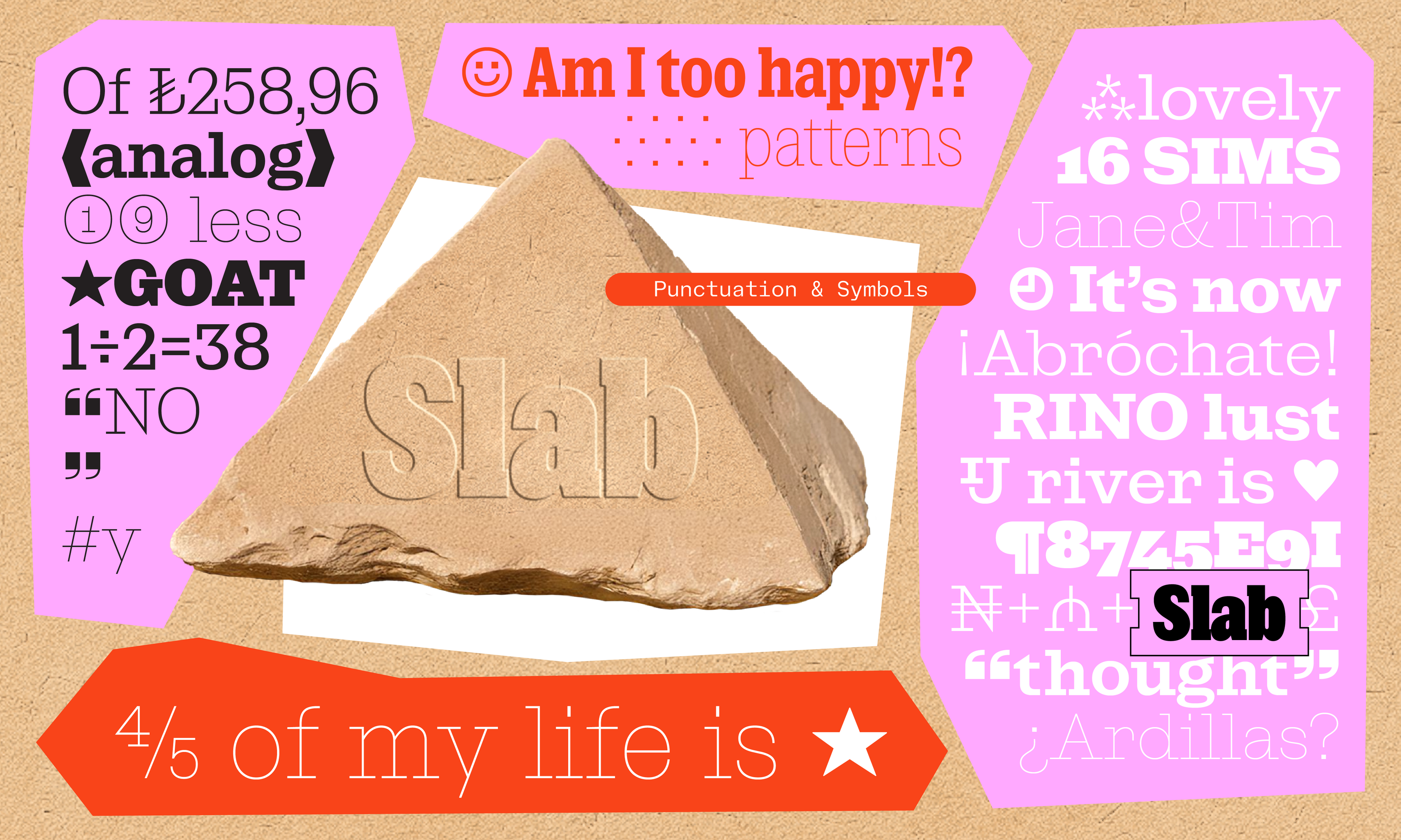
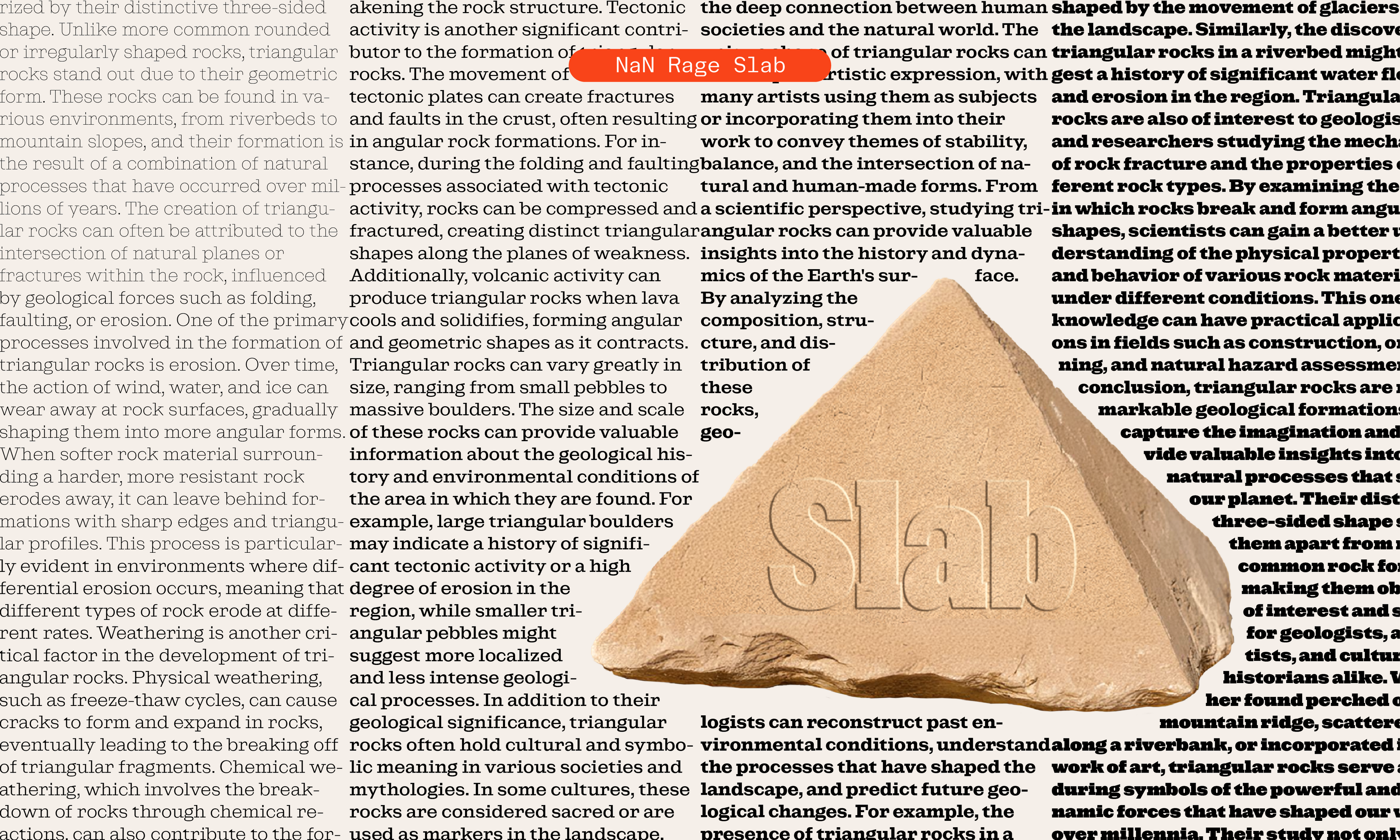
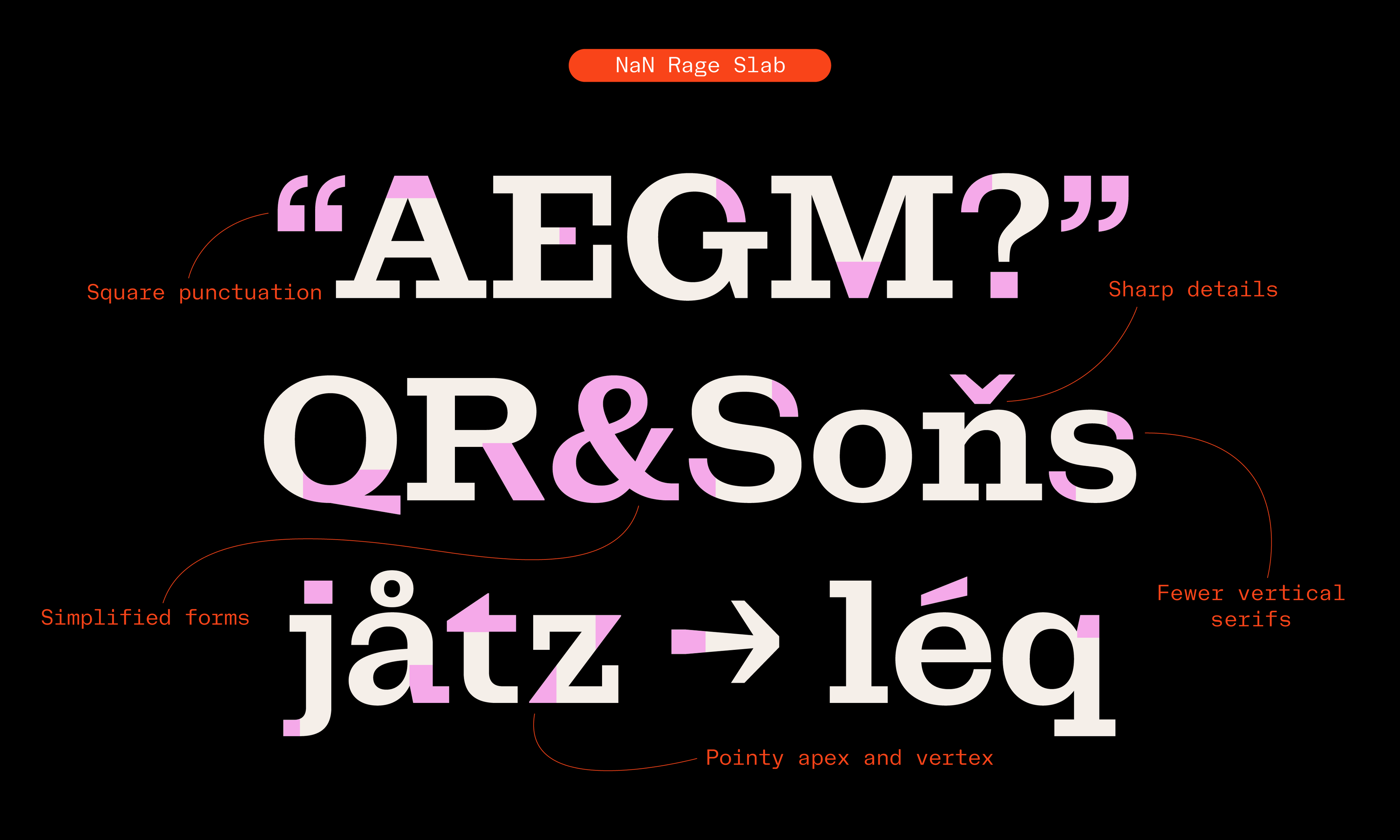
😡 NaN Rage member 2/7 😡
NaN Rage Soft is a modern take on the Slab-Serif genre. It most prominently features bracket-less serifs, simplified non-decorative forms and sharp interruptions.
Applying the “less is more” motto to a slab-serif, Rage Slab has a very sleek and sharp voice, cooler than its sibling Rage Beau.
4 widths * 9 weights = 36 Slabbies
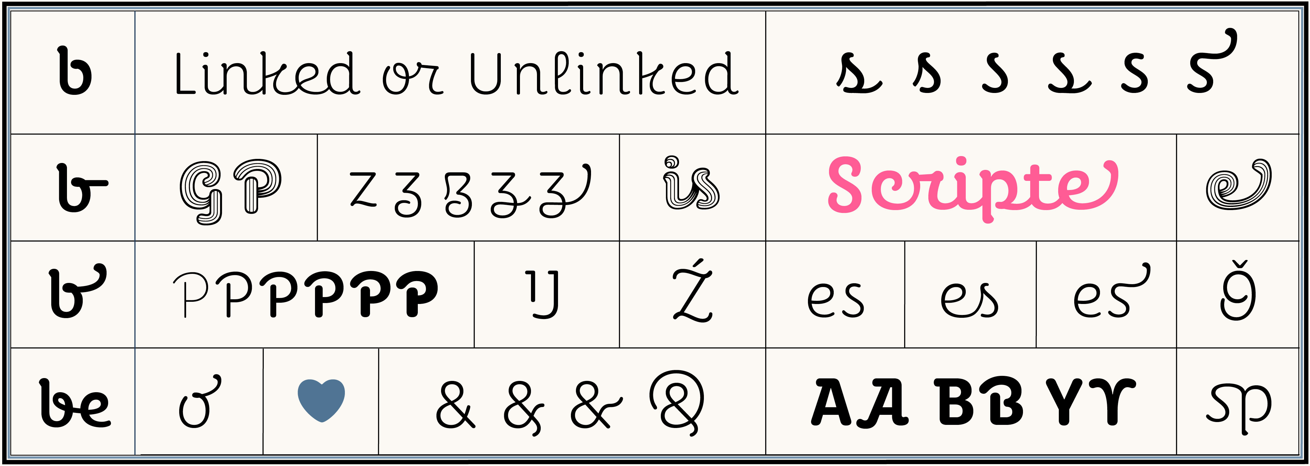
😡 NaN Rage member 6/7 😡
NaN Rage Quik is an unapologetic script font with roots in Sharpie pen lettering and graffiti.
4 widths * 9 weights = 36 Quikies
*WIP*
Quick preview of my coming soon dual-width for dynamic layouts!
#typography #fontdesign #typedesign #motiondesign #newfont #fontinspiration #graphicdesign #designinspiration #typeface
Happy to launch #PerecScripte the new addition to the #Perec super family … after a 14-year maceration. 🤓
Type page = https://pampatype.com/typefaces/perec-scripte
Article https://pampatype.com/blog/perec-goes-script
Specimens:
—screen = https://tinyurl.com/2nkkm39r
—print = https://tinyurl.com/2xwue2ey
@pampa #fontrelease #typedesign #ScriptFonts #newfont #fontdesign
Elevate your type game with Peridot Devanagri and make a statement in over 330 languages. 🌐✨
Available at https://foundryfivetype.com/type/peridot-devanagari/ and all major font retailers.
Guess the book for the chance to win a free desktop licence to my new font. Don't worry it'll get easier in time! #newfont #stanley #fonts #fontfoundry #display #typeface #graphicdesign #sciencefiction #competition #freefont #brand #marketing
**Meet Microsoft Office’s new default font: Aptos** #MSOffice #NewFont
https://www.theverge.com/2023/7/13/23793428/microsoft-aptos-new-default-font-office-365
**Meet Microsoft Office’s new default font: Aptos** #MSOffice #NewFont
https://www.theverge.com/2023/7/13/23793428/microsoft-aptos-new-default-font-office-365
Meet Microsoft Office’s new default font: Aptos #MSOffice #NewFont
https://www.theverge.com/2023/7/13/23793428/microsoft-aptos-new-default-font-office-365
I guess August is surprise font release month, because dafont just published a font of mine, that i submitted 17 months ago! I had completely forgotten that i had submitted this font.
Necker, with extremely limited repertoire, and very wrong opinions about baseline.
#UBC designed a #NewFont that allows characters from #Musqueam #Indigenous #language to be typed on computers & match formal institutional #font used on UBC documents/signs.
Most characters in Musqueam language's - #hən̓q̓əmin̓əm̓ - pronounced HUN-kuh-mee-num - aren't available on English language keyboard.
The new font is also capable of #typesetting the language of the #Syilx, a #FirstNation located in the same area as UBC's #Okanagan campus
Client Info
Server: https://mastodon.social
Version: 2025.04
Repository: https://github.com/cyevgeniy/lmst