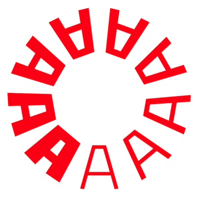
PLINC celebrating US Independence Day with 13 lines of bicentennial alphabets, 1977: https://fontsinuse.com/uses/61775/plinc-bicentennial-alphabets-specimen-page
#TypeSpecimen #PhotoLettering #IndependenceDay #FourthOfJuly #Fonts #Typography
PLINC celebrating US Independence Day with 13 lines of bicentennial alphabets, 1977: https://fontsinuse.com/uses/61775/plinc-bicentennial-alphabets-specimen-page
#TypeSpecimen #PhotoLettering #IndependenceDay #FourthOfJuly #Fonts #Typography
Today’s lettering on photo by Robert Collins on @unsplash. #photolettering #almahoffmannlettering #almahoffmannletters #almahoffmann
Ever heard of Bartley Campbell?
Ed Benguiat (graphic design and lettering), “Angelus Benevolus of Type Design Bartley Campbell Inspired Typography in The United States.” (see alt text for more), centerfold of PLINC: An Illustrated Typographic Journey, vol. 2, no. 1, Photo-Lettering Inc., New York, 1985.
#Lettering #EdBenguiat #PLINC #PhotoLettering #BartleyCampbell #VictorianDesign #TypeDesign #Typography
This week I made a wild discovery: the original interlock display font used for the cover of “Where the Wild Things Are” by Maurice Sendak. I wrote about my “Safari” here: https://blog.threestepsahead.com/general/safari-where-the-wild-things-are-font/ @FontsInUse #typography #WhereTheWildThingsAre #MauriceSendak #fonts #fontsinuse #photolettering
Ed Benguiat, back cover of PLINC: An Illustrated Typographic Journey, vol. 2, no. 1, Photo-Lettering Inc., New York, 1985.
#LetterformArchive #EdBenguiat #PhotoLetteringInc #PLINC #TypeDesign #Lettering #Calligraphy #Swashes #PhotoLettering
Photo-Lettering, Inc. led the pack in expressive typography throughout the 1950s–1970s, supplying headlines for ads, albums, book covers, and magazines. On our blog, guest researcher Anne Galperin highlights the unsung contributions of the women of PLINC. https://letterformarchive.org/news/from-the-collection-the-women-of-photo-lettering/
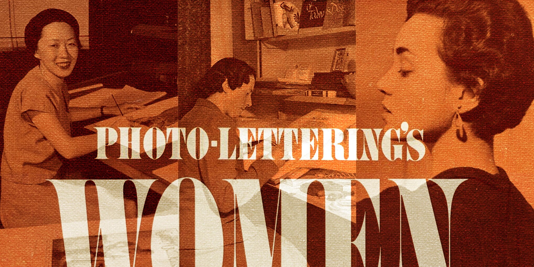
It was a joy to work on this piece with Anne Galperin. As soon as I saw her essay on Betti Haft in @BriarLevit’s book I knew we had to expand on the search for @letterformarchive’s blog. (Sadly, nearly all these women were gone before Anne could interview them. Another reminder to talk to elder designers *now*!) https://letterformarchive.org/news/from-the-collection-the-women-of-photo-lettering/
#TypeDesign #WomenDesigners #Phototype #PhotoLettering #Typography
Narrow-format font catalogs. From condensed, to compressed, to ridiculous. 🤳@laureola
https://www.flickr.com/photos/stewf/52943712051/
#TypeSpecimen #Fonts #Typefaces #FontShop #Lettergraphics #Headliners #PhotoLettering #Linotype
Ed Benguiat, decrying the use of TNT (tight-not-touching) spacing commonly requested by Photo-Lettering customers. As I suspected, this is not a technique professionals like Ed really appreciated because it generally looks like crud.
#PhotoLettering #Phototype #Typography #1970s #1980s #GraphicDesign
When House Industries released a digital version of Photo-Lettering’s Benguiat Montage, they asked its original designer to do a voiceover for a delightful promotional video: https://vimeo.com/358911510
The early uses of Montage that Ed mentions, and many more, are up on Fonts In Use today. https://fontsinuse.com/typefaces/111777/benguiat-montage
#Phototype #PhotoLettering #Fonts #Typography #EdBenguiat #FontsInUse