#choropleth

Eugene Alvin Villar 🇵🇭seav@en.osm.town
2025-11-03

#30DayMapChallenge 🗺️ Day 3️⃣: Polygons

I went with a classic #choropleth map to keep things simple (and save my energy) and this one shows the population change of the 201 barangays (kinda like wards) of the city of Pasay in the #Philippines 🇵🇭 between the 2000 and 2024 censuses.

en.wikipedia.org/wiki/Pasay

The boundaries come from #OpenStreetMap while the population data is from the Philippine Statistics Authority. Map rendering was done using the #D3js library.
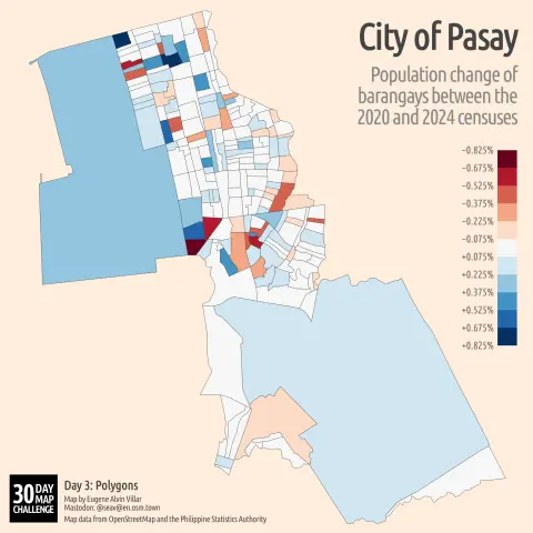
#maps #cartography #gischat

Choropleth map of the 201 barangays (wards) of the city of Pasay in the Philippines showing the population change between the 2000 and 2024 censuses. The more positive the population change, the more dark blue the barangay gets while the more negative, the more dark red.
2025-10-24

Exploropleth is an open-source, web-based geospatial visualization tool for interacting with a catalog of established data binning methods and exporting customized maps #choropleth

exploropleth.github.io/

2025-03-18

First up (for today), building a #choropleth of the active licensed #structuralengineers in the U.S. A linear hue scaling of # of SEs makes a pretty boring map. California dwarfs basically all other states. I'm thinking I might need to normalize the data with pop density.

#dataviz #aec #maps

A choropleth density map depicting the number of licensed structural engineers in each state. California has the most at over 3000.
Stamen Designstamen@vis.social
2025-03-06

Now on the blog: how we expanded UCSF’s Health Atlas from California (which we first collaborated on in 2019) to the entire US in 2024, including data and design updates across the entire tool.

Read now at stamen.com/taking-ucsfs-health

#maps #basemaps #design #cartography #ucsf #health #choropleth

How data viz and cartography combine to tell the story of health factors and outcomes......with beautiful yet simple choropleth maps......and interactive data viz to explain how variables interact.Learn more about how we upgraded the UCSF Health Atlas on the blog
Eugene Alvin Villar 🇵🇭seav@en.osm.town
2024-11-17

#30DayMapChallenge 🗺️ Day 1️⃣6️⃣: #Choropleth

I haven’t done a bivariate choropleth map yet for this year so here is one! This shows two financial indicators (total assets and poverty incidence) for the 16 cities and 1 municipality of #MetroManila, the capital region of the #Philippines 🇵🇭.

The geo shapes come from #OpenStreetMap, the assets data comes from the Commission on Audit, and the poverty incidence is from the Philippine Statistics Authority. The latter 2 were actually via #Wikidata.

🧵 1/2

Map of the cities and municipality of Metro Manila in the Philippines where is is colored according to their total assets vs. poverty incidence.
Frédéric Cantat 🌍CanFre@mamot.fr
2024-11-16

RT IGNFrance@X.com

30DayMapChallenge J16 #Choropleth - Des cartes à lire
📍 Les cartes IGN sont couvertes d'annotations (noms de lieux, points cotés, etc.) placées avec soin pour garantir leur lisibilité.
Cette #carte montre leur densité par emprise sur les cartes IGN au 1:50 000

✍️ @abigail2154

🐦📎: x.com/IGNFrance/status/1857676

2024-08-14

#WikiArcheology on #wikimaps again !
Around 2012 or before, NZ young developer Arthur Gunn created GunnMap. An advanced, Flash (SWF), online #choropleth #maps creator. It was such an innovation back then. player.vimeo.com/video/1849768

Commons category : commons.wikimedia.org/wiki/Cat
Blank map (well coded XML): commons.wikimedia.org/wiki/Fil

Using proprietary SWF technology, this visionary project was not maintained and is now defunct.

cc @dmontagne @assassas77 @pac2

Screenshot of GunnMap.co.nz
Eugene Alvin Villar 🇵🇭seav@en.osm.town
2023-11-13

#30DayMapChallenge 🗺️ Day 1️⃣3️⃣: #Choropleth

(Finally caught up!)

For today, I wanted to do something simple and whimsical.

There’s a lot of rumblings online because Taylor Swift’s wildly successful The Eras Tour is not coming to this or that country. So while I’m not a Swiftie, here’s a map (in my favorite #CahillConcialdi projection) showing which 20 countries currently have tour dates. As you can expect, the usual countries are there and Africa is noticeably absent.

#TaylorSwift #TheErasTour

Choropleth map showing the number of tour dates per country in Taylor Swift’s The Eras Tour. The United States has the most number of dates with other countries, mostly in Europe, plus Japan, Singapore, Australia, Mexico, Brazil, and Argentina having less than 15 dates.
Eugene Alvin Villar 🇵🇭seav@en.osm.town
2023-11-08

#30DayMapChallenge 🗺️ Day 8️⃣: #Africa 🌍

I decided to try something new and create my very first #bivariate #choropleth map! The two variables I’ve mapped for 52 African countries are the 2023 #WorldPressFreedomIndex scores by #ReportersWithoutBorders and the 2022 #HumanDevelopmentIndex by the UN Development Programme.

Unfortunately São Tomé and Príncipe didn’t have a WPFI score while there’s no HDI for Somalia. Of course Western Sahara had no data too.

#HDI #RSF #PressFreedom #WPFI

1/4

Bivariate choropleth map of Africa showing the 2023 World Press Freedom Index against the 2022 Human Development Index. Countries like South Africa have high scores for both while those like Eritrea are among the lowest. Egypt has a high HDI but low press freedom while Namibia has mid HDI with high press freedom.
2023-11-02

Step-by-step guide to generating a Lego-looking choropleth map in R using the "ggplot2" and "sf" packages, with with all the code to reproduce #choropleth

r-graph-gallery.com/web-chorop

2023-10-25

Curious abt a visual saliency technique that can counteract misleading signals in #choropleth #maps? Come listen to A. Ndlovu today 10:45 R104

📜Taken By Surprise? Evaluating how #BayesianSurprise & Suppression Influences Takeaways in #Maps
📷 arxiv.org/abs/2307.15138
#ieeevis

Authors tested Surprise maps & VSUPs techniques in a crowdsourced setting. The results indicated that both can indeed offset some of the issues of traditional #Choropleth maps.

More on this at wpivis.github.io/

Sebastian Lammersseblammers@vis.social
2023-07-24

I just ported over this classic #choropleth map from pure #d3 to a #svelte version.

This time, I learned a lot while creating a custom legend component that is tucked right above the #map.

Play with the code here:
svelte.dev/repl/7d7c651eb5b746

A choropleth map depicting the United States. Each county is colored in a shade of blue according to the unemployment rate in that county. A legend-element above the map indicates that lighter shades mean less unemployment and the darkest shades indicating unemployment rates of more than 8 percent.
Helena 🏳️‍⚧️hexylena@tech.lgbt
2023-01-25

#map projections suck.

Waterman butterfly/Cahill sucks less but bascially no one supports it, outside of a d3 module that implemented it *wrong* github.com/d3/d3-geo-projectio

I'm trying to make a #choropleth (currently in R but I'll take literally any library/lang that does a proper cahill) but everything in {mapproj} is a variation on the theme of Square. They're so boring! And do you want a new projection? Please implement a C function and ... email the author? There's no linked code repository.

Aria :heart_trans: :lesbian_heart:​AriaGrace@tech.lgbt
2022-11-19

I've spent too many hours over the last 2 weeks wrestling with ggplot2, maps, and I don't even remember what else working on a pretty straightforward mapping project. Then I saw a mention of choropleth, installed it, and made more progress in ~1 hour than in those last 2 weeks.

That feeling of relief, excitement, and annoyance at myself.

#r #ggplot2 #choropleth #dataviz #learning

2022-11-17

A long time since I've done one of these: pubs mapped on OpenStreetMap in England & Wales by MSOA (statistical area). For comparison similar map from Jan 2011 (buckets the same).

#pubs #OpenStreetMap #choropleth #QualityAssessment

A map of England and Wales coloured from red (low) to yellow (high) for the number of pubs in each, equal population, statistical area (MSOA). Data from November 2022.Map of England and Wales coloured red (low) to yellow (high) showing the number of pubs by equal population statistical areas. Data from January 2011

Client Info

Server: https://mastodon.social
Version: 2025.07
Repository: https://github.com/cyevgeniy/lmst