#infoGraphics

Information Is Beautifulinfobeautiful@vis.social
2026-02-21

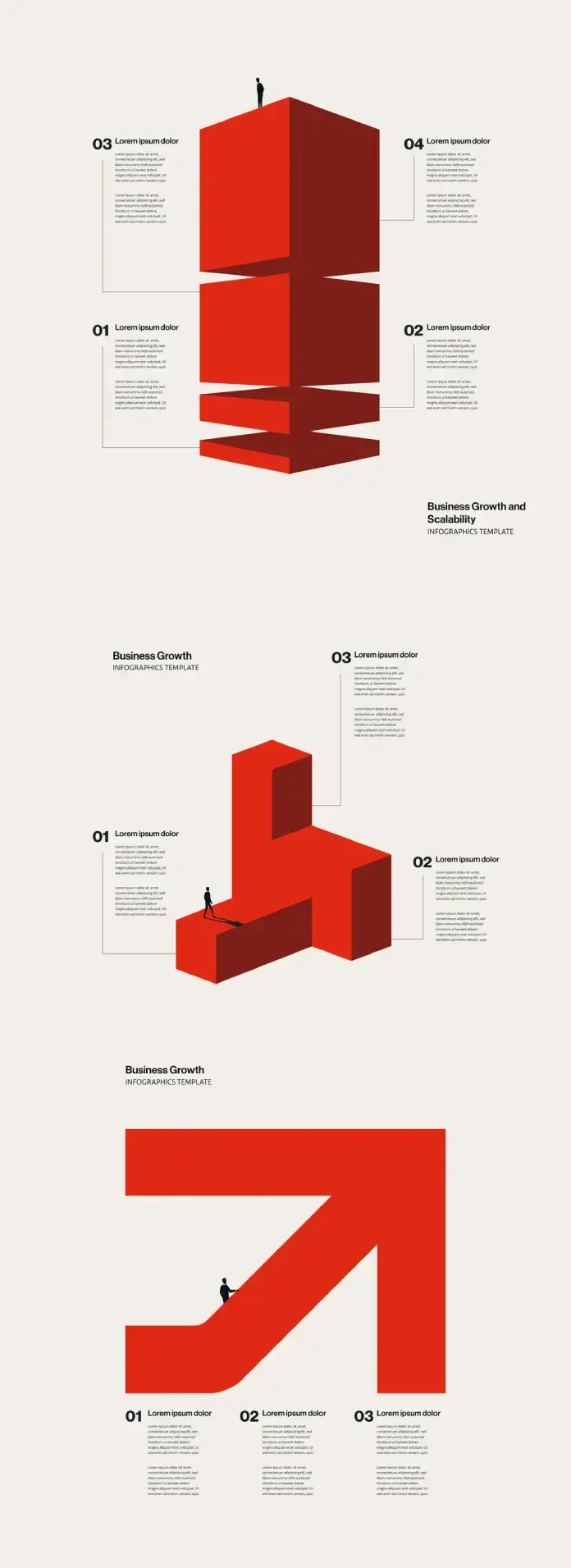
Last few seats remaining for our How to Create Impactful #Infographics training intensive

2 x virtual half days:
25th & 26th Mar 🇬🇧 UK/EU/AUS
29th & 30th Apr 🇺🇸 USA timezone

Mon 27th Apr 🇬🇧 LDN in-person

Deets: bit.ly/IIBWAB
Reviews: geni.us/WABreviews

An infographic flyer advertising an online seminar for learning how to create impactful infographics and data visuals with best-selling author and data-visualisation practitioner David McCandless of Information is Beautiful. Discounts are available.

TestingCatalog News (@testingcatalog)

구글이 NotebookLM의 인포그래픽 커스터마이제이션 스타일을 시험 중입니다. 자동 선택 모드와 함께 스케치, 카와이, 프로페셔널, 애니메, 3D 클레이, 에디토리얼, 스토리보드, 벤토 그리드, 브릭스 등 총 9가지 스타일을 추가해 시각화 옵션을 확대하는 업데이트입니다.

x.com/testingcatalog/status/20

#google #notebooklm #infographics #customization

Miss Kitty 🌈🌈🌈misskitty.art@bsky.brid.gy
2026-02-11

There's a lot of different things to do. Anybody paying attention sees that I put out #flyers, I put out #mission pictures, I put out bullet point #infographics, it can speed up a lot of things that are useful to do. So the #AI that needs to happen is #Napster for open source exponent level #AI.

TechieSA (@TechieBySA)

GPT-1.5 Image 모델을 활용해 SocialSight에서 차량 인포그래픽(Vehicle Infographics)을 생성한 사례를 공유한 트윗으로, 이미지 생성 모델을 활용한 실무적 응용 예시입니다.

x.com/TechieBySA/status/202087

#gpt1.5 #imagegeneration #infographics #socialmedia

2026-02-06

Inspired by xkcd's Movie Narrative charts, I made a chart for the My Little Pony: Friendship is Magic episode "The Mean 6".

#mlp #mylittlepony #infographics #xkcd

A movie narrative chart showing the movement and interactions of characters in the My Little Pony: Friendship is Magic episode "The Mean Six". Each of the 14 characters in the episode is represented by a line in a different color or style. The lines start horizontal and parallel, but as they progress toward the right, the lines diverge and converge haphazardly as the character groups split up and interact with each other.
A Guy Named Brian (he/him)GuyNamedBrian
2026-02-04

A coworker shared this today in honor of Black History Month. I knew a little about W.E.B. Du Bois as a leading black intellectual of the late 19th/early 20th century, but I had no idea that he’d done this sort of work. Fascinating stuff!

smithsonianmag.com/history/fir

ร้านขายยา ย่งเชียงตึ๊งyongchieng@mastodon.in.th
2026-01-28

สร้างแผนภูมิข้อมูล สึกษาการสร้างแผนภูมิข้อมูลที่สวยงามเพื่อแสดงความเข้าใจของข้อมูลที่ซับซ้อน! 📊 #Infographics #VisualData

Information Is Beautifulinfobeautiful@vis.social
2026-01-27

It's fun to learn how to create impactful #infographics & data-visuals. Discover how to create images like these at our next workshops

2 x virtual half days:
25th & 26th Mar 🇬🇧 UK/EU/AUS
29th & 30th Apr 🇺🇸 USA timezone

Mon 27th Apr 🇬🇧 LDN in-person

Details: geni.us/WAB2024
Reviews: geni.us/WABreviews
Discounts available

A playful scatterplot (using dog silhouettes instead of dots) depicts the best dog, according to data. On the vertical axis is a measure of public popularity. On the horizontal is an indexed score of several metrics to consider when owning a dog (cost, temperament, no. of genetic ailments etc). Each dog is coloured by category (sport, toy, hound etc) and sized (S, M, L). If a dog is facing left, it's kind of a dumb dog. If it's facing right, it's an intelligent dog.

Today's infographics source tracking exercise: a history of the History of the Fediverse poster.

gitlab.com/lidia_p/fediposter
Project by Artemis Gryllaki, Bohye Woo and Lídia Pereira

License gitlab.com/lidia_p/fediposter/

Linked at joinfediverse.wiki/Fediverse_o under the section Infographics - Fediposter

Referenced by gnulinux.ch/die-unvollstaendig where the source is given as joinfediverse.wiki/images/7/78

Who thank caos for the pointer.

Anyway. This rabbit hole brought to you by my thoughts darting back to the image during Chapter 1 of academiccloud.social/@sonjasch

#fediverse #FediverseHistory #infographics #gnusocial #mastodon

A schematic with the axes various fediverse application types on the y axis and an arrow of time running from left to right on the x axis. Placed on this diagram are named fediverse softwares along with their connections/heritage loosely based on the protocol used. These connections/lines of heritage are visualised by underlying blobs of colors connecting the various families over time and services. Besides the software names, the diagram has a large text inset spelling out Fed Up! as well as several boxes with densely packed text inside them.
GlitchMentalMXGlitchMentalMX
2026-01-21

Repositorio de visualización de datos estratégicos: Presentamos 'Insights Visuales', una sección dedicada a la síntesis gráfica de tendencias tecnológicas para 2026. 🧠👾 🔗 glitchmental.com/p/insights-vi

Derya Unutmaz, MD (@DeryaTR_)

Gemini Nano Banana Pro를 통해 제공된 교육용 인포그래픽 예시입니다. 트윗은 'How your heart pumps blood'라는 주제로 심장의 혈액 펌프 작용을 설명하는 교육적 시각자료가 Gemini Nano Banana Pro로 생성되었음을 간단히 알리고 있습니다.

x.com/DeryaTR_/status/20128422

#gemini #gemininano #infographics #education

Jesica (@_Jessi_0001)

트윗은 Nano Banana Pro가 'exploded food infographics'를 매우 생생하고 세밀하게 표현한다고 평가합니다. 'makes ... pop', 'so detailed' 및 'visually delicious'와 같은 표현으로 음식 시각화 및 인포그래픽 분야에서 시각적 품질과 식욕 유발 효과를 높이는 활용 사례임을 강조합니다.

x.com/_Jessi_0001/status/20103

#nanobananapro #ai #infographics #visualization #food

2026-01-09

Rhetological Fallacies : Errors and manipulation of rhetoric and logical thinking #RhetologicalFallacies #infographics @infobeautiful informationisbeautiful.net/vis

Client Info

Server: https://mastodon.social
Version: 2025.07
Repository: https://github.com/cyevgeniy/lmst