#HIG

2025-06-16

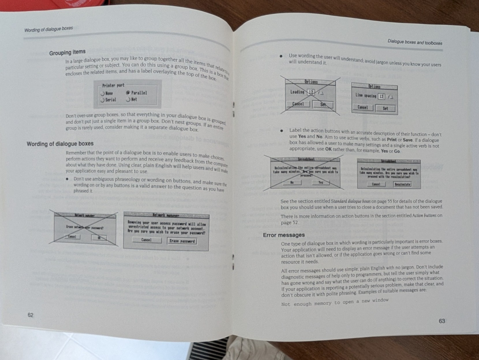
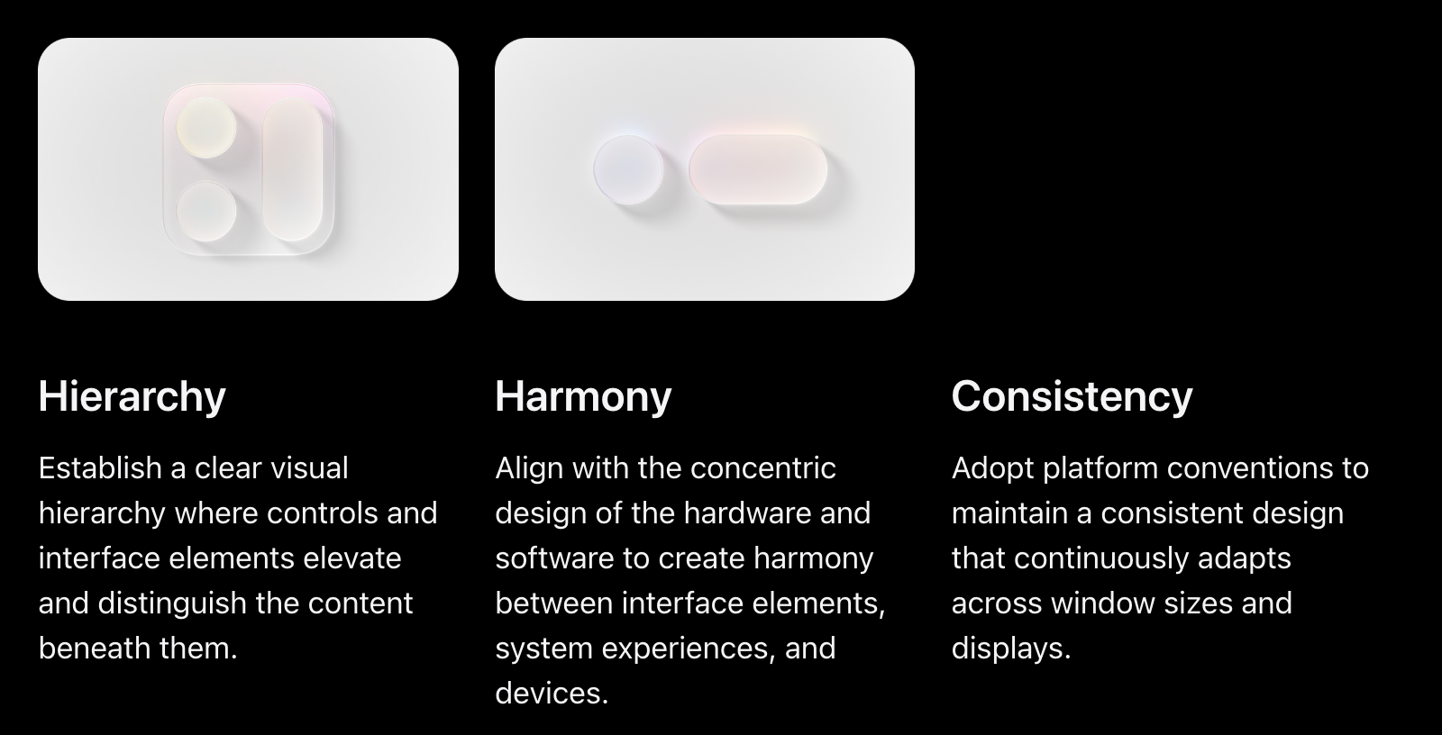
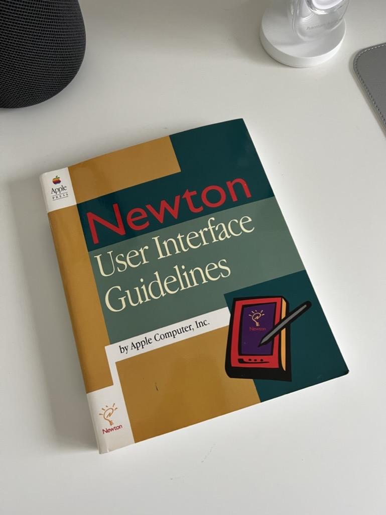
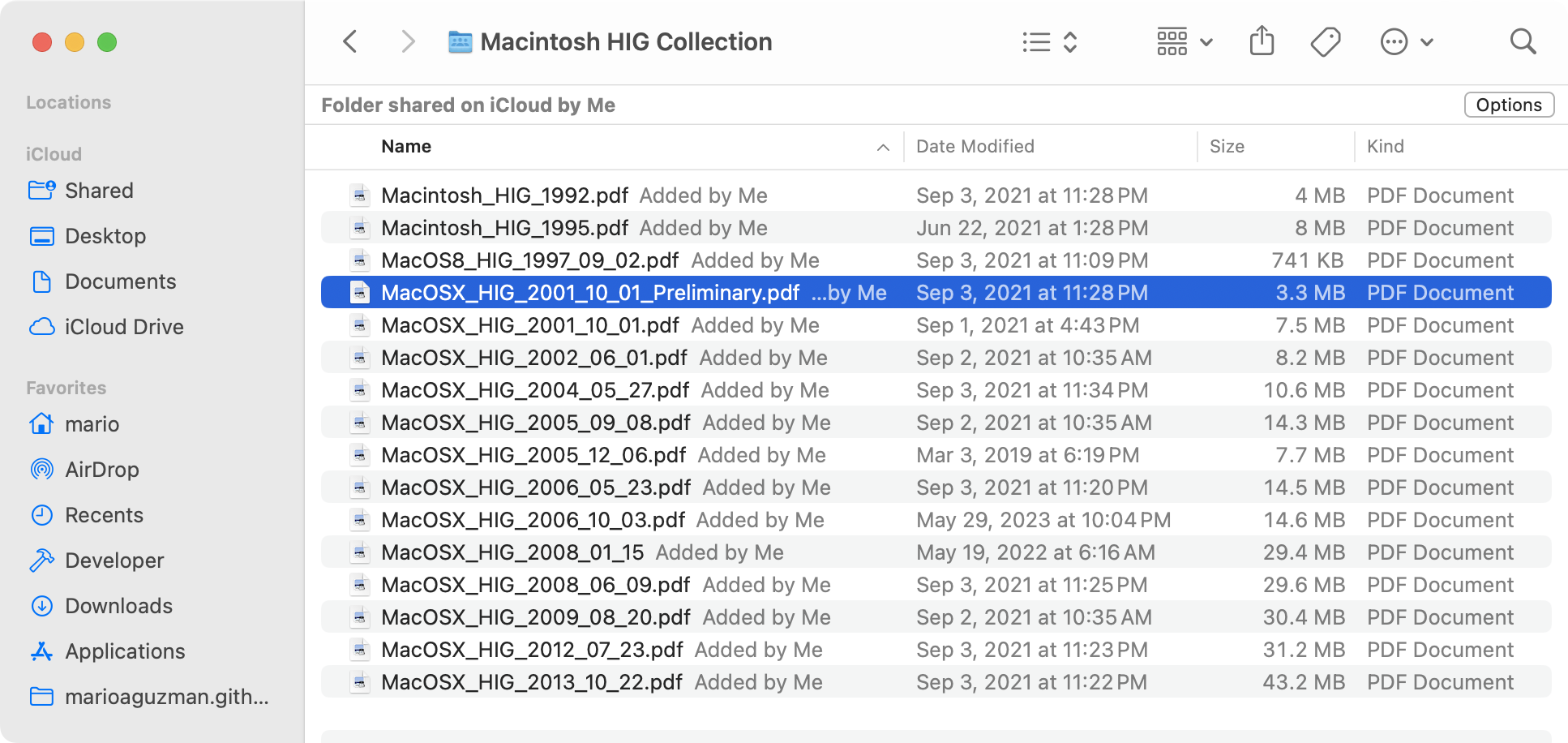
Today I had cause to get out my old #Acorn #RISCOS 3 Style Guide to demonstrate that the fundamentals of good #UX can date back well over 30 years - same with the #Apple #HIG.

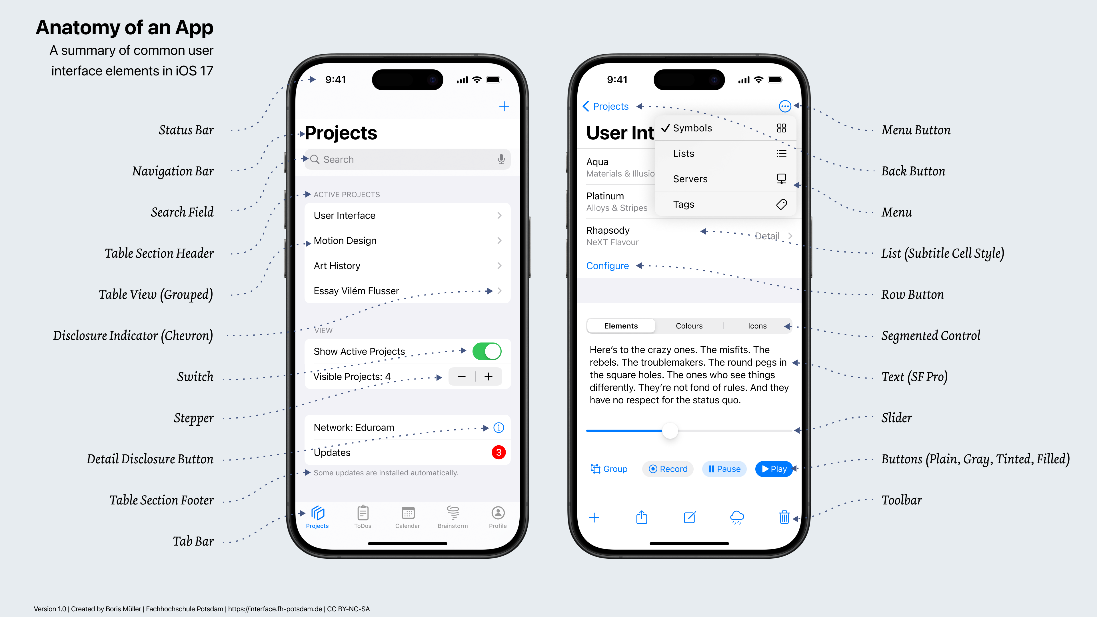
I need to find a modern equivalent that clearly shows the basics for an "intro to usability" post. Most #designSystems seem overly focused on their components, rather than the principles of a good WIMP system.

#RetroComputing

Centre pages of a 1993 developer guide for producing WIMP apps on Acorn's ARM-based desktops.

Topics covered include:

- When to group radio blocks
- How to name buttons in dialogue boxes
- Using human meaningful terms
- Good error messages
2025-06-14

Was this meant to be ironic?

#WWDC25 #LiquidGlass #HIG

Stefan HabelStefanHabel
2025-06-11

@marioguzman How things have changed:
“If you do include icons in your menus, include them only for menu items for which they add significant value; don't include them for every menu item. A menu that includes too many icons (or poorly designed ones) can appear cluttered and be hard to read.”
— Using Icons in Menus, Apple HIG 2005-2009

Mario Alberto Guzmánmarioguzman
2025-05-11

The OG Macintosh Determinate and Indeterminate Progress Bars were fucking *chef's kiss*

Steve has ☕️ for brainssivy@hachyderm.io
2025-05-08

remember when all #macos apps weren't electron and you could drag text like in the #HIG ? #usability

Delightful little apps from Honghao Zhang, in shiny Mac OS X Tiger design: Lickable Menu Bar and Say No To Notch.

Finally enough room for all menu bar icons, in exchange for just 30 vertical pixels.

apps.apple.com/us/app/lickable

apps.apple.com/us/app/say-no-t

#macos #hig

Chunky menu bar with notchSmall notchless glossy menu bar.Say No To Notch screenshotLickable Menu Bar Screenshot
Mario Alberto Guzmánmarioguzman
2025-04-13

Apple's would tell you (or used to at least) to not use bottom bars in your Mac apps... but apps suffer from usability if Bottom Bars are a good fit for them yet omitted…

I really don't like how bottom bars, title bars, and accessory were basically all merged into the toolbar -- especially when full height sidebars and inspector sidebars now eat so much into their horizontal space too. Everything fighting for room.

Here's more info on them...
marioaguzman.github.io/design/

2025-03-31

“… it’s liquid, one of the design goals was when you saw it you wanted to lick it” 💦

interface.free.fr/Archives/Aqu (Aqua Human Interface Guidelines, 2002)

youtu.be/eOAcAxiZ3qE?t=4670 (Macworld 2000 Aqua UI introduction by Steve Jobs)

youtu.be/ItjrcNYxDaA?t=111 (WWDC 2001 Session 130 Aqua Icon Design by Imran Chaudhri)

youtube.com/watch?v=PxRu7wXTyO (WWDC 2001 Sessions on Mac OS X, Aqua UI and System Architecture)

hypercritical.co/2015/04/15/os ( @siracusa OS X Reviews)

#aqua #macOSX #GUI #UI #HIG #osx #design #Y2K

Design Example of a luminescent, blue, translucent, pill shaped, Button with a drop shadow on a white/light gray pinstriped background, from the Aqua UI in OS X, early 2000s.
2025-03-31

github.com/jonsterling/AquaUI

AquaUI is a love letter to the Macintosh of the Aqua era—with its uncompromising attention to detail, futuristic design, and “lickable” visual style.

#aquaUI #macOSX #HIG #aqua

Mario Alberto Guzmánmarioguzman
2025-03-04

I saw some app screenshot posted earlier today with a drop down menu.

Immediately saw everything wrong & goes against the Mac .

Dividers in menus are only to group related menu items into sections. Do not use a divider in between every item. No dividers period if all your menu items are related to one another.

Section titles shouldn’t exist if you only have one section.

Menu item titles should be concise and definitely not be too word especially with a second-line subtitle.

Mario Alberto Guzmánmarioguzman
2024-12-31

I have added a new article to my own for Mac apps: Toolbar Guidelines.

This article goes over how to design, organize, and use built-in & objects and their features.

It also goes over system behaviors when toolbars are mixed with Sidebars, Inspectors, & multi-content layouts!

As a bonus, it also goes over bottom bars & accessory bars. Check it out and let me know what you think!

marioaguzman.github.io/design/

Gödel Escher Spock🦿adamhill@hachyderm.io
2024-09-26

Great resource for UX researchers and retro historians.

Cool to see UI docs pre-desktop publishing that aren't published books.

archive.org/details/apple-hig

#apple #ux #hig

Mario Alberto Guzmánmarioguzman
2024-09-19

For any person who wants to do some layouts on macOS and maybe wants some guidance or examples… I made my own guidelines that are actually concrete. None of this stuff that leaves too much for the imagination that you stray away from making your app feel truly . I haven’t finished everything about design but here’s a start at least.

marioaguzman.github.io/design/

Antoliusantolius
2024-09-11

Does really require cloud account/connection for its autosave feature?

It's 2024, we have fast, spacious SSDs. Pick any out there and it will tell you to store app state seamlessly in the background. Requiring user to constantly click 💾 or lose data is borderline sadistic. I get the "upsell" idea, but both Windows and Office are paid products in their own right.

User has already paid you, the file is sitting there on the disk, just update it ffs.

2024-08-14

A notch-less or pill-less iPhone is on Apple's Human Interface Guidelines 🤔
#Apple #HIG #iPhone #iOS #iOSDev #TipKit

The Apple Human Interface Guidelines website on the TipKit Template section showing an iPhone with no notch or no pill
Mario Alberto Guzmánmarioguzman
2024-07-13

I forgot I never uploaded the 2.0 HIG PDF to this folder either. I just added it for both iCloud & Dropbox. :)

mastodon.social/@marioguzman/1

Mario Alberto Guzmánmarioguzman
2024-07-08

Over the years, I have scoured the internet for various versions of the Mac HIG PDFs. Here is my collection so far.

Some neat ones include HIGs for Mac OS 8 & a preliminary Mac OS X version from the Public Beta.

These HIGs contain general desktop guidelines that still apply today & that you can't find in the modern HIG.

Please retoot! Everyone should read these.

iCloud: icloud.com/iclouddrive/03elmPn

DB: dropbox.com/scl/fo/gziho6zcerb

chuckdudechuckdude
2024-06-10
Boris Müllerboris@vis.social
2024-06-07

In my experience, the Apple Human Interface Guidelines (HIG) have deteriorated in the last few years. Not only in terms of consistency but also in the way the components are presented. The HIG used to be very visual and descriptive. This is no longer the case.

App design is still a core competence for all UX and UI designers. So I created an overview of the most common iOS components for my students. Might also be interesting for this community!

Thanks to @frankrausch

#ux #ui #hig #ios

Anatomy of an App - a visual summary of common user interface elements in iOS 17

Client Info

Server: https://mastodon.social
Version: 2025.04
Repository: https://github.com/cyevgeniy/lmst