#StatisticalAnalysis

Statistics GlobeStatisticsGlobe
2025-05-09

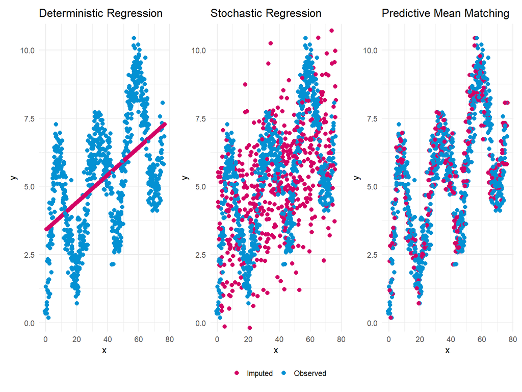
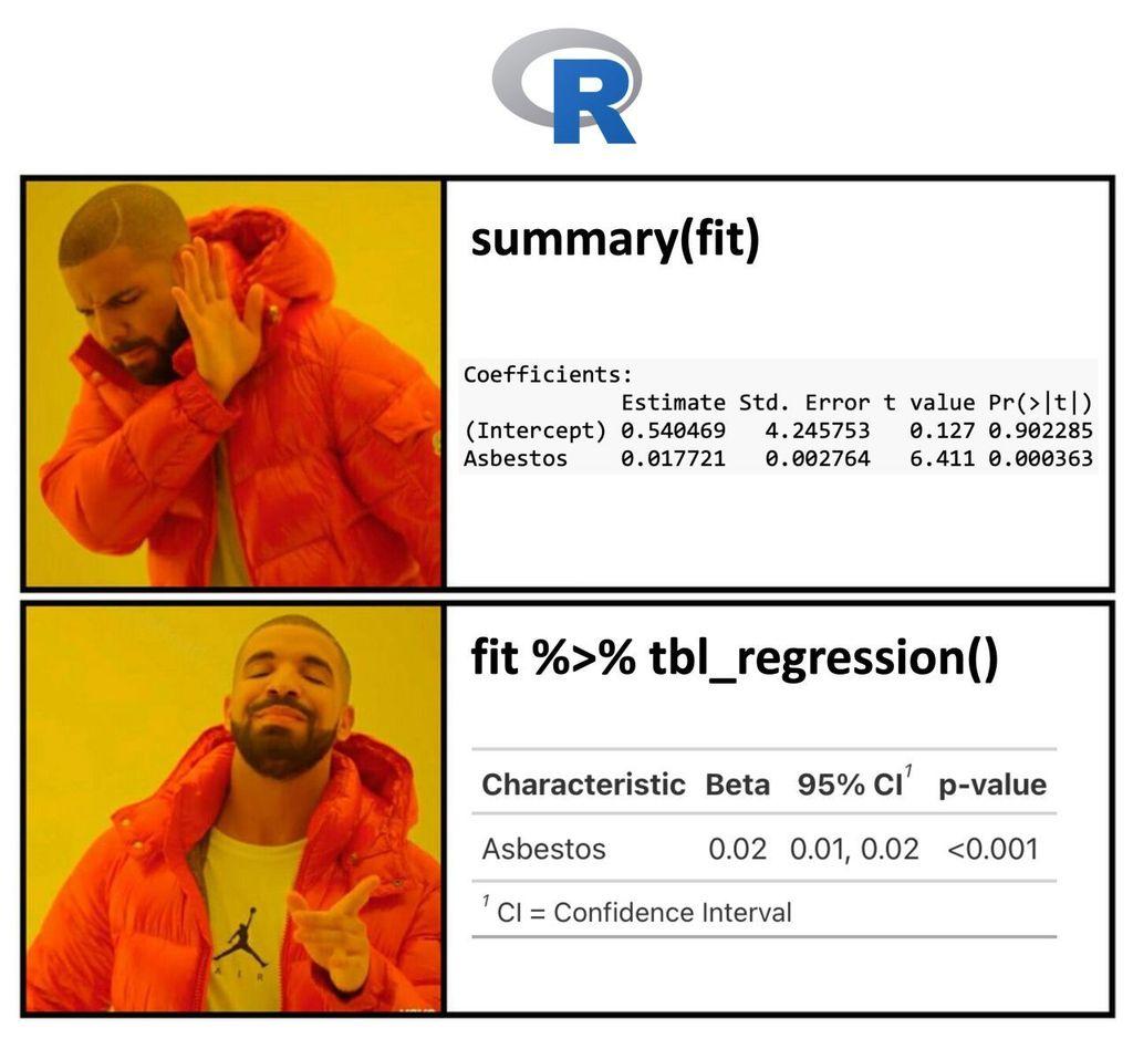
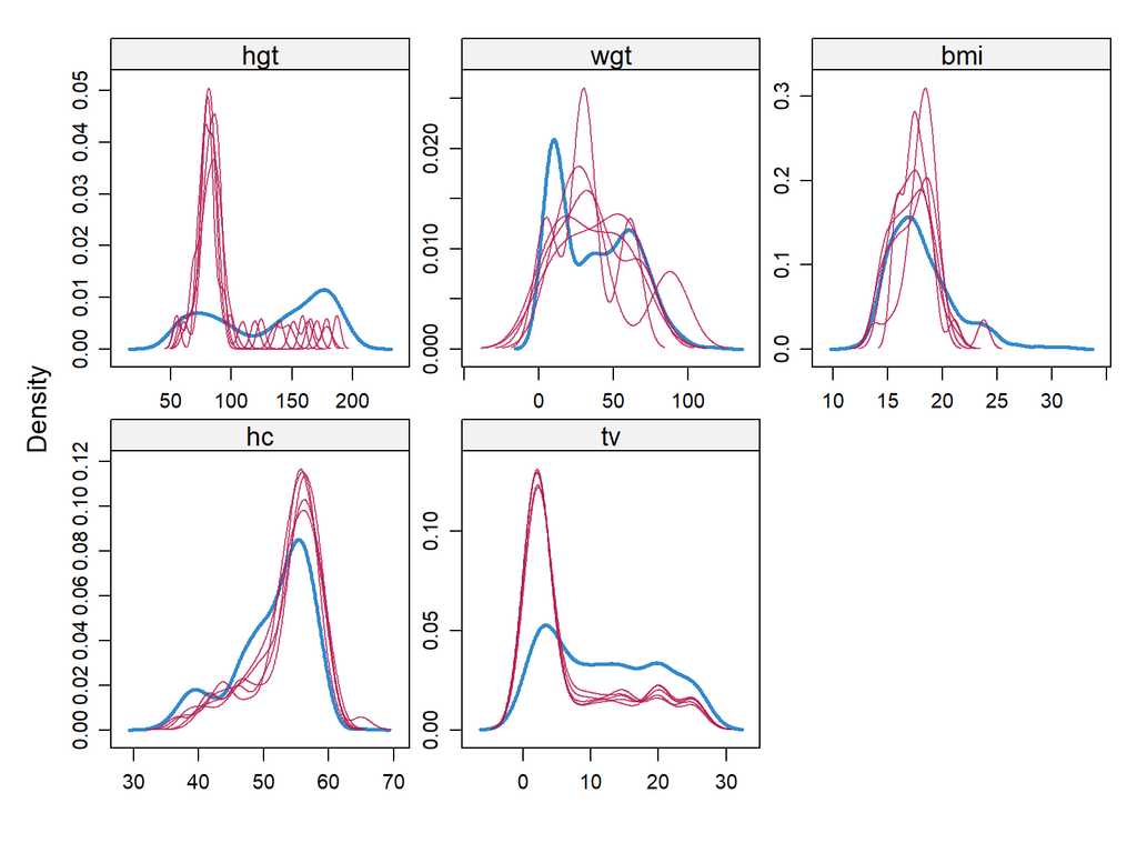
When handling missing values, selecting an imputation method that balances simplicity, variability, and accuracy is essential. Deterministic Regression, Stochastic Regression, and Predictive Mean Matching (PMM) are three widely used methods, each with strengths and limitations depending on the data's structure.

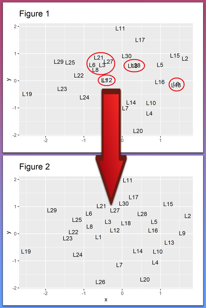
The attached plot compares these methods using a non-linear data example.

Tutorial: statisticsglobe.com/predictive.

More: eepurl.com/gH6myT

Statistics GlobeStatisticsGlobe
2025-05-06

Creating publication-ready plots in R is easier than ever with ggpubr. This extension for ggplot2 simplifies the process of generating clean and professional graphics, especially for exploratory data analysis and reporting.

The attached visual, which I created using ggpubr, demonstrates its versatility.

Additional information: statisticsglobe.com/online-cou

Statistics GlobeStatisticsGlobe
2025-05-02

Making your data analysis more insightful and informative is effortless with ggstatsplot. This powerful ggplot2 extension in R combines statistical analysis and data visualization in a single workflow, helping you generate plots that include statistical summaries directly on the visualizations.

The attached visual, which I created using ggstatsplot, showcases its capabilities.

Learn more: statisticsglobe.com/online-cou

Statistics GlobeStatisticsGlobe
2025-04-22

Today is the final day to register for my courses before a 3-month break with no new enrollments, and your last chance to get a 33% discount.

Here are the courses you can join: statisticsglobe.com/courses

Statistics GlobeStatisticsGlobe
2025-04-22

If you're still using raw R outputs for presentations, it's time for an upgrade! Tools like gtsummary bring your statistical results to life, making them much more digestible for non-technical audiences.

The visualization included here was originally shared in a post by Dr. Alexander Krannich. Thanks to Alexander for inspiring me to create this post.

More details are available at this link: eepurl.com/gH6myT

Statistics GlobeStatisticsGlobe
2025-04-16

To give you a sneak peek into my courses, I’ve just published a free video on YouTube that walks through a complete data project in R.

Watch the video here: youtube.com/watch?v=l2OgRdofp90

Statistics GlobeStatisticsGlobe
2025-02-21

Working with text in ggplot2 plots can be a mess, especially when dealing with overlapping labels, busy backgrounds, or the need for custom formatting. Thankfully, several powerful ggplot2 extensions make text manipulation and annotation much easier and more effective.

With these tools, text in ggplot2 becomes much more manageable and visually appealing.

Harry Wilsonharrywilson7079
2025-02-15

Effective Data Analysis Techniques for Dissertation Writing

Mastering data analysis is key to a successful dissertation! From planning and preparing data to choosing the right methods and tools, it's all about accuracy and insight. Need help? Expert writing services like @SharkPapers, @MyPerfectPaper, and @CollegeEssayOrg have got you covered.

friendbookmark.com/blogpost/50

Statistics GlobeStatisticsGlobe
2025-02-11

In missing data imputation, it is crucial to compare the distributions of imputed values against the observed data to better understand the structure of the imputed values.

The visualization below can be generated using the following R code:

library(mice)
my_imp <- mice(boys)
densityplot(my_imp)

Take a look here for more details: statisticsglobe.com/online-wor

Statistics GlobeStatisticsGlobe
2025-02-04

Avoiding text overlap in plots is essential for clarity, and R offers a great solution with the ggplot2 and ggrepel packages. By automatically repositioning labels, ggrepel keeps your plot clean and easy to interpret.

Video: youtube.com/watch?v=5lu4h_CPhi0
Website: statisticsglobe.com/avoid-over

Take a look here for more details: statisticsglobe.com/online-cou

IB Teguh TMteguhteja
2025-01-28

Dive into our latest blog on using ! Learn to calculate essential statistics for better data insights. Perfect for analysts and data scientists. Explore now!

teguhteja.id/pandas-statistic-

CoListycolisty
2025-01-16

Statistics 1: ANOVA, Regression, and Logistic Regression | CoListy
Learn essential statistical techniques like ANOVA, regression, and logistic regression using SAS software. Perfect for beginners!
/stat .

colisty.netlify.app/courses/st

CoListycolisty
2025-01-16

Unlock SAS Analytics: Courses & Skills for Data Analysis | CoListy
Explore SAS courses in programming, AI, and statistics to master data analysis and machine learning techniques for impactful insights. Learn now! | CoListy

colisty.netlify.app/blogs/unlo

CoListycolisty
2025-01-16

Intro to Statistical Analysis with SAS/STAT Software | CoListy
Learn t-tests, ANOVA, regression, and predictive modeling with SAS/STAT. Master essential statistical techniques for data analysis. | CoListy
/stat

colisty.netlify.app/courses/st

Marco Giannini :tux:magi@mastodon.uno
2024-12-11

Il 2024 è stato l’anno di Linux… su Pornhub
#linux #StatisticalAnalysis #UnoLinux

Ogni anno il famoso sito per adulti Pornhub pubblica le statistiche annuali di utilizzo del sito. Fra le tante metriche prese in considerazione c’è quella relativa ai sistemi operativi più utilizzati dai suoi utenti. Il 2024, così come il 2023, ci da un fornito un dato statistico molto importante per noi pinguini.

marcosbox.com/2024/12/11/il-20

Alex VerbeekAlex_Verbeek
2024-12-01
Prairie dog looking into the camera

Client Info

Server: https://mastodon.social
Version: 2025.04
Repository: https://github.com/cyevgeniy/lmst