Comparison of mice imputation with Nonlinear Nonparametric Statistics (NNS) and k-Nearest Neighbor (kNN).
Check out my course for more details: https://statisticsglobe.com/online-course-missing-data-imputation-r
Comparison of mice imputation with Nonlinear Nonparametric Statistics (NNS) and k-Nearest Neighbor (kNN).
Check out my course for more details: https://statisticsglobe.com/online-course-missing-data-imputation-r

The Hall of Fame Quarterback Dak Prescott Is Quietly Becoming
Alright Cowboys fans, after researching which Hall of Fame quarterback Dak Prescott most resembles i...
#DallasCowboys #DakPrescott #NFLHallofFame #Quarterback #StatisticalAnalysis #SteveYoung
https://insidethestar.com/the-hall-of-fame-quarterback-dak-prescott-is-quietly-becoming/?fsp_sid=9103
The Cowboys Lead the NFL in 2 Areas
The Cowboys currently lead the NFL in two categories and if you’ve watched the Cowboys play this sea...
#DallasCowboys #2025Defense #2025Offense #NFLReferees #Penalties #StatisticalAnalysis
https://insidethestar.com/the-cowboys-lead-the-nfl-in-2-areas/?fsp_sid=9068
This Welch's T-Test interactive guide breaks down the formula, degrees of freedom, and assumptions. It's a better way to move from using the test to understanding it.
#DataAnalytics #StatisticalAnalysis
https://guides.datainquiry.dev/Welchs_Hypothesis_Testing
Variations In Road Exposure And Traffic Volumes In The United States In Areas Susceptible To Landslides [statistical breakdown & analysis, including spatial]
--
https://doi.org/10.1016/j.ijdrr.2025.105567 <-- shared paper
--
#landslide #road #highway #transportation #hazard #exposure #massmovement #engineeringgeology #geology #threat #model #modeling #statistics #national #roadsystem #spatialanalysis #lengths #percentages #engineering #mitigation #statisticalanalysis #safety #susceptibility #publicsafety #disruption #humanimpacts #regionalassessment


Is Rotten Tomatoes Still Reliable? A Statistical Analysis
https://www.statsignificant.com/p/is-rotten-tomatoes-still-reliable
#HackerNews #RottenTomatoes #Reliability #StatisticalAnalysis #MovieRatings #FilmCritique #DataAnalysis
What's behind the headlines - #datatracking #datacollection #research #statisticalanalysis #reporting
Trump says #BureauLaborStatistics ‘scam.’ Here’s how the jobs report really works | CNN Business https://www.cnn.com/2025/08/04/business/bureau-of-labor-statistics-jobs-report-explainer-hnk
Beyond the Dataset
On the recent season of the show Clarkson’s farm, J.C. goes through great lengths to buy the right pub. As with any sensible buyer, the team does a thorough tear down followed by a big build up before the place is open for business. They survey how the place is built, located, and accessed. In their refresh they ensure that each part of the pub is built with purpose. Even the tractor on the ceiling. The art is in answering the question: How was this place put together?
A data-scientist should be equally fussy. Until we trace how every number was collected, corrected and cleaned, —who measured it, what tool warped it, what assumptions skewed it—we can’t trust the next step in our business to flourish.
Old sound (1925) painting in high resolution by Paul Klee. Original from the Kunstmuseum Basel Museum. Digitally enhanced by rawpixel.Two load-bearing pillars
While there are many flavors of data science I’m concerned about the analysis that is done in scientific spheres and startups. In this world, the structure held up by two pillars:
Both of these related to having a deep understanding of the data generation process. Each from a different angle. A crack in either pillar and whatever sits on top crumbles. Plots, significance, AI predictions, mean nothing.
How we measure
A misaligned microscope is the digital equivalent of crooked lumber. No amount of massage can birth a photon that never hit the sensor. In fluorescence imaging, the point-spread function tells you how a pin-point of light smears across neighboring pixels; noise reminds you that light itself arrives from and is recorded by at least some randomness. Misjudge either and the cell you call “twice as bright” may be a mirage.
In this data generation process the instrument nuances control what you see. Understanding this enables us to make judgements about what kind of post processing is right and which one may destroy or invent data. For simpler analysis the post processing can stop at cleaner raw data. For developing AI models, this process extends to labeling and analyzing data distributions. Andrew Ng’s approach, in data-centric AI, insists that tightening labels, fixing sensor drift, and writing clear provenance notes often beat fancier models.
How we compare
Now suppose Clarkson were to test a new fertilizer, fresh goat pellets, only on sunny plots. Any bumper harvest that follows says more about sunshine than about the pellets. Sound comparisons begin long before data arrive. A deep understanding of the science behind the experiment is critical before conducting any statistics. The wrong randomization, controls, and lurking confounder eat away at the foundation of statistics.
This information is not in the data. Only understanding how the experiment was designed and which events preclude others enable us to build a model of the world of the experiment. Taking this lightly has large risks for startups with limited budgets and smaller experiments. A false positive result leads to wasted resources while a false negative presents opportunity costs.
The stakes climb quickly. Early in the COVID-19 pandemic, some regions bragged of lower death rates. Age, testing access, and hospital load varied wildly, yet headlines crowned local policies as miracle cures. When later studies re-leveled the footing, the miracles vanished.
Why the pillars get skipped
Speed, habit, and misplaced trust. Leo Breiman warned in 2001 that many analysts chase algorithmic accuracy and skip the question of how the data were generated. What he called the “two cultures.” Today’s tooling tempts us even more: auto-charts, one-click models, pretrained everything. They save time—until they cost us the answer.
The other issue is lack of a culture that communicates and shares a common language. Only in academic training is it possible to train a single person to understand the science, the instrumentation, and the statistics sufficiently that their research may be taken seriously. Even then we prefer peer review. There is no such scope in startups. Tasks and expertise must be split. It falls to the data scientist to ensure clarity and collecting information horizontally. It is the job of the leadership to enable this or accept dumb risks.
Opening day
Clarkson’s pub opening was a monumental task with a thousand details tracked and tackled by an army of experts. Follow the journey from phenomenon to file, guard the twin pillars of measure and compare, and reinforce them up with careful curation and open culture. Do that, and your analysis leaves room for the most important thing: inquiry.
#AI #causalInference #cleanData #dataCentricAI #dataProvenance #dataQuality #dataScience #evidenceBasedDecisionMaking #experimentDesign #featureExtraction #foundationEngineering #instrumentation #measurementError #science #startupAnalytics #statisticalAnalysis #statistics

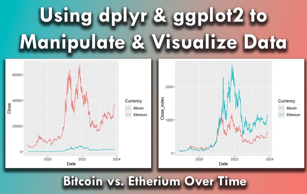
Using dplyr and ggplot2 in R can significantly streamline your data analysis process, making it easier to work with complex data sets.
I have created a video tutorial in collaboration with Albert Rapp, where I demonstrate how to do this in practice: https://www.youtube.com/watch?v=EKISB0gnue4
#coding #datavisualization #rprogramming #dataviz #statisticalanalysis #package #datastructure #ggplot2 #bigdata #tidyverse
Oh joy, another statistical computing environment! 🙄 #LispStat promises to be the R you didn't ask for, but in Lisp, because why not add some parentheses to your data woes? 🤔 Perfect for those who enjoy statistical analysis with a side of vintage programming language nostalgia. 📉👴
https://lisp-stat.dev/about/ #Rlanguage #StatisticalAnalysis #ProgrammingNostalgia #DataScience #HackerNews #ngated
Lisp-stat: Lisp environment for statistical computing
#HackerNews #LispStat #Lisp #Computing #StatisticalAnalysis #DataScience #ProgrammingLanguages
Final reminder that registration for all Statistics Globe online courses closes today and won’t reopen until the end of July.
You can find all courses here: https://statisticsglobe.com/courses
#statistics #datascience #rasts #dataviz #statisticalanalysis

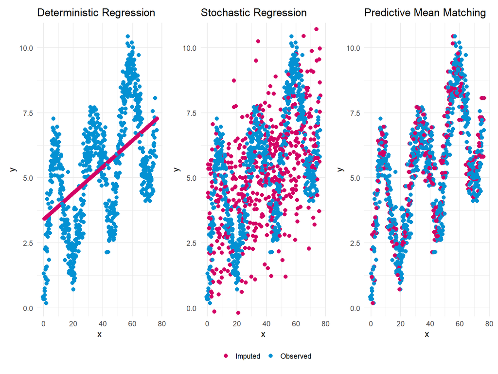
When handling missing values, selecting an imputation method that balances simplicity, variability, and accuracy is essential. Deterministic Regression, Stochastic Regression, and Predictive Mean Matching (PMM) are three widely used methods, each with strengths and limitations depending on the data's structure.
The attached plot compares these methods using a non-linear data example.
Tutorial: https://statisticsglobe.com/predictive-mean-matching-imputation-method/.
More: http://eepurl.com/gH6myT
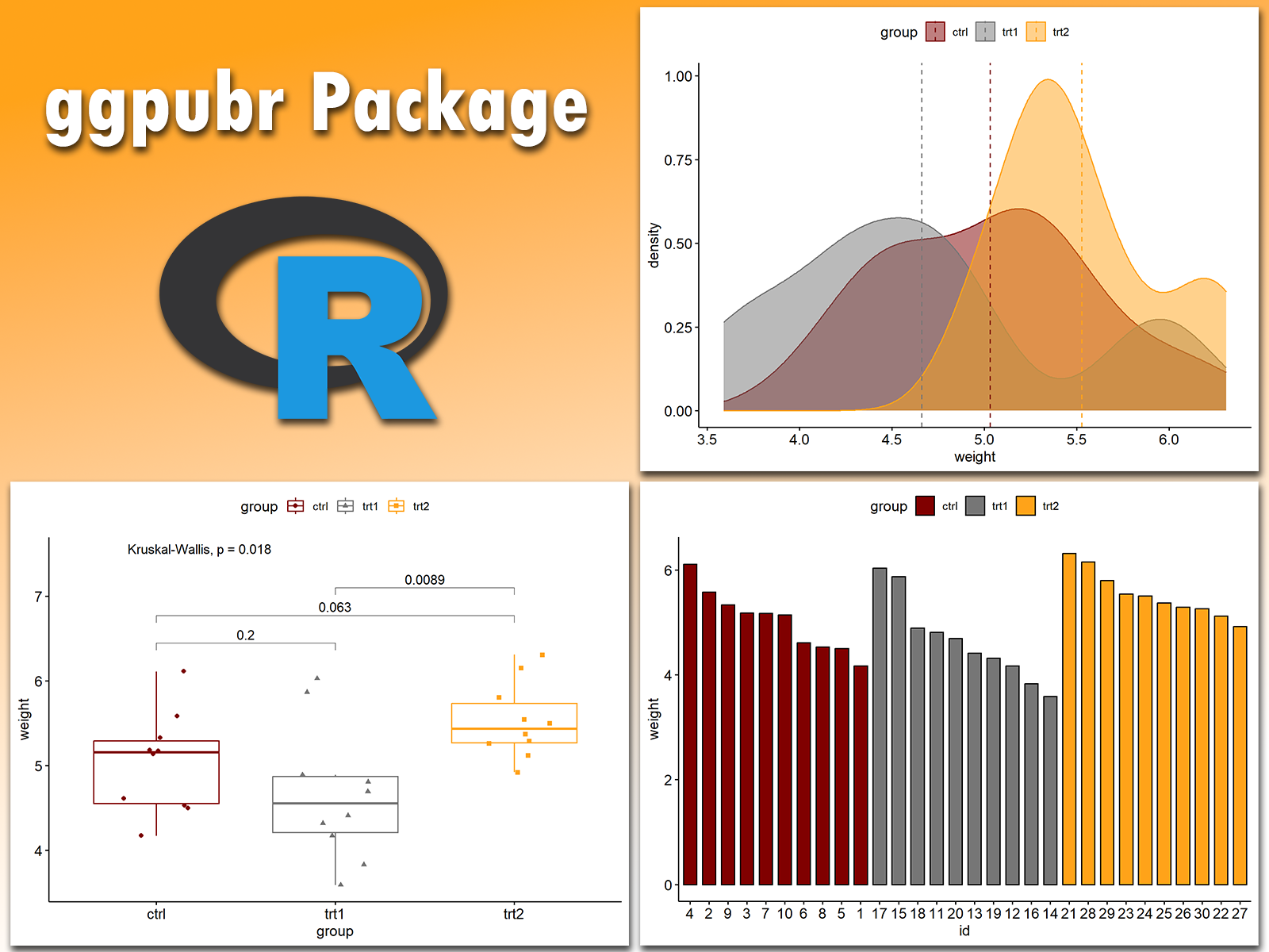
Creating publication-ready plots in R is easier than ever with ggpubr. This extension for ggplot2 simplifies the process of generating clean and professional graphics, especially for exploratory data analysis and reporting.
The attached visual, which I created using ggpubr, demonstrates its versatility.
Additional information: https://statisticsglobe.com/online-course-data-visualization-ggplot2-r
#bigdata #visualanalytics #tidyverse #programming #statisticalanalysis #datavisualization #package #data #ggplot2
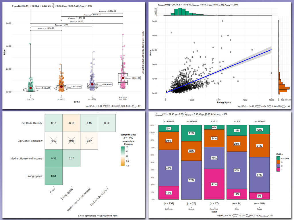
Making your data analysis more insightful and informative is effortless with ggstatsplot. This powerful ggplot2 extension in R combines statistical analysis and data visualization in a single workflow, helping you generate plots that include statistical summaries directly on the visualizations.
The attached visual, which I created using ggstatsplot, showcases its capabilities.
Learn more: https://statisticsglobe.com/online-course-data-visualization-ggplot2-r
#programming #statisticalanalysis #datavisualization #dataanalytics
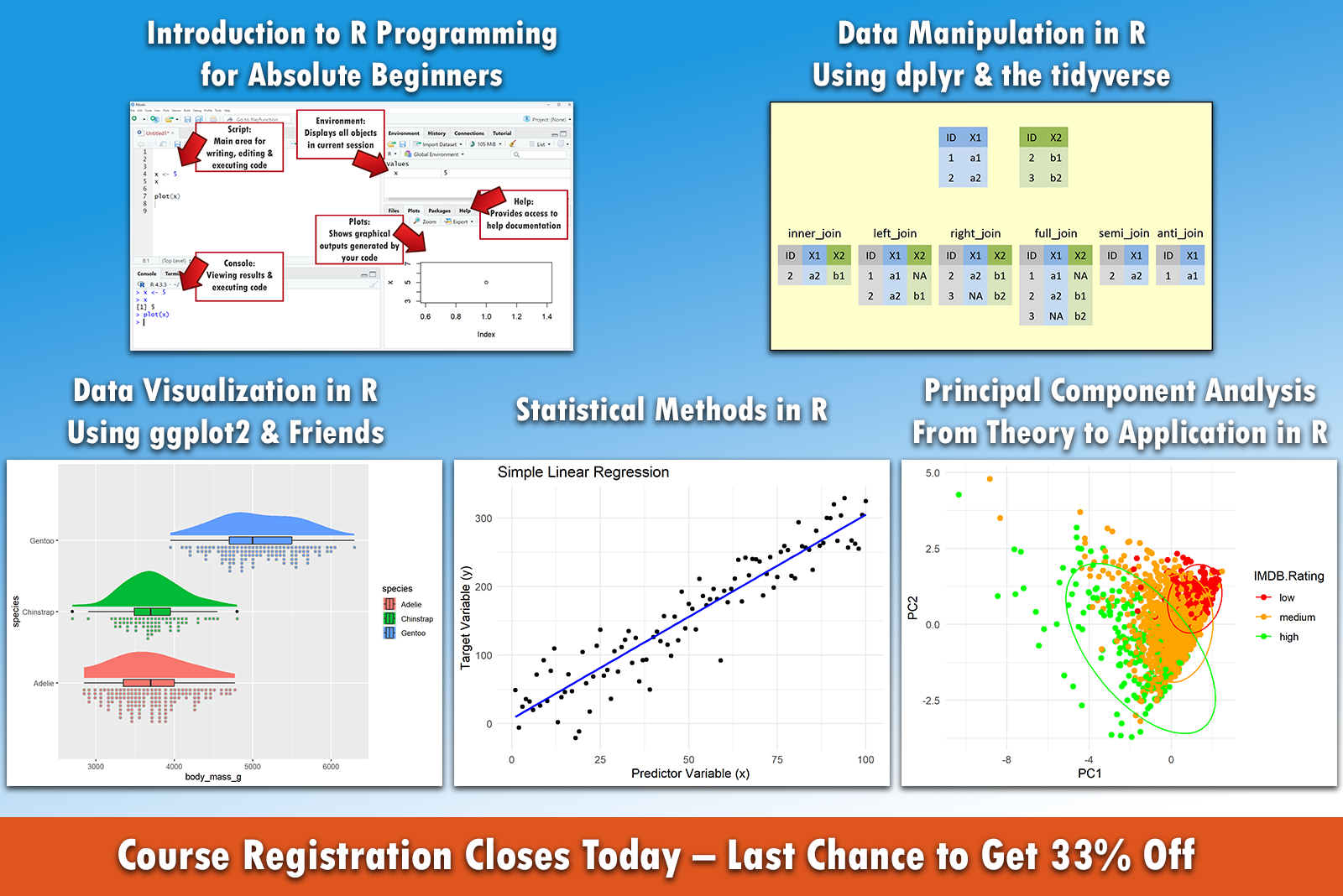
Today is the final day to register for my courses before a 3-month break with no new enrollments, and your last chance to get a 33% discount.
Here are the courses you can join: https://statisticsglobe.com/courses
#rstats #statistics #datascience #dataviz #statisticalanalysis
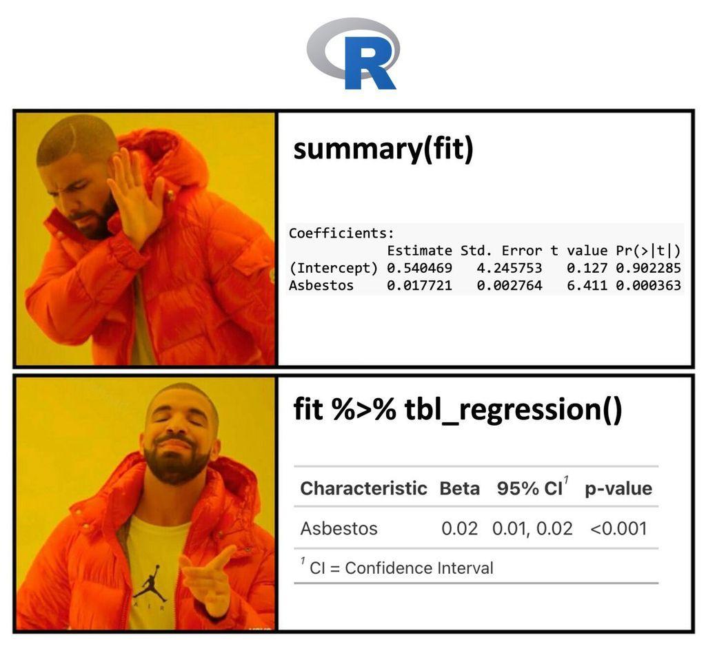
If you're still using raw R outputs for presentations, it's time for an upgrade! Tools like gtsummary bring your statistical results to life, making them much more digestible for non-technical audiences.
The visualization included here was originally shared in a post by Dr. Alexander Krannich. Thanks to Alexander for inspiring me to create this post.
More details are available at this link: http://eepurl.com/gH6myT
Dumb statistical models, always making people look bad
#HackerNews #DumbStatisticalModels #AlwaysLookBad #StatisticalAnalysis #DataScience #Critique
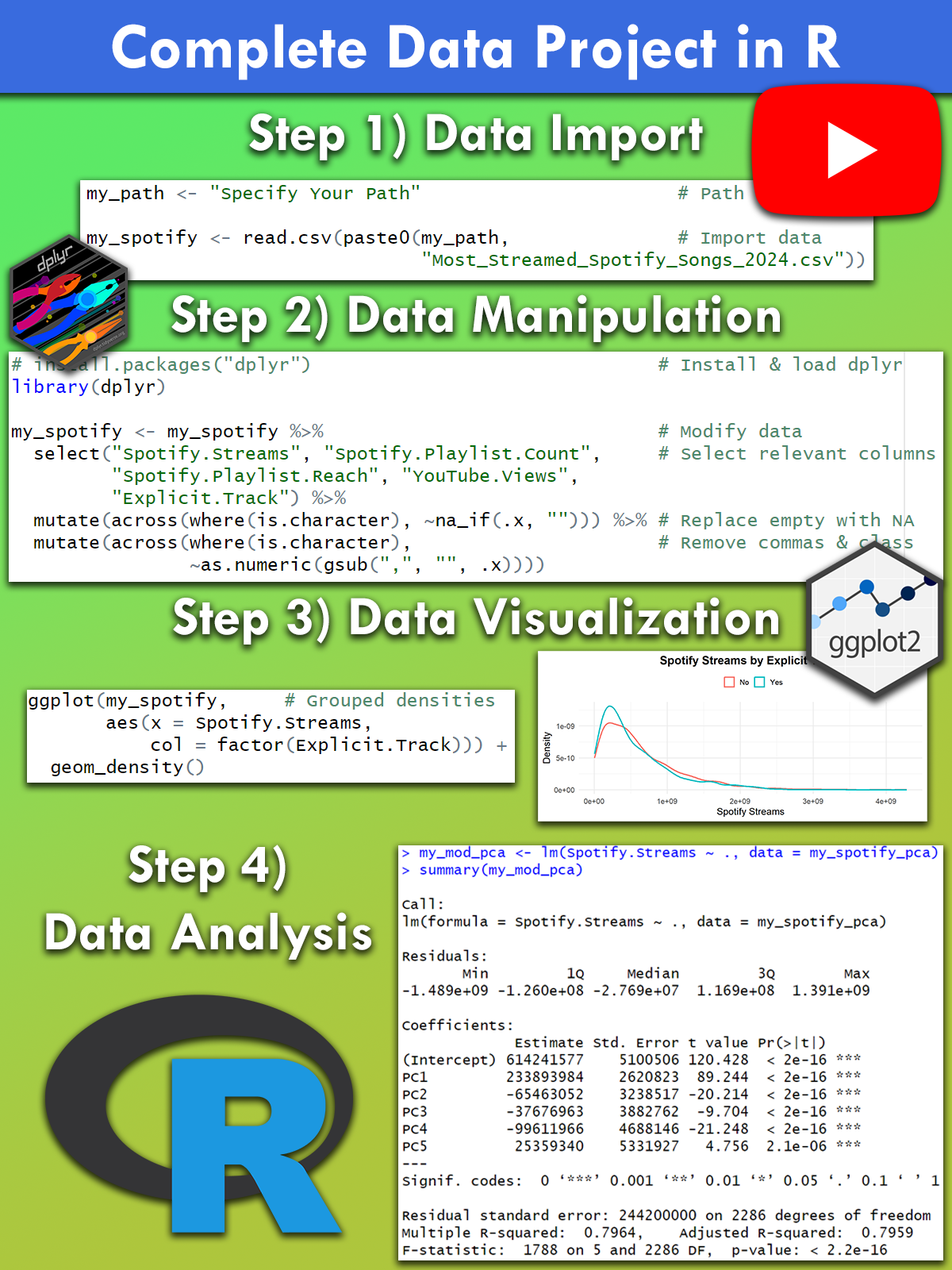
To give you a sneak peek into my courses, I’ve just published a free video on YouTube that walks through a complete data project in R.
Watch the video here: https://www.youtube.com/watch?v=l2OgRdofp90
#rstats #statistics #datascience #dataviz #statisticalanalysis #pca
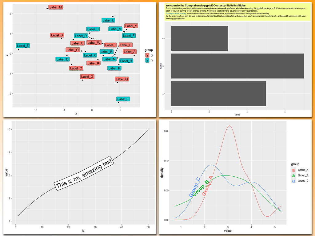
Working with text in ggplot2 plots can be a mess, especially when dealing with overlapping labels, busy backgrounds, or the need for custom formatting. Thankfully, several powerful ggplot2 extensions make text manipulation and annotation much easier and more effective.
With these tools, text in ggplot2 becomes much more manageable and visually appealing.
#ggplot2 #statisticalanalysis #package #visualanalytics #rstudio #tidyverse #datavisualization #datascience