
🤔 In a thrilling new revelation, Gunnar Morling discovers that making things "durable" means they last longer, much like the #cheese in your fridge that refuses to go bad. 🧀 If you've ever wanted to use #SQLite as the brain behind an execution engine, well, you might just need a durable #attention #span to follow this riveting exploration! 🙄
https://www.morling.dev/blog/building-durable-execution-engine-with-sqlite/ #durability #exploration #technology #HackerNews #ngated
#span

Labour MP Ingrid Leary deletes post complaining Government didn’t invite her to event, despite invite from organiser
Two further stages are then planned and, once complete, the cycle and w…
#NewsBeep #News #Headlines #being #complaining #cycle #deletes #despite #didnt #dunedin #event #Facebook #from #Government #her #ingrid #invite #invited #Labour #leary #locals #mosgiel #mp #NewZealand #NZ #organiser #planned #post #pretty #removed #rude #span #this #to #trail
https://www.newsbeep.com/256848/


Studio Span’s Design Breathes Courage into Chicano Culture at Chicago’s Slow & Low Festival
A powerful display of cultural pride is unfolding in Chicago. Studio Span’s design work for the annual Slow & Low: Chicago Lowrider Festival has become a potent symbol of resilience. As Chicano communities navigate a climate of uncertainty, the festival’s branding offers a defiant and beautiful counter-narrative. This is far more than just design; it is a declaration of existence, heritage, and the enduring spirit of a community. Consequently, the work transforms Chicago’s Navy Pier into a vibrant stage for a uniquely American art form, showcasing profound stories of family, sacrifice, and belonging.
Slow & Low Chicago Lowrider FestivalHow Can Design Embody Cultural Courage?
That is the very question Chicago-based Span and the curators of Slow & Low confronted. In their fourth year of collaboration, the challenge was not merely to brand an event. Instead, the goal was to give visual form to a movement. Lowriding, with its deep roots in post-war Mexican-American communities, has always been an act of cultural distinction. While hot rod culture prized speed, lowriders embraced a “low and slow” ethos—a deliberate, proud cruise. This act of claiming space took on even greater political significance during the Chicano Movement. Today, Studio Span’s design masterfully taps into this rich history to address contemporary tensions.
Span Associate Partner and Design Director Nick Adam explains that the goal was to design with the community, not just for them. This collaborative approach aimed to create a brand that felt both authentic and empowering. “The question became: do we shrink, or do we shine?” Adam states. The answer was unequivocal. Ultimately, they chose to bloom, crafting a visual identity that radiates courage.
The Visual Language of Resilience
To achieve this vision, Studio Span’s design looked to the very aesthetics that have defined Chicano culture for generations. The resulting branding is a masterful blend of tradition and modernity.
- Typography as a Statement: The design team returned to classic blackletter text, a style long associated with Chicano art. However, they softened these traditional letterforms with rounded, marker-drawn edges. This subtle tweak gives the typography a handcrafted, accessible feel. It is a nod to the personal artistry inherent in customizing a car. This choice feels both deeply rooted and refreshingly alive.
- Nature’s “Overtake”: A key element in the new branding is the integration of nature. Vines entwine with chains, and four custom-designed roses are threaded throughout the visuals. These roses are depicted at different stages of life. This “overtake” by nature serves as a powerful metaphor. It speaks to growth, life cycles, and the organic, unstoppable force of a culture blooming against a harsh landscape.
Symbolism in Chicano Lowrider Art: The Meaning of the Rose
The rose is not merely a decorative element in Studio Span’s design; it is a symbol rich with cultural meaning. As Adam explains, roses represent devotion, family, and faith within Chicano traditions. Furthermore, they are intrinsically linked to love, remembrance of sacrifice, and the Virgin Mary in Spanish Catholic imagery.
The studio’s creation of four distinct roses—from bud to full bloom—is a particularly poignant touch. This choice honors the multigenerational aspect of lowrider culture, where you often see generations of the same family united by their passion. This visual representation of the life cycle reinforces the themes of heritage and continuity. These themes are absolutely central to the Slow & Low festival.
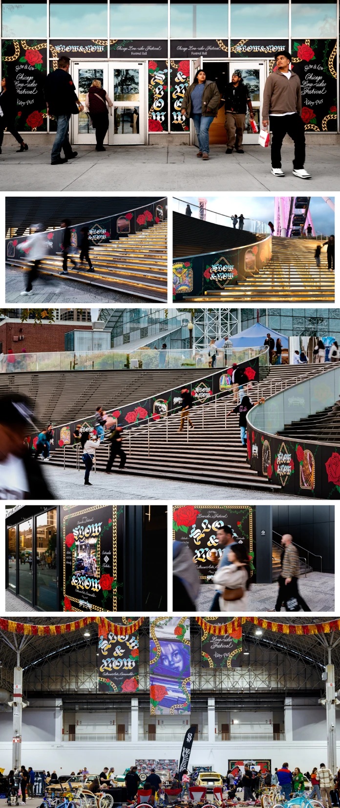
Transforming Civic Space into a Cultural Stage
The impact of Studio Span’s design extends far beyond logos and posters. The visual identity was used to transform the entire half-mile campus of Chicago’s Navy Pier into an immersive cultural experience. This is a significant move. It takes a historically marginalized art form and places it proudly in one of the city’s most prominent public spaces.
The application of the branding was both extensive and thoughtful:
- Environmental Graphics: Fifteen large-scale “supergraphic” walls became popular backdrops for photos. This turned attendees into active participants in the brand’s unfolding narrative.
- Wayfinding and Communication: Over 1,000 feet of banners, stage scrims, and bilingual communications ensured the festival was both navigable and inclusive.
- Branded Merchandise: Items like wristbands, posters, and shirts allowed festival-goers to take a piece of the experience home, turning them into brand ambassadors.
The hand-crafted aesthetic was maintained throughout all materials. For instance, blue and yellow lettering mimicked a sunset reflected on chrome. This was an insider’s nod to Chicano art and 1980s Chicago graffiti. This thoughtful approach provided clear moments of belonging for the festival’s diverse mix of families, clubs, and performers.
A Design That Belongs to the People
Perhaps the most telling testament to the success of Studio Span’s design is the community’s reaction. Adam recounts how, at the end of the festival, people raced to take home the signs. “It wasn’t theft, it was devotion,” he says. This powerful anecdote illustrates a key aspect of the project’s success. Span created a visual system that truly belongs to the people it was made for.
This project serves as a compelling case study. It shows how branding a cultural event in a politically charged climate can be an act of advocacy. By grounding the design in authentic cultural symbols and working closely with community leaders, Span amplified the voice of Chicago’s lowrider culture. Their work demonstrates that design can do more than just sell tickets. Indeed, it can foster belonging, celebrate a rich history, and inspire a community to shine.
All images © studio Span. Check out WE AND THE COLOR’s Branding and Graphic Design categories for more.
Subscribe to our newsletter!
[newsletter_form type=”minimal”]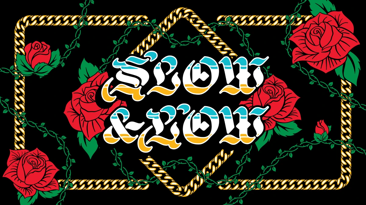
Verblödung bei der #CDU #MERZ #SPAN #LINNEMANN und weiteren CSU`lern ?
Es kriecht etwas dunkelbraunes aus dem Sumpf.
Der Schoß ist fruchtbar noch, aus dem das kroch.« Bertolt Brecht Brecht

@zoe
Es kriecht etwas dunkelbraunes aus dem Sumpf.
Der Schoß ist fruchtbar noch, aus dem das kroch.« Bertolt Brecht Brecht

@Sagittarius_Galaxie
Es kriecht etwas dunkelbraunes aus dem Sumpf:
#CDU #SPAN


El exjefe de L3Harris Trenchant se declara culpable de traicionar exploits de día cero a un corredor ruso #cero #cibercrimen #ciberseguridad #corredor #culpable #declara #departamento_de_justicia #Departamento_de_Justicia_de_EE._UU. #día #exjefe #exploits #L3Harris #ruso #Spyware #Trenchant #vender #Zero_days #ButterWord #Span...
https://butterword.com/el-exjefe-de-l3harris-trenchant-se-declara-culpable-de-traicionar-exploits-de-dia-cero-a-un-corredor-ruso/?feed_id=51323&_unique_id=69025887237ac

I just learned how to do some uBlock origin cosmetic selectors to remove elements on the page that invite me to use AI or take up screen real estate offering pointless AI summaries.
So many web sites use auto-generated CSS class names that you can't match on the actual classes. And you can't be sure that it will actually be 3 <div>s from the root or anything like that.
What I really like is the :upward() selector. I can basically match something like <h3>Try our assistant</h3> and then append :upward(3) to tell uBlock that regardless of what their names are, block the entire div 3 levels up because I found the matching text down here.
One of the things I'm hiding is a graphical button, so I use its aria-label to match it.
Here's some examples:
example.com##.genaiPageSummaryButton:upward(8)

example.com##span:has-text("Open the Assistant"):upward(3)

example.com##a[aria-label="Open automated answers"]:upward(2)
BBVA fracasa en la batalla por la adquisición de 17.000 millones de euros por su rival castellano más pequeño, Sabadell #adquisición #banca #batalla #BBVA #Cataluña #competencia #España #español #euros #fracasa #fusiones_y_adquisiciones #más #millones #Pedro_Sánchez #pequeño #por #rival #Sabadell #ButterWord #Span...
https://butterword.com/bbva-fracasa-en-la-batalla-por-la-adquisicion-de-17-000-millones-de-euros-por-su-rival-castellano-mas-pequeno-sabadell/?feed_id=49103&_unique_id=68f20ec96f780
Google insta a la Corte Suprema a detener la orden sumarial de la tienda de aplicaciones en la demanda épica de juegos | Informativo tecnológicas #aplicaciones #Corte #demanda #detener #épica #Google #insta #judicial #juegos #Noticias #orden #Suprema #tecnológicas #tienda #ButterWord #Span...
https://butterword.com/google-insta-a-la-corte-suprema-a-detener-la-orden-sumarial-de-la-tienda-de-aplicaciones-en-la-demanda-epica-de-juegos-informativo-tecnologicas/?feed_id=45071&_unique_id=68d570f2eeae2

Cutter Gauthier scores twice to help Ducks beat Flames in OT https://www.rawchili.com/nhl/185717/ #Calgary #CalgaryFlames #CalgaryFlames #CutterGauthier #Ducks #flame #Flames #FrankVatrano #Hockey #left #LeoCarlsson #MattCoronato #NHL #overtime #save #scoring #second #span #WristShot #YegorSharangovich


Man wolle
> offen über Fehler der vergangenen Wochen sprechen
...und warum ist der Jens dabei?
https://www.tagesschau.de/inland/wuerzburg-koalition-fraktionsspitzen-100.html


Params-коллекции и collection expressions в C#
Привет, Хабр! В экосистеме C# за последние два релиза случилось ровно то, чего многим не хватало для аккуратной работы со списками значений. В C# 12 появились collection expressions — синтаксис вида [1, 2, 3] со spread-элементами .. , который конвертируется в массивы, Span , ReadOnlySpan , интерфейсы коллекций и любые правильно устроенные типы. В C# 13 к этому добавили params-коллекции: теперь params может быть не только массивом, а почти любой поддерживаемой коллекцией, включая спаны и неизменяемые контейнеры.
https://habr.com/ru/companies/otus/articles/938200/
#c# #C#_12 #C#_13 #collection_expressions #paramsколлекции #ReadOnlySpan #Span #массивы #интерфейсы_коллекций
🎩 Ah, the noble #quest for unification—because what better way to spend your day than reading 4,000 words on "symbolic terms" while desperately wishing for a TL;DR? 🤔✨ Dive into a #riveting #saga where every lowercase letter is a "constant" and the real challenge is unifying your #attention #span with your will to live. 📜💤
https://eli.thegreenplace.net/2018/unification/ #unification #symbolic #terms #TLDR #HackerNews #ngated

Wenn ich Laut denke.... dann Neuwahlen und zur Not eine Ordentliche Ausserparlamentarische Opposition.....
Es nimmt nur Voraus was sowieso kommen wird.
#noMerz #Span #Noafd #nopalantir #nomütterrente #offenegesellschaft
Реальная безопасность корпоративной сети — роль брокеров сетевых пакетов в анализе угроз
Последние громкие кибератаки показали: привычные средства защиты больше не гарантируют безопасность корпоративных сетей. Сегодня критично важно иметь полную видимость происходящего внутри инфраструктуры, пока действия злоумышленников не привели к серьёзному ущербу для бизнеса. Брокеры сетевых пакетов помогают решить эту задачу: они собирают трафик со всех сегментов сети, очищают его от лишнего и направляют в системы анализа. В статье разбираем, как они работают и почему без них современные средства сетевой аналитики рискуют оставаться слепыми и перегруженными данными.
https://habr.com/ru/companies/dsol/articles/935072/
#брокер_сетевых_пакетов #сетевой_мониторинг #Оптимизация_сетевого_трафика #Дедупликация #TAP_ответвитель #span #зеркалирование #NTA #PT_NAD #Kaspersky_KATA

“Stairs, Parque de la Alameda” — A person on stairs at th Parque de la Alameda, Santiago de Compostela.
While visiting Santiago de Compostela this past spring we wandered a bit outside the confines of the central old town, including a visit to the Parque de la Alameda. The large park is easy to access and features everything from statues to groves of trees and (at least during our visit) a carnival. Its open spaces provided a pleasant break from the narrow and sometimes crowded streets of the old part of town…continues: https://gdanmitchell.com/2025/08/05/stairs-parque-de-la-alameda/
#santiagodecompostela #span #europe #monochrome #blackandwhite #stairs #street #travel #photography
Client Info
Server: https://mastodon.social
Version: 2025.07
Repository: https://github.com/cyevgeniy/lmst