#InfographicDesign

PUPUWEB Blogpupuweb
2024-12-24

Want to create stunning infographics in seconds? 🚀 AI tools like Canva, Piktochart, and Venngage make it effortless—no design skills needed! Transform ideas into visuals instantly. 🎨✨ Learn how AI is revolutionizing design:

pupuweb.com/how-to-create-info

2024-09-23

Best Digital Marketing Training Institute

NIDMIs One Of The best digital marketing training institute in Bangalore And We Have Brand Value For The Quality Of Education Which We Provide. Our Curriculum/ Courses Are Designed Fully For Job Orientation Bases nidmindia.com/

2024-09-23

Best Digital Marketing Training Institute

NIDMIs One Of The best digital marketing training institute in Bangalore And We Have Brand Value For The Quality Of Education Which We Provide. Our Curriculum/ Courses Are Designed Fully For Job Orientation Bases nidmindia.com/

2024-08-29

Your title is your first and often only chance to communicate your main message about your research—make it count!

Want to know why traditional descriptive titles are bad and how to create compelling titles for posters and infographics and combine multiple titles, including fun examples from participants in our workshops?

Check out our latest blog:

theonlinescientist.com/how-to-

#Sciencecommunication #Research #Posterpresentations #Infographicdesign

2024-05-29

Elevate Your Infographic Game with These 5 Free Online Tools!

1️⃣ Canva
2️⃣ Piktochart
3️⃣ Venngage
4️⃣ Infogram
5️⃣ Easel.ly

Create stunning infographics in minutes! 💡✨ #InfographicDesign #VisualStorytelling #FreeTools"

Erik Riffle (he/him)erikriffle
2023-11-08

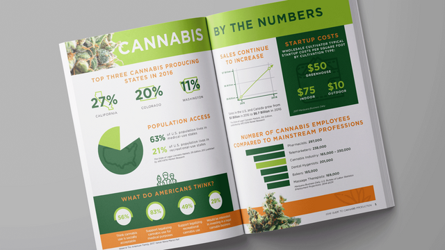
Here is an infographic I made for an agriculture magazine breaking down statistics of the cannabis farming industry. I don't normally design infographics, so this was a fun exercise!

Infographic of the cannabis farming industry.
2023-09-21

Little write-up for the next FIMS newsletter. I meant to mention the Hawthorn (part of my research project) excerpt that will be published oops 😳 I suppose I can mention it when it comes out.

#dataVisualization #InformationVisualization #IIBAwards #infographic #infographicDesign

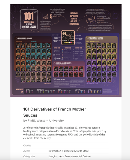
Leah Brown's (Ph.D. LIS) visualization entry for the 2023 Information Is Beautiful Awards, "101 Derivatives of French Mother Sauces" was selected for this year's longlist in the category Arts, Entertainment & Culture. Led by data journalist David McCandless, the 11B Awards are organized by the Data Visualization Society (DVS) and judged by a panel of data visualization experts and public vote. Entrants for the Awards compete from around the world as individuals, teams, studios, or departments from within organizations such as Reuters, AP, USA Today, Harvard, MIT, World Bank, and other international and government bodies. https://www.informationisbeautifulawards.com/showcase/6229- 101-derivatives-of-french-mother-sauces 101 Derivatives of French 3 Mother Sauces i e A reference infographic that visually = organizes 101 derivatives across 6 leading sauce categories from s French cuisine. This infographic is inspired by old-sc... www.informationisbeautifulawards.com
2023-09-01

I'm thrilled my infographic "101 Derivatives of French Mother Sauces" made the longlist for the category "Arts, Entertainment & Culture" in the 2023 Information Is Beautiful Awards! I don't think it will make the shortlist as it's pretty competitive, we're competing against individuals, teams, studios and even agencies from orgs like Reuters, USA Today, MIT, and Harvard Engineering.

lnkd.in/exZpzXH6

#dataVisualization #informationDesign #infographicDesign #informationArchitecture

A screenshot of my infographic "101 Derivatives of French Mother Sauces" on the longlist for the 2023 Information Is Beautiful Awards. The infographic uses a periodic table style to display 101 sauce variations from French cooking.
2023-08-10

Here we go! Prints will go on sale after the competition wraps up, in case they're of interest.

The best part of doing this is now I want to try making every sauce at some point 😅🤞

#InfographicDesign #InformationArchitecture #InformationVisualization

Two final versions of my infographic: 101 Derivatives of French Mother Sauces. The first version is in a magenta palette, the second version is in a slate blue palette. Each version contains 101 sauce derivatives presented in a periodic table format. The last image is of my entry confirmation to the Information Is Beautiful Awards
2023-02-12

Hi! Here a new submission for the #B2VB challenge. "Lunar New Year in China: Domestic Travel on the Rise". Week 02, Build a Multiple Line Chart📈.

Ready for feedback 😊!
Tableau Link in my description.

public.tableau.com/app/profile
.
.
.
.
.
.
.
.
#dataviz #datavisualization #data #informationdesign #design #infovis #China #2023 #dataanalytics #datascience #chart #infographic #infographicdesign #B2VB #travels #lunarnewyear #datafam #work #domestictravel

Hi! Here a new submission for the #B2VB challenge. "Lunar New Year in China: Domestic Travel on the Rise". Week 02, Build a Multiple Line Chart📈.

Client Info

Server: https://mastodon.social
Version: 2025.07
Repository: https://github.com/cyevgeniy/lmst