#userstyle

2025-06-04

Yet another #userstyle after 1h of struggling with userstyles specific tiny unusual details 😅

This time, here is a (customisable) compact version for #todoist. I still hope they would one day implement this but in the meantime here we are!

Also, tasks metadata remains at the right of the task row, in contrast with a few existing similar userstyles.

userstyles.world/style/22662/t

Compact mode userstyle applied to todoist web app → compact mode at the top, very-compact mode at the bottom
2025-06-03

#Vivaldi :vivaldi_red: Notes パネルのエディター部分フォントサイズをもともと少し小さくしていたけど、それよりもすこし大きくした(元のデフォルト状態よりは少し小さい

#UserStyle #Vivaldi #customization

2025-04-21

Я часто кликаю на нижнюю панель плеера Ютуба, чтобы вернуть фокус для управления с клавиатуры. Пару месяцев назад этот клик начал приводить к прокрутке страницы (если есть таймкоды).

Отключается такое поведение простым юзерстилем:

.ytp-chapter-container {
pointer-events: none !important;
}

Добавлял через расширение Tweaks for YouTube chromewebstore.google.com/deta

#userstyle

2025-03-17

« User Style Stylus pour désactiver les popups de suggestion automatique d'emojis sur Discourse, GitHub et GitLab »

notes.sklein.xyz/2025-03-17_18

#LibreWolf #Firefox #tips #UserStyle #Stylus

2024-11-16

i really get annoyed at sloppy stylesheets that render a page like half #darkmode half light with conflicting contrast and legibility problems. the #ReadwiseReader browser extension absolutely sucks at it too - try to highlight something on a white-on-black page and it's unreadable. i can't even hack a #userstyle together to un-fuck it reliably.

a really dumb way for an annotation to be made, right?

but #nvidia does equally stupid things too:

Everyone is low-vision at Nvidia, even the OCR feature can't read this shit!

Look:

```
- 0 x o LEARN " K3 ~ Application | ‘ P | et 26 b MK el 0L LIEY 
```

so dumb.
Freeeeeeeeeeeeeeeeeeeeeeeeeeeefreeplay@tech.lgbt
2024-10-13

#MastoModern is a UserStyle & instance theme that give Masto a nicer look :blobfoxfloofhappy:

Note: the style may break on older versions of Mastodon & instances that have other modifications. The style is compatible with other themes that only change the colors & glitch-soc. :blobfoxdisputed:

Install with the Stylus browser extension here
Don't use the "Stylish" extension
View the code & report issues

#UserStyle #CSS #Mastodon #MastoDev

Mastodon Modern applied on Mastodon, shown is the @tooManyFoxes@botsIn.space account. The is a split in the image showing both light & dark themesMastodon Modern applied showing a post by Foxes Every Hour of a fox kit standing on dried grass with its head tiltedMastodon Modern applied in the Advanced View. The columns are wider to fit more of the screen. The #fox and Foxes Every Hour profile columns are shownMastodon Modern applied on mobile, the side nav have been split into two bars, one at the top of the page containing follow requests, mentions, bookmarks, favorites, and server info. The fixed bottom bar contains the home page, notifications, explore, live feeds, and lists.

The profile shown is again the Foxes Every Hour bot
Freeeeeeeeeeeeeeeeeeeeeeeeeeeefreeplay@tech.lgbt
2024-10-11

I've made a UserStyle that makes websites without any CSS easier to read with some customization options :neofox_floof:

Install it with the Stylus browser extension (not Stylish):
#UserStyle: userstyles.world/style/18536

#CSS

motherFuckingWebsite.com, a website that didn't have any style at all, that now has some styling to follow prefers-color-scheme, center content, adjusts line height, etc. to make it easier to read
2024-10-10

If you use stylus or other user style extensions and you got upgraded to the new masto interface which has a really bad state for filtered toots, here's some CSS i just banged out. It looks like this in action in dark mode. It's not perfect but I don't care much because I don't really want to see this content anyway, I use this as an indicator that maybe I should stop following someone if they show up here all the time.

/* make hidden shit hidden! */
.content-warning--filter::before,
.content-warning--filter::after {
background: linear-gradient( to bottom,
rgba(130, 130, 130, 1) 0%,
rgba(110, 110, 110, 1) 20%,
rgba(90, 90, 90, 1) 40%,
rgba(70, 70, 70, 1) 80%,
rgba(50, 50, 50, 1) 80%,
rgba(30, 30, 30, 1) 100%);
}
.content-warning--filter p {
margin-bottom: 0;
}
.content-warning--filter p span {
font-size: 0.75em;
color: gray;
}
.content-warning--filter .link-button {
color: darkred;
font-size: 0.75em;
float: right;
margin-top: -2em;
}
.status__wrapper:has(.content-warning--filter) .status__info {
display: none;
}

#Stylus #UserStyle #Filter

a filtered toot by somebody that has a filter matcher that says "some stuff i don't want to see". there is no icon  for the retooting user or time display, and a link to show the toot.
Freeeeeeeeeeeeeeeeeeeeeeeeeeeefreeplay@tech.lgbt
2024-10-10

#MastoModern has been updated to v2.0.2 with a bunch of fixes for Masto 4.3 !! :neofox_floof:

You can view the changes here

Install with the Stylus browser extension:
#UserStyle: userstyles.world/style/4773/ma

#Mastodon #CSS

2024-09-15

I've always written userstyles. But just recently have I started to share them with the world 😄

I use #theoldreader as my CSS reader but I'm always annoyed by how it handles font-size, there are so many inconsistencies. I try to fix this and make the font-size more consistent with this new #userstyle: userstyles.world/style/18115/t

(and you can even adjust the default font-size in the style settings 😉)

Side-by-side view of theoldreader before and after applying my new userstyle.
2024-09-12

i made a cohost userstyle for goblin! i also made another userstyle that removes numbers like the note count and the follower counts, if you'd like that!

you can install an extension like stylus, and then install the userstyles from here:
cohost theme:
https://userstyles.world/style/18082/goblin-cohost
no numbers:
https://userstyles.world/style/18083/no-numbers

i also have the css on my website, if you wanna manually copy it or something:
https://tiger.kittycat.homes/goblin-cohost/

it's not perfect and i don't promise that every page will look good with it, but i've been using it without issue to browse profiles and the home timeline, so! it's usable!

it definitely doesn't work with the deck layout, but it does work on the two other layouts that goblin has.

2024-08-12

This kind of things drive me nuts. You want to write a tiny #userstyle to fix or adapt part of a website? Well you can't with these obfuscated CSS classes 🙌 (I won't even talk about the 12 levels of nested divs)

Or at least it makes it much more difficult (and on top of that I'm not even sure these class names remain stable from one deployment to another)

A screenshot of the DOM from a well-known web-app, with a very deeply nested (12 levels) hierarchy of divs bearing obfuscated CSS classes such as "x10l6tqk", "x1n2onr6", "_ak8q", and so on.
Freeeeeeeeeeeeeeeeeeeeeeeeeeeefreeplay@tech.lgbt
2024-07-14

#MastoModern has been updated to v2.0.0! I have partially rewritten the style, so it should be a lot cleaner and smaller, including some fixes and changes :blobfoxfloofhappy:

You can view the full changelog here

Install with the Stylus browser extension:
#UserStyle: userstyles.world/style/4773/ma

Along with this, I have also moved the repository to git.gay: git.gay/freeplay/Mastodon-Mode

If you find any issues, please create an issue here

#Mastodon #CSS #UserStyle

Mastodon with the MastoModern UserStyle applied, shown is the FoxesEveryHour profile (@toomanyfoxes@botsin.space). The image shows both light and dark themes
Steffo (moving)steffo@junimo.party
2024-07-10
Made an #userstyle for myself to use with #Phanpy that colors posts based on their privacy level instead of their source!

It makes everything much intuitive to use for me personally...

It's pretty buggy, and probably not accessible to folks with different needs than me, but in case somebody wants to hack on it, I'm sharing it in the reply below!
A screenshot of the theme.Another screenshot of the theme.A screenshot of the post composer box with the theme applied.
GRIFFENgriffen
2024-07-05

just finished making this AWESOME theme for this website,, install here: userstyles.world/style/13745/2

Freeeeeeeeeeeeeeeeeeeeeeeeeeeefreeplay@tech.lgbt
2024-06-26

I've made a UserStyle that makes Mastodon's alt text editor window fullscreen, as the default window was too small imo

Install with the Stylus browser extension:
#UserStyle: userstyles.world/style/16955

Compiled CSS: git.gay/freeplay/UserStyles/ra

#Mastodon #CSS

Preview of the style applied with me editing the alt text for an image: A super fluffy and round-looking red foxxo facing towards the camera.

In the background is the hourly foxes account
Freeeeeeeeeeeeeeeeeeeeeeeeeeeefreeplay@tech.lgbt
2024-06-26

Will just quickly repost some links to stuff I've made :blobfoxfloofhappy:

#OneBar: A Firefox style that combines the tabs & toolbar into one bar.
git.gay/freeplay/Firefox-Oneba

#MastoModern: Improves the look & feel of Mastodon.
git.gay/freeplay/Mastodon-Mode

Bootleg cat/fox ears for Mastodon:
userstyles.world/style/15031

Threads for Mastodon Pinafore: (Still need to fix for Enafore)
userstyles.world/style/11741

TutanotaModern: More minimal, neater, and makes drastically better use of space than Tutanota's current design.
userstyles.world/style/2325/

#UserStyle #UserCSS #CSS #Firefox #Tutanota #Threads

Firefox Onebar: showing the tabs & toolbox both combined into one bar. The page shows the text Firefox Onebar in the style of the Firefox wordmark, the background is a diagonal red to purple gradientA mastodon post from Foxes Every Hour showing a curled up red fox, the image is cropped so that only its ears are shown.

The avatar contains attached animal ears from the UserStyleTutanota with the UserStyle applied, in the preview is shown a curled up fluffy red fox on the snow that is yawning, facing towards the cameraMastodon with the MastoModern UserStyle applied, shown is the FoxesEveryHour profile (@toomanyfoxes@botsin.space). The image shows both light and dark themes
2024-05-21

Recently switched to the Gioco pieces on #lichess: I like it very much except for its warm tint. So here's a #userstyle to desaturate it and make it more black & white. “It's not much, but it's honest work” 😉

userstyles.world/style/16401/l

Side by side, with the default Gioco theme and with the userstyle applied

#Gmail has gone WOKE. No però, per reale, presente come all’inizio di quest’anno #Google ha tolto di mezzo la versione HTML base per desktop? Ecco, visto che la #webapp moderna fa comunque cagare a spruzzo, su PC uso quella #mobile, che ancora disponibile anche se non viene aggiornata dal paleolitico. #Curiosità, si può aprire senza fare nulla di strano, con qualsiasi user agent, basta visitare l’URL: https://mail.google.com/mail/mu/. 💩️

I mean, è scarna ad un livello allucinante, però il suo lo fa: lista le #email, le fa leggere, e le fa gestire, non serve letteralmente altro. Anzi, per certi versi forse è meglio della vecchia versione HTML base: la #UI è più pulita e meno incasinata, in alcuni versi peggiore ma in altri più scattante. Quindi, se su PC funziona alla fine bene, su #smartphone dovrebbe funzionare anche meglio, essendo fatta apposta, no? 🙃️

Sbagliato!!! Non ricordo esattamente quando hanno fatto ‘sta merda, ma hanno messo questo enorme banner non chiudibile per spammare la loro app Android nativa di ‘sto cazzo; questo oltre, e non al posto di, la schermata di intermezzo che appare ad alcune visite della pagina, che invece c’è sempre stata. Il #banner non appare da user agent desktop, per un motivo immagino ovvio, ossia il fatto che non avrebbe senso, nonostante è proprio lì che darebbe francamente poco #fastidio, mentre sui #telefoni non è buono affatto… 🤥️

Sullo Ximi mi da fastidio ma non mi ha mai fatto #sbroccare, poi ho visto quanto spazio a schermo mi fotte sul Galaxy Ace 4 e qui veramente ho perso la pazienza. Tra quello e la UI di Opera Mini e di Android, metà schermo è solo contorno, e meno di quella metà effettivamente può visualizzare il corpo di una #mail. Ora, Gmail lì sopra mi serviva per solo una cosa prima e credo mai più poi, quindi non ho bisogno di sistemare lì, ma ormai mi sono salata e quindi ho al volo fatto uno #
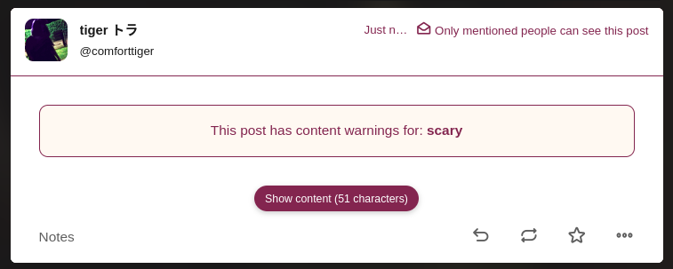
userstyle per installarlo almeno sul primo #telefono, eccolo qua: https://userstyles.world/style/16251/gmail-mobile-tweaks 🌋️

Mentre creavo lo stile comunque ho notato che l’elemento HTML schifoso è denominato “speedbump”, letteralmente “dosso”, e io non so davvero come sentirmi dopo questa #scoperta. Implicherebbe che gli sviluppatori in questo caso sono stati molto probabilmente complici nei piani malefici dei loro manager; un’evidenza di questo tipo distrugge sul nascere scuse del tipo “ah ma no noi non sappiamo che implicazioni questa cosa potrebbe avere noi facciamo solo ciò che ci dicono…“. Ma, dall’altro lato, il fatto che abbia un id così specifico e comodo lo rende molto più semplice da bloccare per noi utenti avanzati, e magari loro anche se costretti ad implementare questo #antipattern hanno tentato di inculare leggermente meno gli utenti. Sentimenti decisamente contrastanti. Qualunque sia la verità, in ogni caso i manager dovrebbero tutti quanti [REDATTO per motivi legali]; “this site looks better in the app” MOTHERFUCKER, YOU made the website… 🕷️💢️💢️

https://octospacc.altervista.org/2024/05/10/gmail-ultracaca/

#antipattern #banner #email #fastidio #GMail #Google #mail #mobile #sbroccare #scoperta #smartphone #telefoni #telefono #UI #userstyle #webapp

2024-04-10

i'm not sure i ever talked about this but i wrote a userstyle for KHInsider Downloads which revamps the ui and makes better use of the space on desktop. check it out and go leave a review if you like it :D
#userstyle #css

userstyles.world/style/14277/k

The interface of downloads.khinsider.com, recolored with a dark purple tinted interface

Client Info

Server: https://mastodon.social
Version: 2025.04
Repository: https://github.com/cyevgeniy/lmst