#Gnuplot

A nod of appreciation to gnuplot, which is flexible, simple to use, and very very fast. I'm exploring the results of 40,000 simulation runs, and graphics are produced in less than the blink of an eye.

#FOSS #gnuplot

An example gnuplot graphic consisting of two stacked graphs showing the relationship between two measures of error in simulation output, the top one for the full dataset, and the bottom one zoomed in toward the origin.
2026-03-02

Adding image rendering to agent-shell

Maybe it'll finally make #gnuplot use stick for me :)

#emacs #mistral #qwen #claude #anthropic #ai #google #goose #gemini #linux #macos #oss #foss #opencode #codex #vibe #windows

Vlastimil Zímaziima
2026-02-13

Pokud jste si někdo, stejně jako já, oblíbil staré meteogramy od ČHMÚ s grafy v , tak teď jsou tady:

intranet.chmi.cz/files/portal/

Matthias Schlechtma_schl@social.tchncs.de
2026-02-05

Spannend ist, das es ein Frequenzwackler nach dem Flicker gibt. #stuttgart #stromausfall #gnuplot

Netzfrequenz geht hoch nachdem die Spannung wieder da ist.
Matthias Schlechtma_schl@social.tchncs.de
2026-02-05

Heute durch Zufall den Stromwackler in Stuttgart mitgeschnitten 🙂 #stuttgart #stromausfall #gnuplot

Netzfrequenzverlauf in Tübingen und Stuttgart, man sieht einen Spike in StuttgartSpannungseinbruch aufgrund des Stromausfalls
dr 🛠️🛰️📡🎧:blobfoxcomputer:davidr@hachyderm.io
2026-02-05

@harish I would never have guessed #gnuplot could compute a convex hull. Or that it could look this good. Why are the gnuplot default settings so incredibly awful if it can look this good?

Michael Knudsenmk@bsd.network
2026-01-29

I'm looking for suggestions for data visualisation.

Nothing sophisticated but I've not found anything uncomplicated yet.

I need to plot a few time series which in itself is not very complex.

However, I would like to annotate the graph to indicate various events, e.g. with vertical bars from points to the x-axis, and the duration is going to be fairly long. Also, I'd like to both get an overview and look at details.

I've used gnuplot for a bunch of things but never got good results for cases like this, and I don't know how to do annotations to plot events.

So.. any ideas?

#DataVis #Plotting #Graphing #Gnuplot

2026-01-28

ermagawd...#Swift and #Swift_Charts (its plotting library) is fundamentally constructed in a way I do not understand. I did not think that it would take a few days to figure out how to set up multiple y-axis. And I still am not able to adjust the x-axis labels properly. For the simple line graphs it was magic. For anything more complicated... I actually miss #gnuplot

2026-01-23

@bagder

#gnuplot was one of the very first tools I used for looking at data

it was 1995 and I was doing my first job (year out between school and uni) and the place had sunOS 4 workstations with 1-bit high-resolution monochrome displays iirc

the unix systems were locked down so there was no python or anything ... just fortran f77 and shell and gnuplot

there was a Windows 3.11 based option with Microcal Origin but that couldn't handle much data volume

(those constraints led me to prototype a linux-based data analysis workstation)

openwindows 2 monochrome desktop on sunos 4.1.1
daniel:// stenberg://bagder
2026-01-23

turned 40 years old (!) back in December. Happy birthday!

2025-12-11
FOSS Advent Calendar - Door 12: Plotting Like a Pro with Gnuplot

"Reports of my death have been greatly exaggerated."
This quote fits perfectly for Gnuplot, a classic FOSS plotting engine that’s still alive, powerful, and incredibly useful for creating beautiful scientific and mathematical visuals directly from the command line.

Gnuplot can generate 2D and 3D plots, animate datasets, visualize functions, and export to nearly any format you might need: PNG, SVG, PDF, EPS, and more. And one of its greatest strengths?
You don’t need a whole Python stack, dozens of libraries, or virtual environments just to make a graph. Gnuplot runs instantly, scriptable, lightweight, and beautifully minimal.

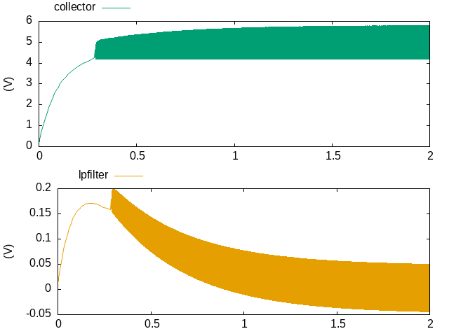
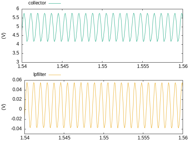
Whether you’re analyzing experimental results, visualizing parametric curves, or just plotting a weird math idea you had at 2 AM (we’ve all been there), Gnuplot gets it done fast and clean.

Pro tip: try rendering a dramatic 3D surface plot or a festive math figure, like a parametric Christmas tree. Gnuplot makes it surprisingly easy to turn equations into art.

Link: https://sourceforge.net/p/gnuplot/gnuplot-main/ci/master/tree/

What’s a plot you’d LOVE to generate with Gnuplot, serious or purely nerdy?

#FOSS #OpenSource #Linux #CLI #Terminal #Gnuplot #DataViz #Plotting #3DGraphics #MathArt #NerdContent #AdventCalendar #OpenTools #FOSSAdvent #CommandLine #ScienceTools #Fediverse #TechNerds #PlottingMagic #adventkalender #adventskalender #DataVisualization #Science #Python #Research #Engineering #AcademicChatter #STEM #Tech #Physics #Chemistry #Maths #SciComm #OpenScience #Research
Stefan Wolfrum :mastodon:metawops
2025-10-20

Ich habe mal aufgeschrieben, wie ich das gemacht habe, dass ich in meine Datei gleich rechts daneben (quasi) live aktualisiert sehe, nach Änderungen … 🤖
blog.metawops.de/tools/gnuplot

Stefan Wolfrum :mastodon:metawops
2025-10-18

My oh my … colors! I’d really like to use the colors from rgb.txt but I’m on . So I downloaded the rgb.txt file, put it into a folder and tried the env vars XAPPLRESDIR and GNUPLOT_DEFAULT_COLORS_PATH – to no avail. I’m using ’s gnuplot 6.0.3 patchlevel 3. Anyone any idea/help/tip/hint?
For now: using the 111 internal colors. Thanks to user „theozh“ over at I got this nice gnuplot plot of them you’ll find enclosed. 🙏🫶 stackoverflow.com/a/54659829/2

2025-10-10

plots of the phase-delay oscillator's outputs.

In order to get going, the analysis includes the `UIC` directive which asks to forgo the typical operating point calculation, and instead use the supplied initial values (see `.ic` line). The specific initial values used should be non-zero, it is simplest to set the battery terminal node (n0) to some non-zero value.

The of the PDO is here: codeberg.org/rjp/diy-tm/src/co

A plot of time-varying voltage at the output of phase delay oscillator as simulated by the Xyce circuit simulator. Oscillations start at around 250 milliseconds, and continue until the end of the plot at 2 seconds. The waveform at the transistors emitter rides at a DC offset of 4.5 volts. The waveform at the filter output is centered at 0 volts.Several cycles of the time domain output of the phase-delay oscillator. There are roughly 6 oscillations in 5 milliseconds which yields a frequency of roughly 1200 Hertz. The output of the low pass filter has a peak to peak voltage of 0.09 Volts and a small amount of harmonic distortion is evident in both the transistor's collector.
2025-09-27

Diagram As Code

I recently sat in a lecture about PlantUML and the advantages of Diagram As Code. Diagram As Code is a special variant of Documentation As Code. It is the possibility for software developers to create their documentation in the form of text files without the use of word processing systems.

schegge.de/2025/09/diagram-as-

#Algorithmen #AusDemLeben #FreshMarker #Java #Asciidoctor #Documentation #Dokumentation #FreshMarker #GnuPlot #Java #JFreeSVG #PlantUml

Eduardo Mercovich (él)edumerco@social.coop
2025-09-15

@schuemaa

You are totally right about the format. It is only that seeing things in a different perspective can open possibilities. :)

I am reading your comments about #gnuplot with care since I'm a but stuck with something simple as horizontal bars and it seems they are not supported...

2025-09-08

Some of these "how deep is an atom in a #commonLisp form in a file" pictures are deeply satisfying to look at.

#gnuplot #clseries Sharpsign... Visualizing lisp expression leaf depth

screwlisp.small-web.org/moment

Make your own in this thread plz. Will send help.

Requests, conceivably.

Revisits how to write
(let* ((current-dir (car (directory #p"./")))
(wild-dir
(make-pathname :directory
'(:relative :wild-inferiors))
)
(wild-here
(merge-pathnames wild-dir current-dir))

A plot of "leaf depth in forms" of lisp's Alexandria's alexandria-2/hash-tables.lisp.Plot of leaf depth for lisp's Alexandria's alexandria-1/sequences.lisp
Benjamin Knispelbenknispel@chaos.social
2025-09-07

It's already been September for a week – and so it's high time for my precipitation overview up to the end of August 2025.

We are still at the lower end of the spectrum; only in 2018 and 2022 was there less precipitation by the end of August. Both of those years were also the driest years to date at my weather station north of Hanover, Germany.

#precipitation #climate #Hanover #Wedemark #WeatherStation #weewx #gnuplot

Diagram showing total precipitation over the course of a year (since 2017) as a function of the day number in the year.

Client Info

Server: https://mastodon.social
Version: 2025.07
Repository: https://github.com/cyevgeniy/lmst