
FOSS Advent Calendar - Door 12: Plotting Like a Pro with Gnuplot
"Reports of my death have been greatly exaggerated."
This quote fits perfectly for Gnuplot, a classic FOSS plotting engine that’s still alive, powerful, and incredibly useful for creating beautiful scientific and mathematical visuals directly from the command line.
Gnuplot can generate 2D and 3D plots, animate datasets, visualize functions, and export to nearly any format you might need: PNG, SVG, PDF, EPS, and more. And one of its greatest strengths?
You don’t need a whole Python stack, dozens of libraries, or virtual environments just to make a graph. Gnuplot runs instantly, scriptable, lightweight, and beautifully minimal.
Whether you’re analyzing experimental results, visualizing parametric curves, or just plotting a weird math idea you had at 2 AM (we’ve all been there), Gnuplot gets it done fast and clean.
Pro tip: try rendering a dramatic 3D surface plot or a festive math figure, like a parametric Christmas tree. Gnuplot makes it surprisingly easy to turn equations into art.
Link: https://sourceforge.net/p/gnuplot/gnuplot-main/ci/master/tree/
What’s a plot you’d LOVE to generate with Gnuplot, serious or purely nerdy?
#FOSS #OpenSource #Linux #CLI #Terminal #Gnuplot #DataViz #Plotting #3DGraphics #MathArt #NerdContent #AdventCalendar #OpenTools #FOSSAdvent #CommandLine #ScienceTools #Fediverse #TechNerds #PlottingMagic #adventkalender #adventskalender #DataVisualization #Science #Python #Research #Engineering #AcademicChatter #STEM #Tech #Physics #Chemistry #Maths #SciComm #OpenScience #Research
#gnuplot


Ich habe mal aufgeschrieben, wie ich das gemacht habe, dass ich in #VSCode meine #gnuplot Datei gleich rechts daneben (quasi) live aktualisiert sehe, nach Änderungen … 🤖 #blog #bloggen #blogging #analogcomputing
https://blog.metawops.de/tools/gnuplot-in-vscode/
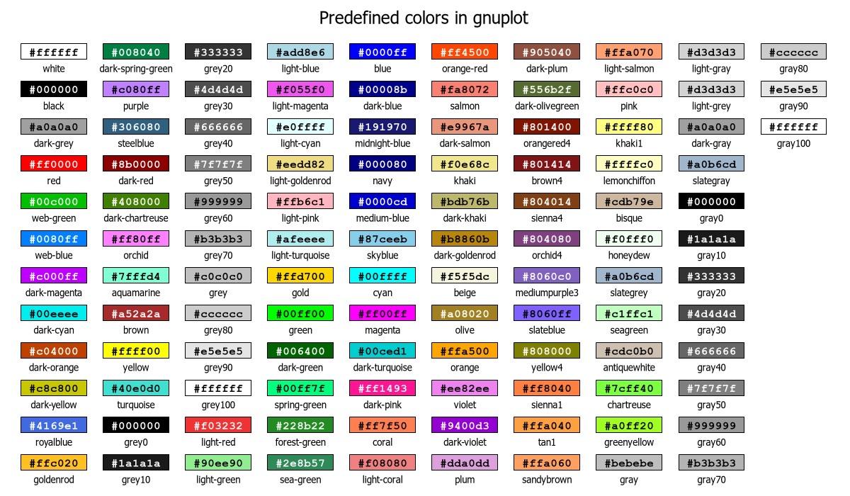
My oh my … #gnuplot colors! I’d really like to use the #X11 colors from rgb.txt but I’m on #macOS. So I downloaded the rgb.txt file, put it into a folder and tried the env vars XAPPLRESDIR and GNUPLOT_DEFAULT_COLORS_PATH – to no avail. I’m using #Homebrew’s gnuplot 6.0.3 patchlevel 3. Anyone any idea/help/tip/hint?
For now: using the 111 internal colors. Thanks to user „theozh“ over at #stackoverflow I got this nice gnuplot plot of them you’ll find enclosed. 🙏🫶 https://stackoverflow.com/a/54659829/2017797

#gnuplot plots of the phase-delay oscillator's outputs.
In order to get #oscillations going, the #transient analysis includes the `UIC` directive which asks #Xyce to forgo the typical operating point calculation, and instead use the supplied initial values (see `.ic` line). The specific initial values used should be non-zero, it is simplest to set the battery terminal node (n0) to some non-zero value.
The #Xyce #simulation of the PDO is here: https://codeberg.org/rjp/diy-tm/src/commit/0b9b12dd28ad2b7ed67f2dd0c2df811469916dae/pdo/sim/osc.sp#
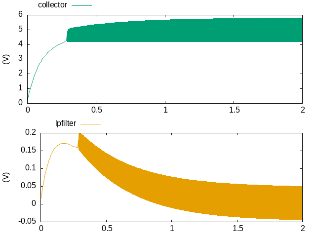
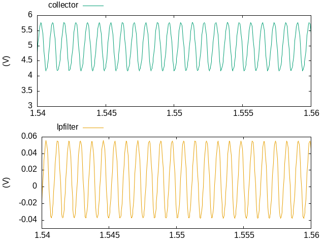

Diagram As Code
I recently sat in a lecture about PlantUML and the advantages of Diagram As Code. Diagram As Code is a special variant of Documentation As Code. It is the possibility for software developers to create their documentation in the form of text files without the use of word processing systems.
https://schegge.de/2025/09/diagram-as-code/
#Algorithmen #AusDemLeben #FreshMarker #Java #Asciidoctor #Documentation #Dokumentation #FreshMarker #GnuPlot #Java #JFreeSVG #PlantUml


Some of these "how deep is an atom in a #commonLisp form in a file" pictures are deeply satisfying to look at.
#gnuplot #clseries Sharpsign... Visualizing lisp expression leaf depth
https://screwlisp.small-web.org/momentary/alexandria-form-atom-heights/
Make your own in this thread plz. Will send help.
Requests, conceivably.
Revisits how to write
(let* ((current-dir (car (directory #p"./")))
(wild-dir
(make-pathname :directory
'(:relative :wild-inferiors))
)
(wild-here
(merge-pathnames wild-dir current-dir))


It's already been September for a week – and so it's high time for my precipitation overview up to the end of August 2025.
We are still at the lower end of the spectrum; only in 2018 and 2022 was there less precipitation by the end of August. Both of those years were also the driest years to date at my weather station north of Hanover, Germany.
#precipitation #climate #Hanover #Wedemark #WeatherStation #weewx #gnuplot
Schon eine Woche lang ist es September – und damit höchste Zeit für meine Niederschlagsübersicht bis Ende August 2025.
Wir sind immer noch im unteren Bereich des Spektrums unterwegs, nur in in den Jahren 2018 und 2022 hatte es bis Ende August weniger Niederschlag gegeben. Beide wurden dann auch die bislang trockensten Jahre an meiner Wetterstation nördlich von Hannover.
#Niederschlag #Klima #Hannover #Wedemark #Wetterstation #weewx #gnuplot
What else can I share to better describe the thesis? Some parts that are not clear?
While #orgmode does 85% out of the box (#LiterateProgramming, tagging, counting, writing, exporting, even interacting with #gnuplot, etc.) #elisp is needed to do some of this calculations, ordering and grouping... :)
[end] #tem25

I configured a #git hook that takes the wordcount from my #typst file every time I commit to my #thesis repository, so I can keep an eye on my progress.
I've been using a small #gnuplot script to plot my progress over time, along with my target (red), a fit, and a fit to the last 15 commits. The 19th of Sep (2nd red line) is my submission deadline, and end of Aug (1st red line) marks where I plan to stop writing and start reviewing.

During a bout of sleeplessness, I created the egnuplot[^1] package for Emacs. It started as a silly experiment, but over time (that is, over the course of the night) I found it genuinely useful. If you know some Elisp and a bit of Gnuplot, and want to plot some curves, give it a try!
I (hopefully) will write a post explaining my motivations and outlining how you can make your own little DSLs in Elisp soon.
I'd love to get some feedback.

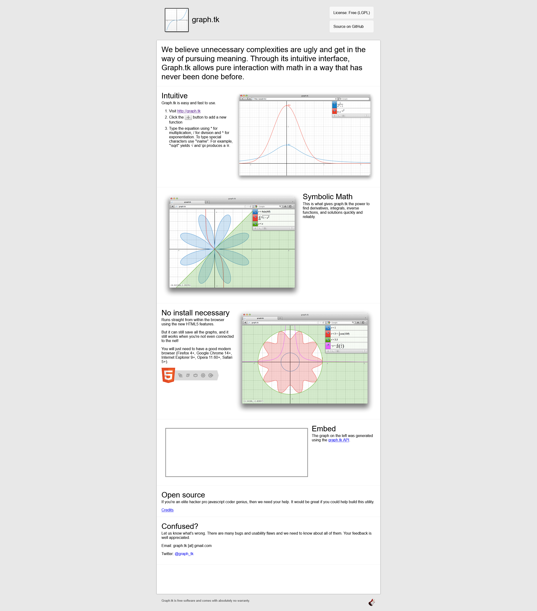
Looking for a libre alternative to Desmos online graphing calculator? (https://www.desmos.com/calculator)
I found grapk.tk!
It used to be on https://graph.tk, but that address no longer works - yet the name of the project remains.
So it's now here:
https://graph.equation.io/
Source on Github:
https://github.com/aantthony/graph.tk
#maths #math #graphs #gnuplot #calculator #graphingCalculator #equation #Desmos #alternative #foss #opensource #libre #freesoftware

New blog post on the inspiration for a new Julia package I am writing.
The package will address the optimization based design of heat exchanger networks for process integration (energy use reduction). The optimization will be based on decision variables defined on the basis of visualisation of hot and cold streams in a process.
The blog post illustrates the concepts using gnuplot src blocks in org mode in Emacs and highlights a nice feature of code reuse in org mode. There is also a small example of the use of Emacs Calc to do some algebra.
The plan is to have a series of blog posts as the code is developed. This is the first in the series.
#HeatExchangerNetworkDesign #HeatExchangerNetworkSynthesis #HENS #Optimization #ProcessOptimization #ProcessIntegration #visualization #Emacs #Calc #EmacsCalc #orgmode #gnuplot #JuliaLang #blog

WfeS. Gnuplot.
"gnuplot has the well-known gotcha of integer division, so 1/2 = 0. Float literals are one solution"
Wer will mit Ganzzahlen plotten? Echt jetzt?
Das hat mich 3h meines Lebens gekostet, weil ich direkt recht aufwändige Funktionen aufgeschrieben habe und eine Milliarde mal jede Formel noch mal im Detail mit meiner Aufschreibung verglichen habe, ob irgendwo eine Klammer fehlt oder ein Dreher drin ist oder oder oder.
🤦♀️ 🤦♀️ 🤦♀️
New blog post for the Emacs Carnival on writing experience (https://masto.gregnewman.io/@greg/114899165487420555):

Works with #gnuplot, too, of course:
/*
#+BEGIN_SRC gnuplot :file myfunc2.png :results graphics
plot sin(x)
#+END_SRC
*/
First (failed) attempt: “Hey #gnuplot, plot this function for me across this range of x and y values, and use color as the z value.”
Second (also failed) attempt: “Fine, I’ll precompute a bunch of points where the function is defined.”
Third (sorta working) attempt: “Fine, I’ll explicitly create NaN points where the function is not defined, so you have a rectangular matrix to turn into the image I want.”
Fourth (definitely working) attempt: “Fine, I’ll declare that any function output with a non-zero imaginary component gets mapped to NaN because My original functions are about spatial relationships between physical objects.”
(Yes, this is distantly related to electrical engineering. No, the imaginary component has nothing to do with phases of currents or voltages that vary over time.)

Client Info
Server: https://mastodon.social
Version: 2025.07
Repository: https://github.com/cyevgeniy/lmst