#UserInterfaceDesign

2025-12-15

Interesting talk from Scott Jenson. Apple and Microsoft have stopped innovating on the desktop UI. So what should we do next?

youtube.com/watch?v=1fZTOjd_bOQ

#UI #UserInterfaceDesign #OpenSource

obrhoffobrhoff
2025-12-09

A very interesting take on how we came from the command line prompt to a graphical user interface. Just to go back to the command line prompt. Was it all for nothing?

youtube.com/watch?v=ANAyXxA5vtc

A Guy Named Brian (he/him)GuyNamedBrian
2025-12-04

John Gruber @gruber makes a lot of really good points in this, & hopefully we’ll see a renaissance in user interface design at Apple with this change. This point really stood out for me, though:

“I am not a Liquid Glass hater. I actually think, on the whole, iOS 26 is a better and more usable UI than iOS 18. But MacOS 26 Tahoe is a mess, visually, and I’m not sure there’s a single thing about its UI that is better than MacOS 15 Sequoia.”

daringfireball.net/2025/12/bad

2020-06-14

Service design and the Mario complex

At Service Design in Government, I discovered that service designers see themselves as Mario. But that is an unrealistic model for what service design should be.

duncanstephen.net/service-desi

Mario jumping on the Earth to collect double diamondsView of Arthur's Seat from the conference venueLarge display of the word "user"Mario and a plate of spaghetti
2025-10-22

To the user-interface designers and programmers out there: If the unfortunate event happens and you have to show an error message, please make sure the message is actually helpful for identifying the issue. You might think that hiding technical details is user-friendly, but in fact, the opposite is true. Do not make us guess what is wrong, tell us what you know!

You might be afraid that this confuses users who are less tech-savvy. Not necessarily, if you give them a rough idea first (maybe in a more emphasized font) and then continue with the details you have (maybe in a smaller font). I am quite sure users are able to ignore the parts they do not understand, and if they need support, at least the person giving support has something to work with.

Some simple examples:

❌ "Cannot connect to bluetooth device."
❓ "Okay, but why?"
✅ "Cannot connect to bluetooth device 'foo' (maybe it is turned off?): The device does not respond."

❌ "Cannot open file."
❓ "Which file? And again, why?"
✅ "Cannot open file 'testfile.txt' for reading: Permission denied"

❌ "Something went wrong when trying to load the website."
❓ "Again, what's the problem? Is the network interface down? Is the DNS server down? Is the target server itself down? Give me a hint, please!"
✅ "Cannot load the website. Maybe your computer is not connected to the Internet? Details: No route to host (192.168.10.1) when attempting to connect to the DNS server."

This is nothing new. In fact, it is just an adaptation of the top-down writing approach we also use when writing scientific papers, for example: You begin with a rough overview and give increasingly more details later in the text.
But do not omit the details completely!

#usability #userinterfaces #userinterfacedesign #errormessages #programming #writing #technicalwriting

A useless satirical error message box with the title "Oops!". The message reads: "Something went wrong. We will not tell you what exactly. If you want to fix this problem: Good luck!" The dialog has a confirmation button labeled "Great!".
2025-10-17
Keith Bradnam 📈kbradnam@hachyderm.io
2025-09-26

Was just making my annual donation to @relay for their #ChildhoodCancer campaign.

It struck me that dark mode on an iPhone makes it really hard to scan the donation page.

The main button I want to click is not very prominent and I thought that clicking on ‘$10’ would let me edit the amount but it doesn’t. That comes on the next page.

Challenges of dark mode design.

#UX #UserInterfaceDesign #UI

A screen grab from a iPhone in dark mode showing the Relay donation page for their annual St Jude campaign. 

The background of the page is black and the main button at the bottom of the page also uses a black background but with a thin blue border  in contrast, another button on the page is more noticeable with a bright blue background. 

The banner image has text in white that almost disappears against a light blue gradient colour.
2025-08-11

Life beyond the folder system

The folder metaphor so intuitive to generations of computer users that they can struggle to think of any other way of using a computer. Yet for younger generations, the idea is completely alien.

duncanstephen.net/life-beyond-

On a dark background, a white folder and eight white files, progressively fading from left to right. At the right, a teal icon representing a graph is overlaid onto the final files
2025-03-29
use cases. Her example was google maps. It has a way to lay out multiple routes, where it's very clear visually which route it recommends, but also helps you understand the context for its choice (traffic, travel times of alternate routes, tolls etc) and lays them out on a map in a way that is digestible so you can quickly decide if there's an alternate route you'd prefer to take.
My guess is that when we see a truly AI native user interface, it will incorporate these principles - not necessarily telling you this is what you have to do, but communicating extremely efficiently (probably visually) what your options are and with an opinionated point of view on how to evaluate them. Maybe there are other examples today beyond google maps routes.
raphael’s pixelfedraphael@pixelfed.social
2025-02-26
That where I cook my FM sound design.
Too kinky not to post.
#synth #synthesizer #webdesign #userinterfacedesign
A web based interface for synth design with tons of buttons and input elements. Very sexy stuff.
2025-02-10

The object of information architecture

In my job at the Scottish Government, we are understanding the opportunities that can be provided by following an object-oriented approach to structuring our information.

duncanstephen.net/the-object-o

Abstract "boxes and arrows" diagram in the shape of the letters IAAbstract "boxes and arrows" diagram in the shape of the letters IA
2025-01-17

What’s Next for User Interfaces and UI Experiences?

Think about it for a second. You’re using a UI right now. It’s how you’re reading this article. Every app, website, and even your microwave uses some form of user interface. It’s the bridge between you and the technology. But what’s next? Are we stuck with the same old screens and buttons? Not at all! The future of UI/UX is exploding with possibilities. It’s a fascinating area, wouldn’t you agree?

Intuition is King: Making Things Just Work

First off, designers are obsessed with making things intuitive. What does that even mean? It’s all about designing interfaces that feel natural. Think of it like this: you shouldn’t have to read a manual to use something. You should just know what to do. That’s the goal.

How do designers achieve this? They’re working with things like:

  • Microinteractions: These are those little animations you barely notice. Think of a button that subtly changes color when you click it. It gives feedback and makes it feel real. They are tiny but so powerful.
  • Contextual design: This means the interface changes based on what you’re doing. For example, a music app might show different controls when you’re listening on headphones versus a speaker. That makes sense, right?
  • Familiar patterns: Designers often reuse common layouts. It’s like learning a new word that uses the same root. You’ve already seen similar things so it feels easier.

Are you starting to notice these details in your everyday tech? It’s pretty cool when you do.

Access for All: The Power of Inclusive Design

But great design isn’t just about being intuitive. It’s also about being accessible. Everyone should be able to use technology. And what does that mean in practice?

  • Screen readers: These are vital tools for people with visual impairments. Interfaces must be designed so they work well with these assistive technologies.
  • Keyboard navigation: Not everyone uses a mouse. Designers are making sure people can use interfaces with just their keyboard.
  • Clear color contrast: Text and backgrounds need to have enough difference in color so that they’re easy to read. This is crucial for people with low vision or color blindness.
  • Subtitles and captions: Videos need text, so people with hearing impairments can understand the content.

Accessibility isn’t just a nice-to-have. It’s essential. It shows how technology can empower everyone. Can you think of a time when you appreciated something being accessible?

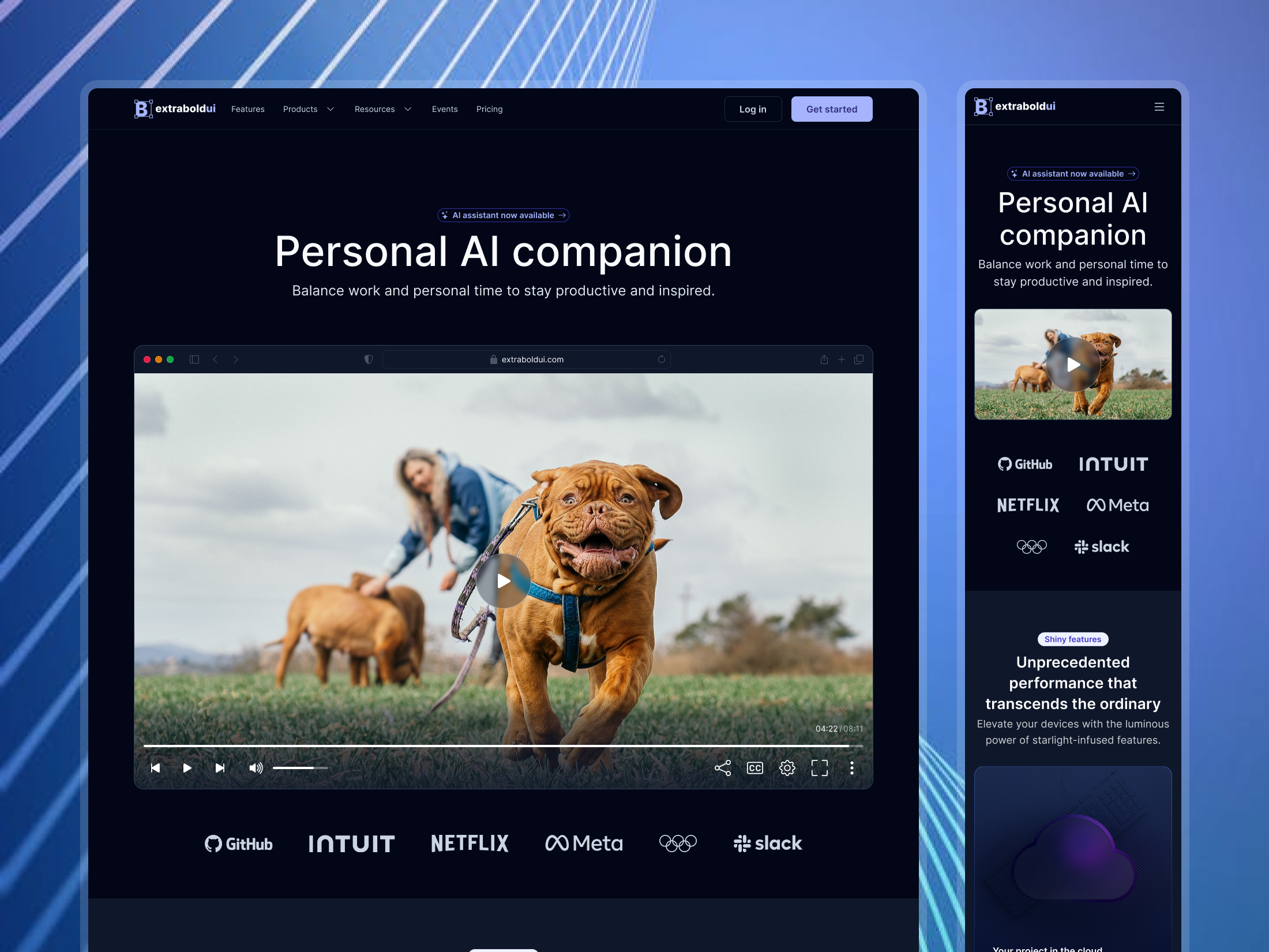
Personalized Experiences: Designed Just for You

Okay, let’s talk about personalization. Do you ever feel like an app knows you? It’s not magic. It’s personalization.

  • Adaptive interfaces: The interface changes based on your past behavior. A shopping app might recommend items you’ve previously looked at.
  • Customization options: You might be able to change the theme or the font size of an app. It makes you feel more in control.
  • Location-based services: You might get different information based on where you are. It’s all about making things useful and relevant.

Personalization is about making technology fit your needs. It shouldn’t feel like one-size-fits-all. Do you prefer personalized experiences? Why or why not?

Emerging Tech: The Wild Frontier of UI/UX

Now, let’s get into the truly exciting stuff. The future of UI/UX is pushing the boundaries of technology:

  • Voice interfaces: Think Siri and Alexa. You talk to your devices. The goal is to make it more conversational and natural.
  • Gesture interfaces: Think of swiping on your phone. We’re moving beyond tapping. Soon you’ll be controlling devices with hand and body movements.
  • Augmented Reality (AR) and Virtual Reality (VR): AR overlays digital information in the real world. VR creates totally immersive experiences. These technologies will create new and exciting types of interfaces. Imagine shopping for furniture by placing a virtual couch in your living room. Or learning a new skill in a VR simulation. Mind-blowing, isn’t it?
  • Brain-computer interfaces (BCIs): This is still cutting-edge but the thought of controlling devices with your mind is wild. It could revolutionize things for people with disabilities.

These technologies promise to change how we interact with technology. What are you most excited about? What would you like to try first?

Why Does All This Matter?

Why is all this important? Because UI/UX impacts everything.

  • Efficiency: Good UI/UX can make tasks faster and easier. Think about how much time you save when an app is well-designed.
  • Engagement: Good design can keep you hooked. This can be good for learning new things or just for enjoyment.
  • Accessibility: Well-designed interfaces are important for accessibility as we discussed.
  • Overall well-being: Poor UI/UX can be frustrating. Good UI/UX reduces stress. It can actually make life better.

UI/UX is not just about how things look. It’s about how they feel. It’s about making technology work for us, not against us. It’s about enhancing the human experience through thoughtful design.

The Future is Now

The field of UI/UX is dynamic and fast-paced. It’s constantly evolving. Designers are constantly learning and experimenting. What’s happening right now might soon become the norm. The future of interface design is all about making technology more human, more intuitive, and more accessible for everyone. It’s an exciting journey. What do you think is next? Keep your eyes peeled. You might be surprised.

Header image by vegefox.com (available via Adobe Stock). Feel free to take a look at our Web Design category to find other inspiring content.

Subscribe to our newsletter!

By continuing, you accept the privacy policy
What's Next for User Interfaces and UI Experiences
Extrabold UIextraboldui
2025-01-09

Landing page [02]
Made with Extrabold UI

Key features:
- Video player in browser
- Bento grid
- Horizontal menu for desktop & mobile
- Desktop & mobile screens
- Light and dark mode

Take your designs to the next level with extraboldui.com

Extrabold UIextraboldui
2025-01-09

Authentication [02] - Create an account
Made with Extrabold UI

Key features:
- Create account form
- Desktop & mobile screens
- Light and dark mode

Take your designs to the next level with extraboldui.com

Client Info

Server: https://mastodon.social
Version: 2025.07
Repository: https://github.com/cyevgeniy/lmst