#Readability

Miguel Afonso Caetanoremixtures@tldr.nettime.org
2025-05-03

"Say what you want about Trump, but he’s known to speak in simple and plain language. Does this make him dumb? I would counter that it makes him accessible.

Does this mean that Sanders and AOC should stop talking about oligarchy? Among their college-educated base, I see no reason why it’s a particularly bad idea. They understand the language and it resonates with them.

There’s also some polling out there from a progressive polling firm showing that most Americans can identify the definition of oligarchy when presented with a multiple-choice question. This isn’t the best polling design in the world, but it’s possible that Sanders and AOC have had some luck in popularizing the term.

But Democrats and progressives need to stop thinking that everyone in America has a college degree and follows every bit of minutiae in the news. Republicans tend to use simpler language, and it’s no surprise that they’ve won the working class’s votes for several elections in a row now. They speak more like ordinary people than Democrats do.

It’s not dumb to not understand every word in the English dictionary. What would be dumb is politicians insisting that we use words that people don’t understand in order to persuade them."

www.theamericansaga.com/p/do-americans-understand-what-bernie

#USA #Bernie #AOC #Oligarchy #Readability #Trump #DemocraticParty #Elitism #Populism
#Web #usability and #accessibility ...

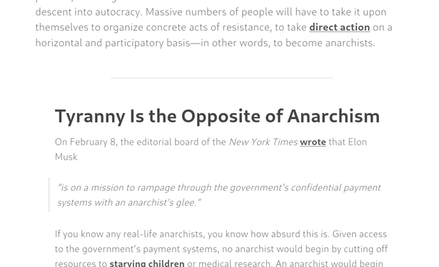
This is from crimethinc.com, but I'm not trying to pick particularly on them. There are many, many, many sites just as bad or worse.

This is a screenshot from an article on their site today, rendered in Firefox (Linux).

See the hair-thin font? See the fact that it's light grey on a white background? There's virtually no contrast between the text and the background.

This is an accessibility nightmare for those with any sort of vision problem. Picking the colour out of the screenshot (I didn't look at the CSS), it appears the text is basically 45% grey. This is ludicrous.

If the font face had some heft, it might be still be half-assed readable with contrast this low.

But as is... If I were to take my contacts out, I wouldn't even be able to tell that this screenshot *had* any of the normal-sized text in it, much less be able to read any of it.

Web designers, I beg you: please consider more than the appearance of what you're creating when you're making design choices.

Remember that not everyone is a 20- or 30-something with near-perfect vision.

Remember that people have cataracts or other types of eye cloudiness which necessitate high-contrast text to be able to read, even if they scale the fonts up by a huge amount.

Remember that vision degrades naturally in people in many ways other than "just wear glasses" can fix.

#WebDesign #WebDesigner #web #design #font #contrast #vision #eye #readability #legibility #unreadable

A partial screenshot of a browser window open to a web page about tyranny.  The text is in an extremely thin/fine font face, and is light grey on a white background.  It is difficult to read unless you are a 20- or 30-something young person with excellent vision.

It's almost completely lacking in visual contrast.  It's an accessibility nightmare.
2025-04-18

A – Z Challenge: Readability

Keeping Your Blog Readable: A Path to Connection and Clarity In the vast sea of the internet, we often find ourselves competing for attention, with countless voices vying for recognition. As a blogger, ensuring that your content is readable is not just a matter of style; it's a crucial step in creating meaningful connections with your audience. Readability affects how your message is perceived and absorbed. It’s about offering a seamless experience that invites readers to engage with […]

fedorapancakes.com/2025/04/18/

N-gated Hacker Newsngate
2025-04-17

Ah, the age-old debate: should we pass arguments individually and make our as readable as ancient hieroglyphs 🗿, or shove them into a single and pretend we’re sophisticated? 🤔 Spoiler alert: object are the holy grail ✨, and if you disagree, you’re clearly living in 2025 BC, not 2025 AD.
carlos-menezes.com/single-para

N-gated Hacker Newsngate
2025-04-14

🚀 Behold the epic tale of Janet's , where the author heroically excludes regular expressions like they're yesterday's news. 💥 Marvel at the labyrinth of magic that claims to be more readable, but only if you have a PhD in arcane text processing. 📜✨
bakpakin.com/writing/how-janet

N-gated Hacker Newsngate
2025-04-02

Google thinks it's necessary to turn into twins just to write a simple article 🤖🤦. Apparently, someone forgot that we humans can read without needing a PhD in robot-speak 📚. Thanks, but next time keep the robotic mumbo jumbo for the sci-fi flicks 🎬.
blog.google/products/gemini/ho

N-gated Hacker Newsngate
2025-04-01

Ah, the ol' "look how small my JavaScript library is" flex. 🦒 In a world where we're stuffing 163 bytes into a library, because who needs or maintenance anyway? 🤡 Next up, solving world hunger with emojis. 🍕🌍
github.com/hassanshaikley/pico

Erdem S.erdemsicak
2025-03-22

AI -

Stop copy pasting answers. Use tools like or to fine tune tone, flow, and post generation.

Stop copy pasting AI answers. Use tools like Grammarly or Hemingway to fine tune tone, flow, and readability post generation.
Arnaud Mangasaryanramenos@framapiaf.org
2025-03-13

De bons rappels pour bien choisir une typo et l'utiliser lors de la création de documents à présenter/partager dans un souci de lisibilité et accessibilité :

alain-michel.canoprof.fr/eleve

Merci @alainmi11 !

#typography #accessibility #readability #fonts #document #slides

2025-03-13

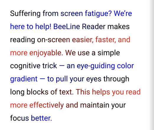
Two years ago at #CSUN I learned about what became my favorite browser extension, BeeLine Reader. I've been a subscriber ever since.

It's easy to set up on desktop, but has been some struggle to get working on Android. But this week I discovered it works with Microsoft's Edge Canary mobile browser, which has experimental support for extensions. Instructions are here: u.osu.edu/keck.60/2023/03/26/b

#AndroidAccessibility #Accessibility #Readability #Legibility

A paragraph of text in black, red and blue. Each line ends with a particular color, and the next line starts with that same color, fading into a different color across the line.

The paragraph reads:

Suffering from screen fatigue? We’re here to help! BeeLine Reader makes reading on-screen easier, faster, and more enjoyable. We use a simple cognitive trick — an eye-guiding color gradient — to pull your eyes through long blocks of text. This helps you read more effectively and maintain your focus better.
N-gated Hacker Newsngate
2025-03-11

Ah yes, another 🥱 thrilling exploration of complexities, as if developers needed more excuses for their disasters. A visual voyage through Halstead metrics and "cognitive complexities" that reads like a love letter to unreadable code. Just admit it: if your code needs a table of contents, it's not the code, it's you. 😂🚀
seeinglogic.com/posts/visual-r

Inautiloinautilo
2025-02-23
The Last Psion | Alexthelastpsion@oldbytes.space
2025-02-13

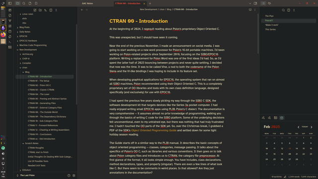
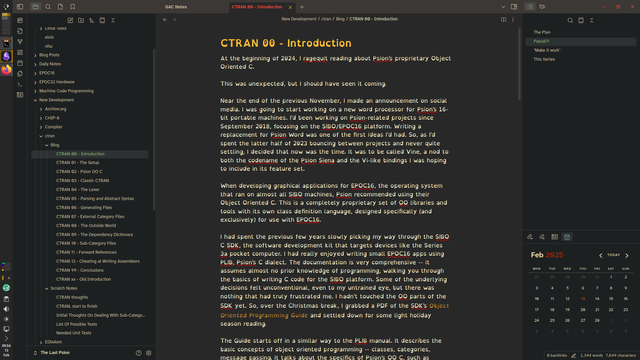
I'm currently messing with my fonts in #Obsidian. I can't decide whether I prefer Atkinson Hyperlegible Next or OpenDyslexic Nerd. (The rest of the interface is Hyperlegible Next.)

I'm sticking with JetBrainsMono Nerd for monospace text for now, but I'm considering trying Hyperlegible Mono.

I'm not diagnosed #dyslexic (my spelling and grammar are fine, and I can spot a misplaced apostrophe from 100 paces), but I might have #Irlens. And I certainly have other bouncy brain features.

#fonts #readability #nd

Screenshot of Obsidian, running on Arch Linux with Plasma 6. The main editing pane is using the Atkinson Hyperlegible Next font.Screenshot of Obsidian, running on Arch Linux with Plasma 6. The main editing pane is using the OpenDyslexic Nerd font.
2025-02-11

Master Python variable naming for cleaner, more readable code. Learn strategies for choosing informative yet concise names. Improve code maintainability & reduce the need for comments.
tech-champion.com/programming/

Inautiloinautilo
2025-02-11


Approaches to the ‘&’ selector in CSS · More maintainable, readable, and clever CSS nesting ilo.im/1628p2

_____

Client Info

Server: https://mastodon.social
Version: 2025.04
Repository: https://github.com/cyevgeniy/lmst