#EnvironmentalData

2026-01-22

How much does landform position matter for vegetation dynamics across Calgary?

I explored how ΔNDVI (2025-2024) varies across geomorphon classes (summit, ridge, slope, hollow, valley, etc.) using a large spatial dataset (~194k observations).

A few key points from the analysis:
• Non-parametric Kruskal–Wallis test shows statistically significant differences between geomorphons
• However, the effect size is moderate (ε² ≈ 0.04)
• Distributions strongly overlap — landform position matters, but it is not a deterministic driver
• Median ΔNDVI tends to be higher in lower landscape positions (hollows, footslopes, valleys), consistent with moisture and accumulation controls

#EnvironmentalData #RemoteSensing #NDVI #LandscapeEcology #Geomorphology #DataAnalysis #RStats
#ReproducibleResearch #Calgary #GreennessOfCalgary #Sentinel2

ΔNDVI (2025-2024) variations across geomorphon classes for Calgary
Planetary Ecologistplanetaryecologist
2025-11-25

Pacific Islands Ocean Observing System (Oceanography 🌊)

The Pacific Islands Ocean Observing System is a nonprofit association and one of eleven such associations in the U.S. Integrated Ocean Observing System, funded in part by the National Oceanic and Atmospheric Administration. The PacIOOS area covers eight time zones, and 2300 i...

en.wikipedia.org/wiki/Pacific_

2025-11-20

A long time ago, when I was member of an environmental NGO and creating analytical graphics for public awareness, I developed a custom template for calendar-style diagrams.

These “danger calendars” showed how many sanitary air-quality standards were exceeded each day. The format revealed not only individual pollution spikes but also long-term patterns — seasonality, problematic months, weekday effects, and gaps in monitoring.

The example below shows air-quality exceedances in Kryvyi Rih (2014–2016), based on official data from the Hydrometeorological Service of Ukraine.

And yes — Kryvyi Rih has extremely poor air quality.

#DataVisualization #AirQuality #EnvironmentalData #RStats #EcoAnalytics #SciComm #DataScience #Ukraine #AirPollution #UrbanHealth #UrbanEcology #FOSS #ggplot2

A calendar-style air-quality diagram for Kryvyi Rih (2014–2016).
Each cell represents one day and is colored according to how many sanitary standards were exceeded: green for clean days, yellow/orange/red/purple for increasing levels of exceedance, and grey for missing data. The diagram is structured by month and weekday, revealing seasonal and weekly pollution patterns.
2025-11-13

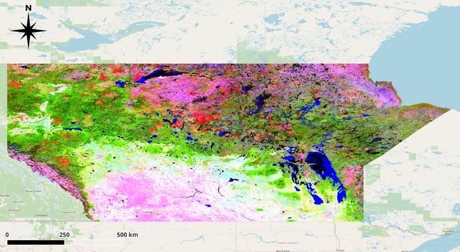
🛰️ Today I’m sharing one of my favourite large-scale remote sensing experiments:
a Principal Component Analysis (PCA) of MODIS composite data for the three central provinces of Canada (Alberta, Saskatchewan, Manitoba).

On this map:
- PC1 emphasizes broad ecological zones and vegetation productivity
- PC2 highlights soil and surface moisture differences
- PC3 captures subtle spectral variations — often linked to geology, wetlands, disturbance patterns, or local microclimates

Even though it looks abstract, PCA is a kind of “spectral fingerprint” of the land. It summarises thousands of square kilometres into a single visual structure that shows how the Canadian Prairies and Boreal regions differ and transition into one another.

#RemoteSensing #MODIS #Geospatial #EarthObservation #Rstats #DataVisualization #PCA #SatelliteData #Canada #Alberta #Saskatchewan #Manitoba #EnvironmentalData #GeoDataArt #GeoSpectralArt

Principal Component Analysis (PCA) RGB composite of MODIS satellite data across Alberta, Saskatchewan, and Manitoba. Bright colours reflect different spectral components: vegetation gradients, soil properties, wetlands, geological contrasts, and disturbance patterns.
2025-11-11

📚 A short note for those who just joined my profile

Over the past few days, I’ve been sharing many posts — not for promotion, but to open parts of my long-term research archive.

During more than a decade of independent work, I’ve accumulated a huge amount of data, methods, and materials: from geochemical modeling and groundwater studies to urban greenness mapping and environmental visualization.

Many of these works were completed years ago but remained unpublished outside of narrow expert circles — so I’m gradually bringing them here, one by one, to make them visible and interconnected.

The pace will slow down soon 🙂 — what you’re seeing now is a process of unfolding a whole scientific story.

#OpenScience #Geochemistry #Hydrology #GIScience #EnvironmentalData #UrbanEcology #IndependentResearch #ScienceCommunication #DataVisualization #Rstats #QGIS #SAGAGIS #FOSS #Linux #DataScience

2025-11-11

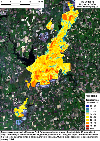
🏙️ The Hellish Trade Zones
(Ukrainian: “Торговельні пекельні зони”)

An older piece from 2017 — but still relevant today.
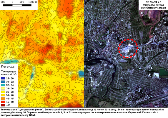
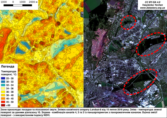
Using Landsat-8 thermal imagery, I explored how urban heat islands form in large commercial and industrial areas completely devoid of vegetation.

These “hellish trade zones” show surface temperatures exceeding 45–50 °C, while nearby shelterbelts and green spaces remain much cooler.
The visual storytelling approach — combining satellite data, maps, and simple explanations — helped raise public awareness about urban greening and environmental health in my city.

📍 Location: Kryvyi Rih, Ukraine
🛰️ Data: Landsat-8 (July 15, 2016), thermal band 10 + NDVI
🔗 More: datastory.org.ua/%d1%82%d0%be%

#UrbanHeatIsland #RemoteSensing #Landsat #UrbanEcology #ClimateChange #EnvironmentalData #UrbanGreening #Geospatial #GIScience #OpenScience #DataVisualization #Ukraine #Sustainability #KryvyiRih #UrbanHealth

Surface temperature map of Kryvyi Rih derived from Landsat-8 thermal band 10.“Central Market” — one of the city’s hottest urban spots, over 45 °C.Cooler zones correspond to shelterbelts and forest strips that mitigate local heat.
2025-11-09

🫐 The Blueberry Map Experiment — modelling meets the mountains

In 2022, while living with my family in the Czech Republic, I built a digital map of wild blueberry hotspots in the Jizera Mountains.

At first, it looked like a fun summer project — our neighbors used the map to find the best berry spots and enjoy the landscape.
But behind it was a serious experiment: I tested species distribution modelling (SDM) methods, later adapted for wide-world rare earth element prediction.

Within this “blueberry project” I:
🔹 automated the full spatial workflow in R and QGIS,
🔹 generated geomorphons and other terrain-based predictors,
🔹 built and validated ML models,
🔹 created probability maps and tested them in the field.

✨ What started as a family hobby became a field-tested workflow for predictive geoscience.

#DataScience #MachineLearning #GIS #SpatialModeling #SDM #CzechRepublic #RemoteSensing #Geoscience #RStats #EnvironmentalData #PredictiveMapping #LandscapeEcology #RareEarthElements #CriticalMinerals

Panoramic view of the Jizera Mountains with spruce forest and granite formations under a bright summer sky.Close-up photo of ripe wild blueberries in a mountain forest.Model validation plot (ROC curve) demonstrating high predictive accuracy for the blueberry occurrence model, with AUC near 1.0.Map (Ukrainian text) — Probability map of ripe blueberry occurrence in the Jizera Mountains, generated using species distribution modelling. Green areas show high-probability zones (>0.8).
2025-11-09

🌿 Calgary’s vegetation — satellite comparison (2024 → 2025)

Median NDVI maps from mid-May to mid-September show a clear difference between the two seasons.

In 2025, NDVI values are noticeably higher — vegetation stayed greener and denser for longer.
The wetter summer had a strong effect on canopy productivity across most Calgary communities, especially in parkland and tree-covered zones.

🛰️ Based on Sentinel-2 imagery and R + QGIS processing.

#RemoteSensing #NDVI #UrbanEcology #Calgary #GeospatialAnalysis #GIS #Sentinel2 #EnvironmentalData #DataVisualization #OpenScience #EarthObservation #ClimateImpact #RStats #QGIS

Side-by-side comparison maps of median NDVI (Normalized Difference Vegetation Index) for Calgary in summer 2024 and 2025.
The left panel (2024) shows mostly yellow and brown tones — indicating moderate or low vegetation activity.
The right panel (2025) displays broader green and cyan areas, especially in parks and residential zones, showing higher vegetation density and improved canopy health.
NDVI derived from Sentinel-2 satellite imagery, processed with open-source GIS tools.
2025-11-09

🧠 Full-Stack Science — from raw data to the final PDF

While preparing the new version of my monograph, I realized something funny:
if I listed all the software I used, the “Used software” section would look more like a Linux manual than a scientific appendix.

Because, honestly — everything mattered.
From grep, awk, and apt, to PHREEQC, R, QGIS, and finally LaTeX.

Every single stage — data cleaning, modeling, visualization, mapping, typesetting — I did entirely on my own.
No outsourcing. No “sending for refinement.”
Just a full-stack, open-source workflow — from the first script to the final monograph PDF.

📘 Draft available on Zenodo:
🔗 zenodo.org/records/16741148

#OpenScience #IndependentResearch #Geochemistry #Hydrogeology #DataScience #PHREEQC #RStats #QGIS #Linux #LaTeX #EnvironmentalData #GeospatialAnalysis #FullStackResearch #ScientificWorkflow #Zenodo #SvystunovaGully

Table from the monograph listing the main software used in the study — including R packages (ggplot2, terra, sf, tidyverse), PHREEQC, QGIS, LaTeX, and LibreOffice. The table demonstrates the fully open-source research workflow applied in geochemical modeling and data visualization.
2025-11-08

“If the map does not match the terrain — trust the terrain!”
— Principle of field geoscience

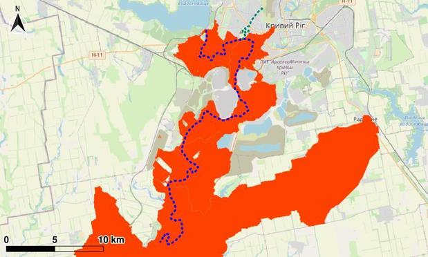
This is how the effective catchment area of the Inhulets River looks within the study region.

The upstream part — above the Karachunivske Reservoir's dam, the outlet of the Saksahan derivative tunnel, and the confluence of the Stara Saksahan River — was excluded from the calculation.

Within the analyzed area, surface runoff is possible only from the highlighted zone.
The rest of the “catchment basin” is hydrologically inactive: runoff is intercepted by ponds, settling tanks, and other anthropogenic landforms.

🌍 The analysis was based on the Copernicus GLO-30 DEM, integrated with hydrological modeling and terrain processing in open-source GIS.

#Hydrology #Geochemistry #InhuletsRiver #GIS #SAGAGIS #QGIS #HydrologicalModeling #RemoteSensing #GeospatialAnalysis #EnvironmentalData #RStats #LandscapeGeochemistry #Copernicus

The effective catchment area of the Inhulets River looks within the study region
2025-11-08

🌿 Calgary Greenness Dynamics (2024–2025)

Mapping ΔNDVI between the summers of 2024 and 2025 shows how Calgary’s communities changed in their vegetation cover.

🟢 Some areas became noticeably greener this year — likely due to the wetter and milder summer.
🔴 Others show slight declines, possibly linked to construction, soil dryness, or limited tree canopy recovery.

These patterns reveal how different parts of the city respond to seasonal variability — and where future urban greening might have the most impact.

🛰️ Based on Sentinel-2 data and NDVI analysis in R.

#Calgary #NDVI #RemoteSensing #UrbanEcology #DataVisualization #GreennessOfCalgary #EnvironmentalData #GIS #RStats #GeospatialAnalysis #yyc #Alberta #Canada

Mapping ΔNDVI between the summers of 2024 and 2025 for Calgary’s communities.
2025-11-08

🌿 Where Calgary Got Greener — and Where It Didn’t?

A quick look at how Calgary’s residential communities changed in greenness (NDVI) between 2024 and 2025.

🟢 Some neighbourhoods show a clear recovery of vegetation — probably thanks to a wetter, milder summer, better soil moisture, or local greening efforts.
🔴 Others stayed stagnant or even lost NDVI — maybe new construction, dry soils, or sparse vegetation played a role.

The bar chart shows Top-5 and Bottom-5 communities by NDVI change. It’s fascinating how uneven the “greening pulse” can be within one city.

📊 Based on Sentinel-2 data, mid-May – mid-September, processed in R.

#Calgary #NDVI #RemoteSensing #UrbanEcology #EnvironmentalData #GIS #Sentinel2 #ClimateImpact #GeospatialAnalysis #DataScience #RStats #OpenData #GreennessOfCalgary #Alberta #Canada

Top-5 and Bottom-5 Calgary communities by NDVI change
2025-11-07

🛰️ Land-cover classification with Sentinel-1 & Sentinel-2 — validated and working

My machine-learning model for land-cover classification has shown very high accuracy (both overall and per-class).
It was trained on multi-temporal Sentinel-1/2 data over one of Ukraine’s largest mining and industrial areas.

The model now serves as a base for analysing environmental dynamics and supporting real-world sustainability decisions.
Bridging #RemoteSensing with #EnvironmentalData and #GeospatialAnalytics — where research meets practice.

#MachineLearning #EarthObservation #GIS #DataScience #EnvironmentalMonitoring #Sustainability #OpenScience #Ukraine #RStats #LandCover #Copernicus #CopernicusSentinel

Confusion matrix for #RandomForest classifierPer-class accuracy of #RandomForest classifier
💧🌏 Greg CocksGregCocks@techhub.social
2025-10-27

Improving our Coasts with High-Resolution Land Cover Data [#NOAA]
--
coast.noaa.gov/states/stories/ <-- shared technical article
--
coast.noaa.gov/ccapatlas/ <-- on-demand, online NOAA CCAP Landcover Atlas
--
coast.noaa.gov/digitalcoast/da <-- #opendata C-CAP High-Resolution Land Cover
--
Use Case Examples:
• Flood Inundation Modeling and Risk Assessment
• Stormwater Management and Water Quality Protection
• Heat Risk and Urban Forestry
• Wetland Monitoring, Conservation, or Restoration Planning
• Other – e.g., Discovering Gaps in Broadband Access
--
#GIS #spatial #mapping #NOAA #DigitalCoast #LandCover #CoastalManagement #GeospatialData #EnvironmentalData #ResilientCommunities #landcover #usecase #economics #remotesensing #earthobservation #opendata #floodinnundation #waterquality #water #hydrology #risk #hazard #spatialanalysis #spatiotemporal #stormwater #management #heatrisk #urbanforestry #wetland #monitoring #conservation #planning #resortation
@noaa #NOAAOfficeForCoastalManagement

Ars Technica Newsarstechnica@c.im
2025-07-25

Mistral’s new “environmental audit” shows how much AI is hurting the planet arstechni.ca/XrZb #environmentaldata #MistralAI #Mistral #audit #LLMs #AI

2025-04-23

🚨 New project: Machine learning for blue line tracing and wastewater surveillance

🚀We're partnering with @UVA_ID, @imperialmed.bsky.social @novelt_CH @icddr_b and WHO GIS Centre to create smarter, scalable ways to track infectious diseases in low and middle-income countries using #EnvironmentalData #SatelliteData

#Bangladesh 🇧🇩 #Dhaka
worldpop.org/current-projects/

Photo of sanitation in Rohingya camp, by Rabiul Hasan / icddr,b
Jeremy B. Yoder 🖖🏻🌿🏳️‍🌈📈jby@ecoevo.social
2025-03-14

The Conservation Biology Institute is looking for volunteers with GIS and spatial data experience to help secure and preserve federally funded environmental datasets on their Data Basin platform

mailchi.mp/1757b2a216df/data-b

#science #data #conservation #gis #SpatialData #EnvironmentalData #USpolitics

Client Info

Server: https://mastodon.social
Version: 2025.07
Repository: https://github.com/cyevgeniy/lmst